3 Takes on COVID-19 Vaccine Safety
Tagged:COVID
/
JournalClub
/
MathInTheNews
/
PharmaAndBiotech
/
Politics
/
SomebodyAskedMe
Somebody asked me about safety data for this fall’s COVID-19 booster vaccinations. Again.
General Matters
You might recall that it’s been a custom on this Crummy Little Blog That Nobody Reads (CLBTNR) that we live-blog the FDA VRBPAC advisory sessions on COVID-19 vaccines. We did not do that starting this year, since we have little tolerance for the Trump/Kennedy willful disregard of science. You can see here [1] why we felt the need to disengage from the venomous nonsense.
 Still, let the record show that the FDA VRBPAC met on 2025-May-22, and recommended a monovalent
booster based on the JN.1 lineage, preferably LP.8.1 (though I think Novavax can be JN.1,
since they’re a protein vaccine and can’t pivot fast) [2]:
Based on the totality of the evidence, FDA has advised the manufacturers of the approved COVID-19 vaccines that to more closely match currently circulating SARS-CoV-2 viruses, the COVID-19 vaccines for use in the United States beginning in fall 2025 should be monovalent JN.1-lineage-based COVID-19 vaccines (2025-2026 Formula), preferentially using the LP.8.1 strain.
That’s… ok, I guess?
But it’s not great: we’re still, as always, several variant strains behind reality. The virus mutates faster than our systems can respond, especially now with all the right-wing foot-dragging and imposition of nonsensical constraints.
 For example, let’s consider the wastewater genomics of SARS-CoV2 collected over the years
by the Wisconsin State Laboratory of Hygiene. [3] First a
couple of terms:
- Metagenomics is when you do gene sequencing on something other than cells, to see what all the things living there are. For example, this has been done on seawater and revealed a host of bacterial and viral beasties that were poorly understood.
- Wastewater metagenomics is when you do this at a sewage processing plant. Actually, all sorts of analyses are done on sewage, because of its startling honesty: everybody who uses a toilet contributes. You can tell a lot about cocaine use, for example, by looking for the by-products. Doing metagenomics, specifically focused on the SARS-CoV2 genome, is a way to tell which strains are in circulation with a very high level of honesty not relying on anybody reporting anything. (Unless use of a toilet constitutes reporting, in which case I really don’t want to hear about your theory of “reporting”.)
This has been a big deal for some time with COVID-19; we’ve been writing enthusiastically about it in this CLBTNR for some years now. [4] [5] [6] [7] [8] [9] So let’s see what our colleagues in Wisconsin have to say about it, with their state-wide sewage monitoring.
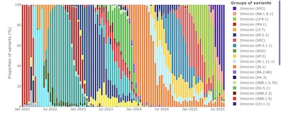 First, consider the barplots of viral strain proportions over time, as shown here. (Click
to embiggen, or use the references below, or this link, to consult the original.)
- The horizontal axis is time, biweekly for about 3.5 years.
- The vertical axis is the proportion of sequences seen for each viral variant.
- Each column of colored bars is a stacked bar chart, showing you the proportion of sequences seen in sewage for a given variant, over that 2-week period.
- The color legend is on the right, but here it only shows the top variants for the most recent period. Of course you can go to the reference below for all the details.
Now, note a few things carefully about the right most bar for 2025-Aug-11, the latest data:
- Everything of consequence in an Omicron substrain now. The rest of the variants are practically extinct. That is, the virus has so optimized itself for infecting us, that it’s down to just 1 specialist variant, Omicron. But there are lots of subvariants!
- The dominant subvariant right now is XFG (purple). NB: In the variant naming convention, names beginning with “X” are recombinant, i.e., fusions of more than 1 other variant.
- The variants recommended by the FDA are LP.8.1 and its superclass JN.1.
- LP.8.1 is the green one, number 3 in the color legend. It’s very tiny, near the bottom of the bar.
- JN.1 is the orange one, in 12th place in the color legend. It’s way down at the bottom.
Initially, this looks pretty discouraging: we’re about to get jabs (you are, aren’t you?) with a booster for a strain that’s completely a minority player, not the big bad XFG.
But… look a bit back in time (bars further to the left). I know it’s hard to read here, but it’s clearer in the interactive version on the Wisconsin web site: the 7th bar from the right corresponds to 2025-May-19. The long green bars there mean that the LP.8.1 strain was dominant then, so the decision to pick that strain was reasonable then.
But really, the question we’d like answered is whether the vaccine strains JN.1/LP.8.1 are still (somehow!) a reasonable choice now, when all the action is from XFG?
For that, we consult the phylogenetic tree of SARS-CoV2 viral variants (constructed from NextStrain clades and PANGO lineage information). If you don’t know what that is, think of it as an evolutionary family tree of the virus. Two strains that are very close in the tree (number of links to travel between them) are actually very close in their genetics, and a vaccine for one will likely give coverage for the other. (“Likely”: sequence similarity isn’t everything, e.g., if there’s a single black magic mutation dramatially increasing infectiousness. But all else being equal, sequence similarity is a good measure.)
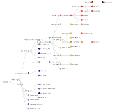 Here’s the tree constructed by our friends in Wisconsin (click to embiggen, or use
this link or the references to consult the original).
Have a look at the upper right:
- Go to the upper right corner, then back off to the left 4 levels. You should be looking at a node labeled 24A (JN.1). That’s the root strain recommended for vaccines this fall.
- An immediate descendant of that, to the right one level and just a skosh down, is 25A (LP.8.1). That’s the recommended target for vaccines this fall.
- Directly below 25A (LP.8.1) is 25C (XFG). That’s the dominant strain right now!
So the dominant strain right now is a direct descendant of the JN.1 lineage, and an immediate sibling of the LP.8.1 lineage. A vaccine for either of those should still provide excellent coverage against XFG, all else being equal (no “evil miracle” mutations).
Conclusion: Get this booster. Yes, our institutions are sclerotic, have always been too slow, and are now wildly corrupted with malign actors. However, the surviving FDA & CDC scientists last May got the VRBPAC committee to recommend something which should serve us well.
So that’s the vaccine that’s here to deal with. Its efficacy looks like a pretty good shot on target for this winter. But what about its safety?
COVID-19 vaccines, especially the mRNA vaccines from Pfizer & Moderna, have been proven safe and effective beyond a reasonable doubt. Still, people are just twitchy about them. Given the amount of disinformation, ignorance and willful lying for political purposes that we live in now, I guess this is understandable.
So once again on this CLBTNR, we’ll take a look at the data. Today we go through 3 takes on the safety of the vaccines: 2 very good, and 1… less so.
Take 1: All of Denmark, 1 Month After Vaccination
 Recall that our upcoming boosters are for LP.8.1, a direct descendant of JN.1. That means
safety data about a JN.1 vaccine is quite relevant now.
Fortunately, Andersson and colleagues have published just such a safety study [10] using essentially all the available electronic medical records in Denmark. (This is one of the benefits of universal health care: the universal medical records enable huge datasets that can explore hypotheses in much more scientific detail!)
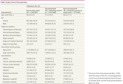 First, let’s have a look at their study cohort, shown here (click to embiggen):
- Note the size: 1.5 million subjects, 1 million vaccinated and 0.5 million
unvaccinated.
- That’s not the entire population of Denmark (around 6 million in a 2025-Jul-01 estimate), but it’s probably everybody who had any contact with the medical system in the study period 2024-2025.
- This is a very big study, essential impossible to replicate in the US with its fragmented, expensive health care with multiple incompatible electronic medical records systems and sometimes vicious insurance gate-keeping to avoid medical treatment.
- Since they selected those aged ≥ 65 or with higher risks, the population skews a bit
older. We should expect to see more “old people problems” than in a general
population.
- Indeed, the most frequent co-morbidity was “chronic cardiac disorder”.
- It also skews a bit female, which is to be expected given male/female life expectancy differences.
- It looks like, in the vaccinated population, there were about 86% included because of age, and 13% included because of risks. So it’s mostly a study of Danish seniors.
The paper’s a little unclear to me on this subject, but what it appears they did was ignore the unvaccinated population, and compare 29 different risks in the vaccinated population. The comparison was 28 days after vaccination vs the rest of the study period. So they’re looking for fairly prompt, acute reactions to the vaccine in the month immediately following.
They then computed, for each type of event, an incident risk ratio. It basically amounts to computing the ratio of the risk rate per day in the time 28 days after the vaccination. A ratio < 1 indicates less risk in the post-vaccination month; a ratio > 1 indicates more. A ratio near 1, especially with a 95% confidence interval straddling 1, means there’s no significant difference.
There are multiple ways to compute the confidence interval here:
- The Clopper-Pearson method for binomial proportion confidence intervals,
- Our own unpublished and mostly untested, but theoretically pleasing, method of Gauss hypergeometric functions for ratios of Beta-distributed variables, and
- Poisson regression.
They chose the last method, Poisson regression, to get them an event count and confidence intervals to fold into the ratio to get a ratio confidence interval.
I could check their work with either of the other 2 methods, but have not done so and will not unless (somehow?) there’s demand. A quick spot check, dividing the mean events per 100k person-years in both groups gives an estimate close to the mean value they’ve plotted. So it looks honest, at least from a reasonable distance.
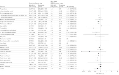 Have a look at the forest plot on the right
of this figure.
- Each row is one of the 29 events they checked for, based on observation of what happened before in vaccinated populations, and what happens to older populations in general. There’s no insinuation that vaccines cause any of this, just that these things happen, particularly to older people, so they checked the incidence rates.
- In most cases, the mean of the ratio is < 1, meaning the risk is lower immediately following vaccination.
- However, take a closer look at the error bars.
- In almost every case, the error bar spans a ratios < 1 to ratios > 1. That means in those cases there is no statistically significant evidence to point to any difference in the event rates immediately after vaccination vs otherwise.
- In only a few cases, the ratio is < 1 and the 95% confidence interval is also bounded below 1. This means there is evidence that you’re safer from that risk in the month following vaccination… though judging by the ratio, not by much.
Conclusion: For the 29 risk factors relevant to this cohort, there’s no evidence that risks immediately following vaccination are any different from other times. Vaccines do not increase any risks immediately following their administration.
A Mathematical Digression: Poisson Regression & Adjusted Incidence Rate Ratios
It occurred to me that for most people it’s not obvious why Poisson regression is a useful tool for calculating adjusted Incidence Rate Ratios (IRRs). So let’s fix that! (The Wikipedia page on Poisson regression is a good starting point.)
Poisson regression tries to predict a count of events $Y$ (e.g., number of medical adverse events) from a vector of features $\mathbf{x}$ (e.g., age, vaccination status, risk status). Predicting the log mean of $Y$ conditional on $\mathbf{x}$ with regression coefficients $\alpha$ and $\beta$:
\[\log(\mathbb{E}[Y \vert \mathbf{x}]) = \alpha + \beta' \mathbf{x}\]This would fit your observed values of $Y$, but adjust them a bit so they make sense as groups with the covariates $\mathbf{x}$.
Now if you want to compare 2 groups, with observed counts $Y_1$ and $Y_2$ with group covariates $\mathbf{x}_1$ and $\mathbf{x}_2$ (say, vaccinated and unvaccinated people within the same age cohort), then you’d use the regression model like this:
\[\left\{ \begin{align*} \log(\mathbb{E}[Y_1 \vert \mathbf{x}_1]) &= \alpha + \beta' \mathbf{x}_1 \\ \log(\mathbb{E}[Y_2 \vert \mathbf{x}_2]) &= \alpha + \beta' \mathbf{x}_2 \end{align*} \right.\]Take the difference, and you get a log estimator (almost) for the ratio:
\[\log\left(\frac{\mathbb{E}[Y_1 \vert \mathbf{x}_1]}{\mathbb{E}[Y_2 \vert \mathbf{x}_2]}\right) = \beta' (\mathbf{x}_1 - \mathbf{x}_2)\]So this plus the uncertainty estimates on $\beta$ from the regression get you an estimator on the ratio and 95% confidence limits.
A couple caveats:
- Yes, this depends on the coding levels for $\mathbf{x}$. But if you have 2 groups, say vaccinated and unvaccinated, coded as 0 and 1, then $\mathbf{x}_1 - \mathbf{x}_2 = 1$, conveniently enough.
- Yes, the ratio of the expectation values is not the expectation of the ratio. Ratio statistics is a whole ‘nother thing. See, for example, our method on a method of Gauss hypergeometric functions for ratios of Beta-distributed variables to get some idea how hairy that gets. The Poisson method used here is apparently good enough, often enough, that it’s widely used.
- The variables being predicted are not actually counts, but rates. That is, there’s some kind of normalization done for each covariate group, e.g., divide by the number of fully vaccinated 18-44 year olds to get an incidence rate, say, per 100k person-years. That mildly complicates things, but is intellectually straightforward.
In the end you get (almost) an estimator for the incidence rate ratio, adjusted for the covariates, and a 95% confidence interval on it.
(I’d have done it differently using my method of ratio statistics on Beta-distributed event probabilities, but I admit that’s a niche taste.)
Take 2: All of Norway, 3 Years After Vaccination
So that’s the boring, safe story for no risk increase in the short term.
What about longer term?
We definitely see increased all-cause mortality rates at the onset of the pandemic. Were these due to the vaccines, or due to COVID-19 itself (and its disruption of health care in general)?
 For that, we turn to a 3-year study by Dahl, et al. [11],
who looked at all-cause mortality in a similarly broad population in Norway (universal
health care!), over 2021-2023.
Note that this is a preprint, which is not as yet peer-reviewed. So… grain of salt.
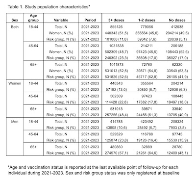 First, let’s look at their study cohort, the summary table of which is shown here.
- It was a retrospective cohort study, including just about everybody over age 18 living
in Norway in the years 2021-2023.
- They were able to mine real-time national health registry data to obtain a study cohort of 4,645,910 people.
- The 2024 population of Norway is around 5.5 million, so this was nearly the entire country in 2021-2023.
- Subjects were categorized as unvaccinated, partially vaccinated (1 or 2 doses), and fully
vaccinated (3+ doses).
- People changed vaccination groups upon receiving a new dose. This was reported in real time by the national electronic medical records system.
- These are obviously not the JN.1/LP.8.1 vaccines of this year, but rather the mRNA vaccines first available in 2021 and their modified versions through 2023.
- If you want to study long-term effects, you have to look long term, which means including older treatments like the very first mRNA vaccines. Yes, mRNA vaccines have been in use for long enough that we can look at the first versions as having been “in the old days” of 2021!
- Death outcomes were from the National Population Register.
Now let’s consider their calculations. They stratified by analyzing each age group separately. Within each age group, they performed Poisson regressions to adjust for covariates like gender, place of residence, and by whether they were in a high-risk group.
These Poisson regressions yielded an adjusted incidence rate ratio of all-cause mortality, for each vaccination group compared to the unvaccinated. This looks almost exactly like the method of the previous paper, except that instead of measuring 29 adverse events for a few months, they measured only all-causes mortality for 3 years.
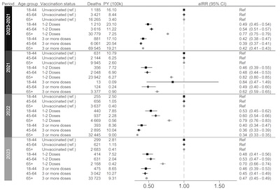 The results are shown here, in a forest plot.
- There are 4 groups, each in a horizontal strip. The most important one is the top strip, which represents all 3 years combined.
- Within each such group, they first stratify by vaccination status (unvaccinated, partial, and full) and then by age group (18-44, 45-64, and 65+).
- NB: Since the unvaccinated group is the baseline for comparison, the ratio for them is always exactly 1. We’re interested in whether the vaccinated groups show a ratio less than 1 (fewer deaths) or greater than 1 (more deaths).
Note that the adjusted IRR is always less than 1, and is in fact bounded below 1 by its 95% confidence interval! Also note that in the 3-year combined dataset, the 95% confidence intervals are very tight: a consequence of having 4.6 million test subjects! Universal health care is good for health care, but it’s also great for research.
(You might be curious about the one weird apparent exception for fully vaccinated, age 18-44, in 2021 only: the 95% confidence interval crosses 1. If you look at the number of deaths in that vax group and age group for that year, there were only 13! Basically this group was so well protected from dying that there were too few deaths to estimate accurately the 95% confidence interval! That was a very safe time to be a fully vaccinated young Norwegian.)
Conclusion: The vaccinated population had a lower death rate from all causes.
Take 3: Some of Florida, For 1 Year Early in the Pandemic
 Levi, et al. report a different result (for a slightly different question) using data
from Florida in the US. [12]
Note that this is also a preprint, which is not as yet peer-reviewed. So… grain of salt.
I’m not quite sure what to day about this one! It appears to be an attempt to use Florida data on Pfizer vs Moderna vaccination and match with vital statistics, to see if there’s an increase in all-cause mortality with one vaccine compared to the other vaccine.
- Matched cohort of 1,962,822 adults.
- Participants got a first dose of Pfizer or Moderna between 2020-Dec-18 and 2021-Aug-31.
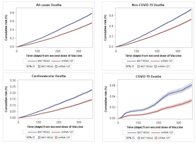
- Outcomes sought were all-cause mortality, COVID-19 mortality, and cardiovascular.
- They claim a very peculiar result, that there was increased mortality with Pfizer compared to Moderna, as shown by the KM curves here.
As for their statistical methods: in 56 pages, there is not a single equation. There are big walls of descriptive word salad, and I understand some people like that. But it’s hard to say exactly what they did, without diving deeper than I care to do.
- There are a number of Kaplan-Meier survival curves, stratified by vaccine, for various
populations. But…
- There’s no mention of, say, a logrank $p$-value to assess whether the curves are statistically significantly different.
- There’s no mention of a Cox regression that would normally be done here, to account
for censorship.
- There is some mention of logistic regression (death or not) on various predictors, much like the Poisson regressions used above to get adjusted incidence rate ratios.
- There is no discussion of why logistic regression vs Poisson regression vs Cox regression, or the like. I mean, I love logistic regression, but from what I understand of the word salad it may not be the correct tool here.
- The data made me pretty uneasy:
- Florida isn’t exactly famous for having reliable data like this. And the famous conservative slogan about dying “with COVID-19” vs “of COVID-19” means they’re depending on a judgment made by unknown persons with unknown agendas.
- They exclude cases of suicide and murder, treating them separately as “negative controls”. I don’t like this: “all-cause mortality” should mean all causes. Suicidal depression or murderously poor impulse control & aggression seem like things worthy of inclusion.
- Unlike the Norway & Denmark studies above, where vaccination as near-universal, in the US and in Florida in particular this was more of an iffy decision, depending on the person’s exposure to misinformation.
- By choosing vaccination dates of 2020-Dec-18 and 2021-Aug-31, they’re looking only at people who were vaccinated very early in the pandemic. That population skews older and with more co-morbidities; we vaccinated them earlier because they needed the protection. (We denizens of Château Weekend are among them. Ok, not the cats, but the rest of us.)
I did like the fact that they started out with about 12 million records, and pared it down to about 950k in each arm, after careful matching of cohort properties. That part looks to be well done, but again there are no statistical details or equations for the cohort matching.
But why hasn’t anybody else seen this, and made a very, very loud noise about it? If their conclusion is true, why did the Norwegian data above show long-term protective effects against all-cause mortality? And why did the Danish data above show protective effects against 29 separate adverse events in the short term? Why has no pharmacovigilance study shown Pfizer inferior to Moderna?
If I were a referee, I’d stop the paper here and demand (a) explanations of why the dataset is not biased, (b) a clearer explanation of their statistical methods (including $p$-values attached to the KM curves), and (c) a meta-analysis including someone else’s data, showing that the effect is real.
But honestly, the thing that really made me twitchy was that one of the authors is Joseph Ladapo, currently surgeon general of Florida. Absent some really compelling argument to the contrary, he just looks problematic to me. The senior health reporter at the popular science venue Ars Technica has been writing negatively about him for years:

- As we worried previously, on this CLBTNR,
this is the guy who (a) wants to ban all mandatory school vaccinations, and (b)
compared vaccine mandates to slavery [13]:
Every last one of them is wrong and drips with disdain and slavery.

- Back in 2022, he did a “dubious analysis” of Florida data and ended up recommending
against mRNA vaccines for men ages 18-39. [14] The
study was posted on the Florida Dept of Health web site, but without their logo, and
without any authors. The critical review was not kind:
Experts roundly dubbed the analysis “utter rubbish,” “extremely misleading,” and “comically bad.” Some called the analysis method “terrible,” and one epidemiologist called it “the absolute most batshit study design & analysis plan I have ever seen.” Others noted that the conclusion “smells of p-hacking” and data cherry-picking.

- Shortly after that in 2023, he was accused of fraud. [15]
Florida’s health department opened and then closed an investigation into the state’s polarizing surgeon general, Joseph Ladapo, after a tipster claiming to have insider knowledge alleged that Ladapo “manipulated data” and committed “scientific fraud” in his final edits to what became a contentious, widely panned analysis on COVID-19 vaccine safety in young men.
The investigation was closed, since the tipster did not want to be publicly exposed. However, there is evidence that the study authors – whoever they may be – deliberately avoided emailing about the project, passing notes to each other instead. This kept them off the official government records.
Attempting to conceal your work is never a good sign in science.
-
Later in 2023, as he continued to allege “crimes” in the vaccines, against masking, and promoting nonsense treatment like ivermectin, he tried to get the FDA and CDC on his side. [16]
(Recall this was 2023, when the FDA and CDC were still science-run organizations.)
Their response was blistering:
In a four-page letter dated March 10, FDA Commissioner Robert Califf and CDC Director Rochelle Walensky easily debunk his inaccuracies, falsehoods, and bluster, while taking the opportunity to point out that he is failing the people of Florida in his role as a public health official.
…
In a knock to Ladapo’s dubious analysis on cardiac deaths, Walensky and Califf cited several studies that collectively indicate that “not only is there no evidence of increased risk of death following mRNA vaccines, but available data have shown quite the opposite: that being up to date on vaccinations saves lives compared to individuals who did not get vaccinated.” They also specifically highlighted a study looking at cardiac events, noting that “the risk of stroke and heart attack was actually lower in people who had been vaccinated, not higher” (emphasis theirs).
It’s a paper with a startling conclusion, but which just presents too many problems to believe it right out of the gate.
The Weekend Conclusion
- The fall 2025 vaccine, optimized for LP.8.1, is very likely to be effective against the dominant variant, XFG. XFG is a recombinant (hence name starting with X) sibling of LP.8.1.
- There is no acute short-term risk in the month after vaccination, compared to the rest of the time.
- There is no increased mortality from vaccination, in fact dramatically the opposite as shown by the Norway data. (Levi, et al. will disagree about Pfizer vs Moderna, but I am extremely uneasy with their data and with one of the co-authors.)
Bottom line: Get the COVID-19 booster this fall, and get a flu shot while you’re there.
(Ceterum censeo, Trump incarcerandam esse.)
Notes & References
1: Weekend Editor, “Why Writing About Vaccines is Hard for Me Now”, Some Weekend Reading blog, 2025-Jul-16. ↩
2: FDA Staff, “COVID-19 Vaccines (2025-2026 Formula) for Use in the United States Beginning in Fall 2025”, US Food & Drug Administration web site, downloaded 2025-Sep-10. ↩
3: Wisconsin State Labaratory of Hygiene Staff, “SARS-CoV-2 Wastewater Genomic Dashboard”, Wisconsin State Labaratory of Hygiene web site, downloaded 2025-Sep-10. ↩
4: Weekend Editor, “Coronavirus & Elections: The Winter of Our Discontent”, Some Weekend Reading blog, 2020-Nov-02. ↩
5: Weekend Editor, “Wastewater coronavirus RNA vs medical loads”, Some Weekend Reading blog, 2020-Nov-04. ↩
6: Weekend Editor, “Wastewater Revisited: Metagenomic Viral RNA and Medical Loads”, Some Weekend Reading blog, 2021-May-21. ↩
7: Weekend Editor, “Boston Wastewater Re-Re-Visited: Sewage Viral RNA vs COVID-19 Cases and Deaths”, Some Weekend Reading blog, 2022-Feb-04. ↩
8: Weekend Editor, “Why Writing About Vaccines is Hard for Me NowSARS-CoV2 Cryptic Sequences in NYC Wastewater: Why Not to Sleep Well at Night”, Some Weekend Reading blog, 2022-Feb-07. ↩
9: Weekend Editor, “COVID-19 mRNA in Boston Wastewater”, Some Weekend Reading blog, 2023-Jul-06. ↩
10: NW Andersson, et al., “Safety of JN.1-Updated mRNA COVID-19 Vaccines”, JAMA Network Open, 8:7, 2025-Jul-28. DOI: 10.1001/jamanetworkopen.2025.23557. ↩
11: J Dahl, et al., “COVID-19 mRNA-vaccination and all-cause mortality in the adult population in Norway during 2021-2023: a population-based cohort study”, medRχiv, 2024-Dec-16. DOI: 10.1101/2024.12.15.24319058.
NB: This is an as yet not peer-reviewed preprint. ↩
12: R Levi, et al., “Twelve-Month All-Cause Mortality after Initial COVID-19 Vaccination with Pfizer-BioNTech or mRNA-1273 among Adults Living in Florida”, medRχiv, 2025-Jul-22. DOI: 10.1101/2025.04.25.25326460.
NB: This is an as yet not peer-reviewed preprint. ↩
13: B Mole, “In win for infectious diseases, Florida to end all school vaccine requirements”, Ars Technica, 2025-Sep-03. ↩
14: B Mole, “That Florida ‘analysis’ on COVID vaccines is—you guessed it—total garbage”, Ars Technica, 2022-Oct-11. ↩
15: B Mole, “Florida surgeon general fudged data for dubious COVID analysis, tipster says”, Ars Technica, 2023-Feb-23. ↩
16: B Mole, “Florida surgeon general wrong on vaccines and bad at his job, CDC and FDA say”, Ars Technica, 2023-Mar-13. ↩
Gestae Commentaria
Comments for this post are closed pending repair of the comment system, but the Email/Twitter/Mastodon icons at page-top always work.