Wastewater Revisited: Metagenomic Viral RNA and Medical Loads
Tagged:COVID
/
MathInTheNews
/
R
/
Statistics
Last November, we looked at metagenomics of sewage SARS-CoV-2 RNA vs medical loads in Boston. The results then were inconclusive. There’s a lot more data now. Does the mRNA in sewage actually predict anything useful about COVID hospital admission, ICU admission, ventilator use, and death? Yes, it does.
Everybody’s doing metagenomics nowadays
 From Nature comes a news article [1] telling us how much
sewage surveillance/metagenomics has become
en vogue in the last year:
- There are now apparently over 200 COVID sewage projects all over the world now.
- It’s been used to detect illegal drug use, as well as COVID-19 and polio and other public health problems.
- In the UAE, they’re using it on the sewage in the tanks of arriving aircraft, to see if anybody on the flight was infected.
- In Hong Kong the surveillance is more geographically detailed, down to the level of apartment buildings. (Not quite sure I approve of that, but… China.)
- People are not just measuring the RNA levels of SARS-CoV-2 in general, but actually sequencing deep enough to detect which variants are present.
- At UCSD, they’re testing sewage in 343 buildings to detect infections so immediate and focused testing can happen.
- Given the hysterical resistance to masks/tests/vaccines, it was inevitable somebody would say what Gertjan Medema, a microbiologist in the Netherlands, said: “Not everyone is getting tested, but everyone is going to the bathroom. It’s nice to have an objective tool that isn’t dependent on willingness to get tested.” Le sigh.
Giving it a second try
 Last November, our analysis
of COVID-19 surveillance in sewage in Boston was a bit disappointing: it worked nicely
during the first wave in the spring, but fell apart on what looked like a second wave
shaping up in the fall. Now there’s more data available, so let’s take another look!
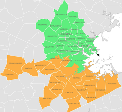
To recap: the Massachusetts Water Resources Authority (MWRA) has a wastewater treatment plant on Deer Island. It processes wastewater from metropolitan Boston in 2 zones, roughly north vs south, as shown here in the map. They’ve hired Biobot Analytics to analyze the viral RNA in copies/ml on a more or less daily basis.
We’ll take the approximate year’s worth of data, and compare it to corresponding data on COVID-19 hospitalization, ICU admission, ventilator useage, and death. It just makes sense that at some lag, the RNA levels observed today must be somewhat predictive of health care useage a bit later, no?
Data
![]()
- Medical load data: Our go-to source for COVID medical loads is of course the COVID
Tracking Project. [2] The data is overall excellent,
modulo 2 unfortunate facts:
- On 2020-06-30 and 2020-09-02, the number of deaths recorded is negative: supposedly, there were 41 and 4 resurrections from the dead on those days. As resurrection is not a recognized medical procedure, and if it were it would have been news, this is no doubt a bug in the data. Your Humble Weeekend Editor is a nasty, suspicious, grizzled old statistician who checks things like this.
- Also, this is state-wide data, whereas the MWRA data is for metro Boston. While the Boston area accounts for a lot of the Massachusetts population and the lion’s share of the state’s formidable medical capability, it is not all. County-level data would be better, but this is what I’ve got.
- The COVID Tracking Project shut down on March 7 of 2021. They started as a stopgap solution during the presidency of TheFormerGuy, when the Federal abilities were crippled by ignorance, incompetence, and outright lying. With the change of administration, the Federal capabilities started coming back on line. I could have built a Frankenstein dataset out of their data and the next couple months of Federal data, but Frankensteins always have trouble at the seams. So I’m limited here to data up to March 7th.
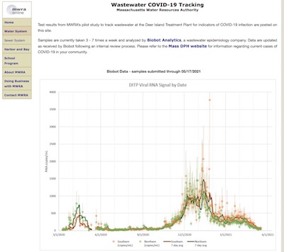
- Wastewater SARS-CoV-2 RNA data: The wastewater RNA data comes from the MWRA web
site. [3]
- This could have been provided in better form: it was a PDF, which mangled things up if you copied & pasted into a text file. (Honestly, it felt slightly like “malicious compliance”: they have to disclose the data, but do so in the least useful way possible and put roadblocks in the way of anybody who wants to do an independent analysis. Probably not, though: just silly PDF formatting.) In the end, I was able to use Google Sheets to decipher the mangled text, and spot checks showed I eventually got the data.
- There are a couple of very peculiar outliers, e.g., a value on 2021-01-25 that is easily 10x the other points. In the end, I left it in, though it’ll stick out in the plots below.
Exploratory analysis, or: What’s in all that data, anyway?
The first order of business was to write an R script to load those datasets, clean them up a bit, do an inner join on the date to get them into a single joint dataset, and analyze it. [4] The joint dataset is also available [5] for anybody who wants to peer review the results, or springboard off in a new direction without having to redo the data marshalling.
NB: Because of the COVID Tracking Project’s shutdown on 2021-Mar-07, the data cuts off as of that date. We’re blind to events in March - May of 2021.
Next, we investigated whether the RNA signal from the north & south districts was
sufficiently similar that they could be combined, or if they were giving different signals.
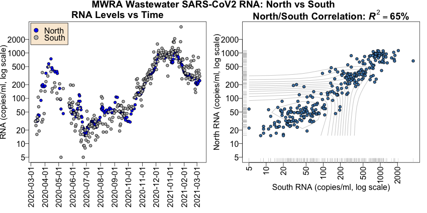
On the left is the time course of the RNA levels for the north (blue) and south (gray) districts.
- Each point represents 1 day’s reading. There are some missing days. Unlike our previous attempt, we did not take 7 day rolling means, but stuck with single day data.
- The RNA is on a log scale, so we can see clearly what’s happening at the low levels. Once that’s accounted for, this more or less reproduces the data on the MWRA web site.
- Note that the previous analysis failed to see a relationship between “2nd wave” data in Oct/Nov and hospital loads. Here we see clearly that that was not a 2nd wave! It was just general background. The real second wave started in December.
- The first and second waves are nicely correlated between the MWRA districts.
On the right is a scatterplot of the north vs south data.
- Each point represents a day when both districts reported.
- Both axes are on a log scale, to reveal behavior at low signal somewhat better.
- A Pearson correlation of $R^2 = 65\%$ is about as good as this sort of thing ever gets.
Conclusion: We should feel free to combine the data by averaging between the 2 districts. (When only 1 district reports, we could use the other, but in practice we just marked that day NA.)
Next, we investigated whether there was any serious relationship between the SARS-CoV2 RNA levels observed by the MWRA and the medical useage reported by the COVID Tracking Project.
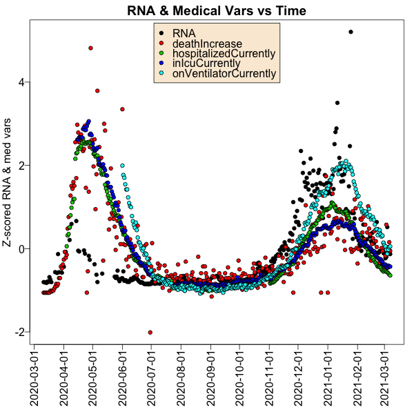
This is what the time course of RNA levels and 4 interesting medical load measures looks
like:
- Each point is a single day.
- The color tells what type of variable we’re talking about; black is for RNA and colors for the medical variables like hospital admission, ICU admission, use of ventilator, and death.
- It’s hard to put all those variables on the same vertical axis, since they have wildly
different units and starkly different ranges (1000s of copies of RNA/ml vs 100s of
deaths, for example, have a 10x difference).
- If there were only 2 variables, I’d put an alternative vertical axis on the right. But with 5 variables, we can’t pull that trick.
- So instead, I’ve $Z$ scaled all of them, so they all have mean 0 and standard deviation 1. This means the vertical number is hard to interpret (number of standard deviations away from the mean), but you can see whether the curves have the same shape.
- Note that in both waves, a peak in RNA (black points) is rapidly followed by a peak in all the other medical useage variables.
- But the 2 waves are different: in the first wave moderate RNA levels caused huge use of hospital services; in the second wave a much larger RNA level led to the same or smaller use of hospital services. We take this to mean that (a) it’s mostly a younger population in the 2nd wave who have less extreme disease, or (b) the knowledge of how to care for COVID-19 patients got better. Indeed, last November we observed reports of both of those. [6]
Conclusion: There is pretty good evidence that a peak in wastewater RNA levels seems to be related to a peak in hospitalization, ICU admission, ventliator useage, and death shortly thereafter. We did not see this last November because the 2nd wave had not seriously started yet.
For our final exploratory analysis, we look at the Pearson correlation among our 5 variables: wastewater viral RNA levels, hospital admission, ICU admission, ventilator use, and death.
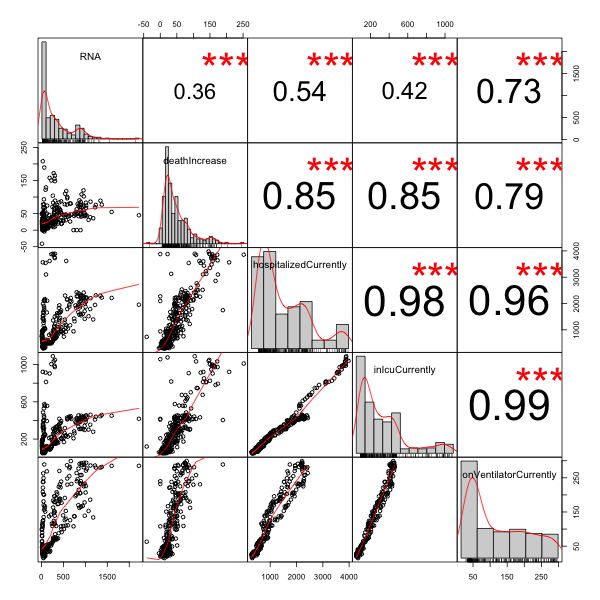
What’s in the plot:
- In the upper right triangle of the matrix are the Pearson correlations, each with 3 red stars indicating that they are statistically significant (i.e., there’s very little chance of the null hypothesis of 0 correlation).
- On the diagonal are histograms of the individual variables, giving you an idea of the distribution and presence of outliers for each variable.
- In the lower right triangle of the matrix are scatterplots of each pair of variables.
Now let’s interpret the plots a bit:
- Obviously, the highest correlations are among hospitalization, ICU admission, and ventilator useage (bottom 3). The Pearson correlation is 0.96 - 0.99, which is enormous. The scatterplots show almost perfect stratight lines. This makes some sense, since hospitalization can lead to ICU admission which can lead to ventilator use.
- Next, the death rates are slightly less correlated with the other medical variables, at a Pearson correlation of 0.79 - 0.85. Fair enough: even in hospital, COVID-19 doesn’t always lead to death.
- Finally, the thing we most want to examine is the first row and column: the relationship of RNA with the other variables. Still, a correlation of 0.5 - 0.7 is pretty good; only the death rate with correlation of 0.36 is somewhat doubtful.
- We note with deep suspicion the points in the death rate that are negative…
- Looking at the scatterplots in the first column of death vs RNA, we see why this is so: there is high correlation at low RNA levels, but then it flattens out as the RNA level becomes large. That is to say, the effect saturates. In sophisticated modeling, we’d fix this with a link function, e.g., log transforming something. Here we’ll just forge ahead with linear models, accepting that we will over-predict medical useage at high RNA levels.
Conclusion: There is enough predictive power in RNA to model medical useage. There is some saturation at high levels of RNA, that might be treatable with a transformation, e.g., log transform or power law; we don’t plan to explore that here.
Some naïve regression models at various lags
Ok, enough exploratory analysis: there’s signal here to be found! Let’s explore some (naïve) linear regressions, where we try to predict a medical variable (hospitalization, ICU, ventilator, or death) from the RNA level observed some days earlier. If the lag parameter, in days, is $l$, then we’re fitting models with regression coefficients $\beta_0$, $\beta_1$ like:
\[\mathrm{MedVar}_t = \beta_0 + \beta_1 \times \mathrm{RNA}_{t - l}\]We’ll figure out the value of $l$ for each medical variable by brute force: try the model
for 0 - 21 days, and pick the value which maximizes the regression’s overall $F$-statistic
$p$-value and the adjusted $R^2$. (It turns out in this case either of those will pick
the same lag $l$.)
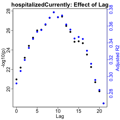
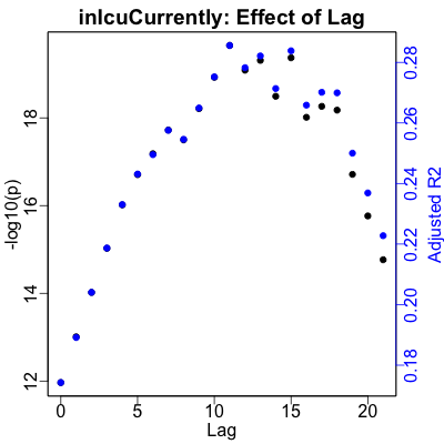
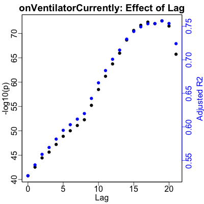
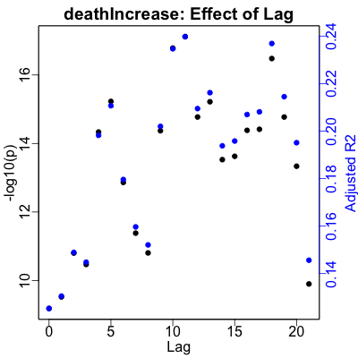 Here are the plots showing the result of those calculations:
- The left vertical axis, in black for the black points, shows $-\log_{10} p$. That is, the better (smaller) $p$-values increase vertically and the regressions become more statistically significant.
- The right vertical axis, in blue for the blue points, shows the adjusted $R^2$, or how much of the variance of the medical variable is explained by the RNA. Higher is better, where the effect size of the regression increases.
- The horizontal axis is the lag in days, from 0 to 21 days. Obviously, we’re looking to set the lag for each medical variable to be at a peak in the lag, for (ideally, and in this case, practically) both $p$ and $R^2$.
Hospitalization shows a clear peak at 9 days lag. ICU useage peaks a bit later at 11 days. Ventilator useage peaks a bit later still at 19 days. Death is a bit more puzzling, as we’d expect from the lower correlation with RNA noted above. It’s obviously better predicted after about 10 days, but there’s no clear, obvious lag to pick. The best one turns out to be 11 days, so we’ll just use that.
The regression summary table below shows that the regression $p$-values are ridiculously statistially significant in all cases. For strength of effect, ventilation is the best predicted at 75% of the variance, followed by hospitalization, ICU admission, and finally death.
Except for the death variable, these make sense: hospitalization precedes ICU admission, and ICU admission precedes ventilation.
Having established the optimal lags, and riding right past the potential issue of multiple hypothesis test correction we’ve ignored here, let’s do some regression models to see if wastewater RNA really has at least some predictive power of medical use some number of days later.
The following table summarizes the regression results: the intercept & slope coefficients, their 95% confidence intervals, the overall regression $p$-value to assess significance, and the adjusted $R^2$ to assess the strength of prediction. The regressions are all pretty good, except maybe for death where the slope coefficient was smallest and the adjusted $R^2$ was least inspiring.

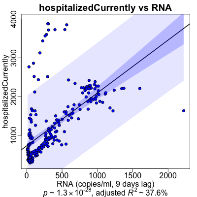
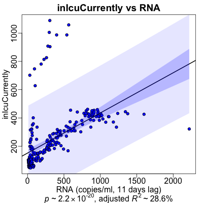
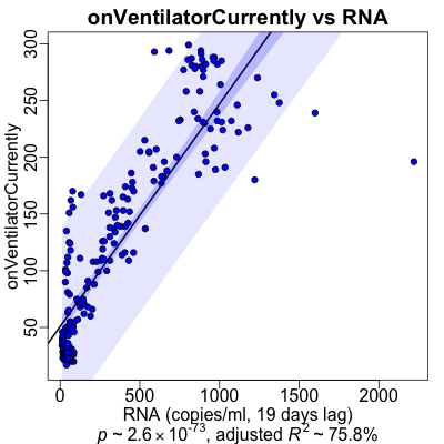
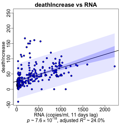 Here’s what the regessions looked like graphically.
- The RNA (at the appropriate lag) is on the horizontal axis, and the medical varaible is on the vertical axis.
- The black line is the regression line.
- The dark purple area is the confidence interval of the mean at that position, i.e., how uncertain we are about the mean value that is the regression line itself.
- The ligher purple area is the prediction interval: what’s the confidence interval if we were to use the regression line to predict just one more value at that RNA level. Note that this is significantly wider than the confidence interval; making predictions from this sort of model would be shaky!
- Hospitalization: Note the 2 clouds of points: one very steep representing the 1st wave of high hospitalization for moderate RNA, and the bigger cloud of 2nd wave points where the RNA was higher, but less hospitalization. The waves were different! This means it would be hard to use a model trained on one wave to predict another, because the medical practice is still changing.
- ICU admission: Pretty similar to hospitlization, we see 2 clouds of points for each of the 2 waves of COVID-19 infections in Massachusetts. But the model seems to track the 2nd wave pretty well. (Not because it’s smart; just because there are more data points in the 2nd wave.)
- Ventilator useage: Here the 2 waves are not especially distinct; I don’t know why. I do note that I’m increasingly irritated at the single obvious outlier of high RNA at the extreme right; it’s twitched each of our models and should probably be removed.
- Death: Surprisingly, the plot looks pretty good in spite of the high level of variance in death rates. I’m guessing that since death is literally the last end stage medical event, it can happen from numerous causes. Not everything has to progress through hospitalization (some people die at home), or through ICU admission (some people die of thromboses before the ICU), or not everybody went on a ventilator before dying.
So it looks like there’s predictive information, but it’s difficult to use because of (a) data artifacts like RNA outliers or negative death rates, (b) only 2 waves to work with, and (c) the pragmatics medical treatment for COVID-19 were changing rapidly, as was the population getting infected (old vs young) in the 2 waves.
Limitations, or what we’d like to have done better
Let’s be honest about how limited this study is, and list some of the problems here:
- Data only through March 7: The COVID Tracking Project has shut down, so there’s no data after March 7. We could have made a Frankenstein dataset by combining it with the continuing Federal data, but didn’t.
- Boston metro RNA vs state-wide medical data: The MWRA’s RNA data is local to Boston, but it appears the medical use data is state-wide. Now, the Boston metro area does account for a lot of the population and a very large fraction of the state’s formidable medical capabilty… but not all of it. County-level medical data would have meant we could match geographically a bit better.
- Data anomalies: There are a couple of high-RNA outliers in the data, that probably bent the regression models around a bit. There 2 days of negative death rats in the medical data, which is… peculiar.
- Confidence limits: The RNA data comes with columns that look like confidence limits, but they don’t actually bracket the value reported. So we don’t know how to use the uncertainty data, but would like to know.
- Test positivity rates: It would have been nice to consider test positivity rates as another predictor variable. However, the testing policy changed so radically (from basically unavailable to ubiquitous) over the period studied, I wouldn’t know how to handle it.
- Transformations: We should have considered some nonlinear transformations, e.g., log transforms or power transforms to account for the evident nonlinearity of the relationship of medical variables to RNA (especially at high RNA levels).
- Regression lines through the origin: We should have considered forcing the intercept to be 0 in the regression models, on the very good intuition that if there’s no virus, there are no virus-induced deaths. That would have meant more power for fitting the slope coefficient.
- Time series models: The right way to do this would have been with an ARIMA time series model instead of naive regression optimizing on a lag.
- Multiple hypothesis test correction: We made no attempt at this, as would be required for serious modeling. E.g., we tested 21 lags, but then behaved as though we’d chosen the lag in advance. That would have to be fixed in a thorough study.
- Different character of the waves: There were 2 waves of infection evident in the data, but wave 1 had much higher hospitalization, ventilation, and death rates for smaller RNA levels. Since the health care practices changed, we can’t really compare regression models between the waves. We saw this in the scatterplots above.
- Binary classifier: Since the waves had different quantitative character, we should consider a binary classifier: given a level of RNA, are we in a wave or not?
- Crossvalidation: None of this has been crossvalidated! With only 2 waves to look at, that might be pretty difficult for regression. A classifier might be doable, though.
The Weekend Conclusion
We tried to use SARS-CoV2 RNA in wastewater to predict medical useag some number of days later. We somewhat succeeded, in that we have statistically significant (though naïve) regression models. We somewhat failed, in that the adjusted $R^2$’s are not very large and the practice of medicine and the population being treated changed between the 2 waves.
So the science on metagenomics of viral RNA in wastewater wins. The pragmatic use as a prognostic biomarker is, alas, somewhat marginal with extremely simple models like these; perhaps more sophisticated models will work?
Notes & References
1: F Kreier, “The myriad ways sewage surveillance is helping fight COVID around the world”, Nature, 2021-May-10.↩
2: COVID Tracking Project, Massachusetts medical use data, retrieved 2021-May-14. NB: The COVID Tracking Project stopped recording data on 2021-March-07, when the Federal government became functional again under the Biden administration.↩
3: Massachusetts Water Resources Authority, Biobot wastewater RNA data, retrieved 2021-May-12. ↩
4: Weekend Editor, Second wastewater/COVID analysis script in R, Some Weekend Reading, 2021-May-21. There is also a transcript of running the analysis. ↩
5: Weekend Editor, Joint RNA & COVID medical load dataset, Some Weekend Reading, 2021-May-21. ↩
6: F Freyer, “People sick with COVID-19 face better odds of survival”, Boston Globe, 2020-Nov-08. ↩
Gestae Commentaria
Comments for this post are closed pending repair of the comment system, but the Email/Twitter/Mastodon icons at page-top always work.