Boston Wastewater Re-Re-Visited: Sewage Viral RNA vs COVID-19 Cases and Deaths
Tagged:COVID
/
MathInTheNews
/
R
/
Statistics
In 2020-November and 2021-May, we looked at the SARS-CoV2 mRNA in Boston wastewater. It’s relation to medical loads was erratic. How’s it look with another 9 months of data?
The question
As always, we want a biomarker that will predict short-term rises in COVID-19 cases, hospitalizations, ICU admissions, and deaths. It would be nice if it were causally related to the disease in some straightforward way (though there are perfectly good biomarkers for which we know no such causal relation).
The Massachusetts Water Resources Authority (MWRA), at its Deer Island Treatment Plant (DITP), runs a huge sewage treatment operation for the metro Boston area. They’ve been sequencing the amount of SARS-CoV2 viral mRNA in sewage, in conjunction with Biobot Analytics, for almost 2 years now, through 3 major waves of COVID-19 in the Boston area. Frankly, it’s the biggest and coolest example of metagenomics I’ve ever seen.

 We’d like to use the sewage mRNA levels to predict medical consequences, some number of
days later. We’re not alone in this; way back in early 2021 there was a paper in
Nature [1] documenting over 200 COVID sewage metagenomics
projects all over the world, both for COVID-19 and for illegal drug surveillance. Given
hysterical defiance of public health measures, Gertjan Medema, a Dutch microbiologist
said:
Not everyone is getting tested, but everyone is going to the bathroom. It’s nice to have an objective tool that isn’t dependent on willingness to get tested.
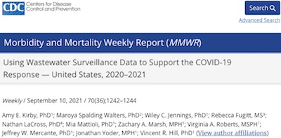
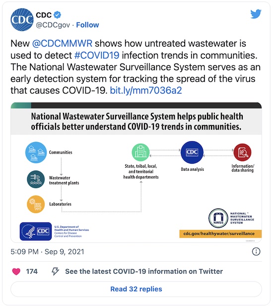
Since then, the CDC’s Mortality and Morbidity Weekly Report (sort of an in-house CDC journal) has highlighted how useful wastewater metagenomics is [2]:
 The last two times we tried this (2020-November and 2021-May),
we got equivocal results: a reasonable fit on one wave, but no fit whatsoever on the next
wave. We had some theories at the time about why that might be [3]:
- The virus is evolving underneath us, forming new variants.
- The population is evolving, in its own way, because the smart ones are getting vaccinated.
- The medical standard of care is evolving, not just with new drugs but also with new practices (like prone intubation) that push down the death rate.
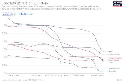 Katelyn Jetelina, writing a few days ago at
Your Local Epidemiologist,
shows this with mortality curves from Our World in Data. [4]
You can clearly see here (click to embiggen) that the
case fatality rate is declining all
over the world, in response to viral changes, increasing (though maddeningly slow)
vaccination, and improvements in medical standard of care for COVID-19 patients. We
shouldn’t expect the waves to be very similar.
So basically, the waves aren’t really measuring the same thing: different viruses, differently vaccinated populations, and different standard of care treatments.
Now that we’re on the downside of our 3rd wave (Omicron) here in New England, can we do any better with more data to see this sui generis wave effect?
Data sources: wastewater metagenomics
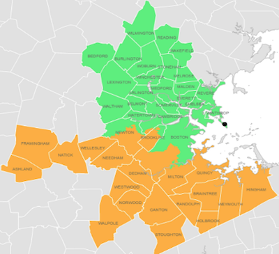
![]() The first source, of course, is the MWRA’s report of the Biobot sequencing
data. [5] However, they stubbornly report their data only as
either a plot (click to embiggen) or a table in a PDF. The table is obviously extracted
from a spreadsheet, but they do not provide the spreadsheet; it’s almost as thought they
want to be in technical compliance with a requirement to disclose the data, without
actually disclosing it in a usefully machine-readable way.
The first source, of course, is the MWRA’s report of the Biobot sequencing
data. [5] However, they stubbornly report their data only as
either a plot (click to embiggen) or a table in a PDF. The table is obviously extracted
from a spreadsheet, but they do not provide the spreadsheet; it’s almost as thought they
want to be in technical compliance with a requirement to disclose the data, without
actually disclosing it in a usefully machine-readable way.
So… it gave us fits the last couple times, trying to get the data out of the PDF and into a spreadsheet for later analysis. This time we explored some other alternatives:
- Biobot.io suggested looking in a Github repository they maintain. It looks like there are files there which might contain what we want, but they don’t include data for Norfolk county in Massachusetts, and have very different numbers than what’s on the MWRA web site. This may be due to the data being “normalized”, though as is often the case, with no equations to tell us precisely the meaning of “normalized”, the data simply cannot be matched. So I just don’t understand those data.
- Eventually, we stumbled upon
some advice from ProductivitySpot,
detailing a way to use Google Drive tools as a conversion pipeline:
- Download the MWRA PDF file to our local machine, then upload to Google Drive.
- In Google Drive, open the PDF file with Google Docs (not a PDF viewer).
- Select the table (not the whole document, which has header lines &c). E.g., click on topmost, leftmost cell then command-click (control-click) on the bottommost, rightmost cell at the bottom of the file. Then copy.
- Open a new Google Sheets spreadsheet, select A1, and paste.
- Download the spreadsheet as a tab-separated data file, spot-check against the .pdf, then gzip compress it. At that point, we have a compressed tab-separated data file suitable for automated analysis. The data matched what was in the PDF in the 20-30 places we checked.
All that, apparently because somebody didn’t want to publish a spreadsheet, just a PDF picture of it instead… sheesh. But we got the MWRA data in the end, and semi-automatically (i.e., you have to do a few hand steps, but not too many).
Data sources: county-level COVID-19 case rates and death rates
One problem with our previous analysis was that we used state-wide data on COVID-19 medical loads (cases, hospitalizations, ICU admissions, and deaths) while the MWRA data is particular only to the Boston area (approximately Suffolk, Middlesex, and Norfolk counties). We’d like to improve upon that this time, by using county-specific data on COVID-19 medical loads.
Another problem with the previous analysis is that it use data from the COVID-19 Tracking Project. Not that there’s anything bad with them; quite the contrary! They were a citizen scientist reponse to the Republican incompetence and lying at the federal level, to provide truthful and timely medical information. So, well done, them. But with the advent of the Biden administration and the return of some degree of rationality, they shut down.
I haven’t explored the new US federal datasets that allegedly replace them. In any case, because the Trump administration corrupted preetty much everything, none of the federal data from those days is worth the bits it’s written on. So rather than build a Frankenstein of old COVID-19 Tracking Project and new federal data, we looked further afield:
- The covdata package at GitHub incorporates several data sources in a rather nice way. Alas, like the COVID-19 Tracking Project, it appears to be now out of date.
- The folks at Biobot.io helpfully suggest USAFacts.org, but I can’t remember just now why I didn’t care for it much.
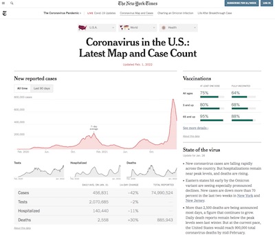 In the end, I settled upon a tracking dataset from the
New York Times [6], because it
includes the data I want and has been collected consistently over the pandemic years.
This is the data behind the interactive visualization maintained by the Times (click to
embiggen).
The upside is that we can get daily data for precisely the counties served by the MWRA. The downside is that the only medical variables recorded are cases and deaths, not hospitalizations, ICU admissions, and ventilator usage. Ok, we’ll take what we can get and run with it.
Our Analysis
The only 2 medical variables we can predict with the NYT dataset are the number of cases and the number of deaths each day. Ultimately, the right way to deal with time series data such as these is with something like an ARMA(p, q) time series model. However, before proceeding that far, we want to do some far, far more elementary analyses to see if there’s predictive power in these data at all:
- Do the North and South district mRNA levels correlate enough that we should average over them? (Answer: Yes.)
- Does the time series of the average mRNA data resemble the plot on the MWRA web site, i.e., have we captured the right data? (Answer: Yes.)
- Do the mRNA levels show correlation with cases or deaths? Is that Pearson or Spearman correlation? Is the correlation statisticallly signficant? (Answer: Yes, Pearson, and sort of.)
- If we try a very simple-minded univariate regression model on the mRNA, what lag (in days) is best between the mRNA observation and the subsequent case diagnosis or death, and is the lag for deaths sensibly longer than for cases? (Answer: 7 days for cases, 18 days for deaths, and yes.)
- Is the best regression at that lag staistically significant, and does it show adequate strength of effect in terms of $R^2$ for the model prediction? (Answer: Yes for significance, sometimes no for strength of effect.)
- Does the regression model work on all waves together, or on some waves but not others? Is there any inter-wave predictability, or is each wave sui generis? (Answer: No, for all waves together, yes for individual waves.)
Only if we get some positive results from most of those questions would we proceed to more complicated time series models. Our trial model will be a univariate regression to predict medical variables (cases, deaths each day) from mRNA levels observed in sewage:
\[\mathrm{MedVar}_t = \beta_0 + \beta_1 \times \mathrm{RNA}_{t - l}\]This uses 2 regression coefficients ($\beta_1$ , $\beta_0$) at a lag of $l$ days to predidct outcomes. We have to determine the optimal $l$ for cases and for deaths, then fit the model and see if at least the slope coefficient $\beta_1$ is statistically significant and if the overall regression has an $R^2$ large enough to tell us it’s predicting a reasonable percent of the variance in cases or deaths.
We’ll have to do all those studies for the whole dataset, as well as for individual wave subsets.
We’ve updated our little R script to do this task [7]:
- It loads the MWRA mRNA data and the NYT covid case and death rate data, filters the latter to extract data for Middlesex, Norfolk, and Suffolk counties in Massachusetts, first-differences cumulative case and death rates to get daily data, then does an inner join on the dates to merge the two into a joint dataset.
- It then performs the analyses below: correlation of North vs South district sewage RNA, computation of a prediction dataset, in which the 3 counties get their case and death rates summed for prediction from RNA, some exploratory correlation analyses between RNA and medical variables, and finally a regression to test prediction.
The joint dataset and an example predictor set for all waves are archived here for peer review. [8]
Sewage mRNA Validation: North/South Correlation
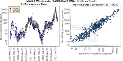 First, let’s confirm again that the North and South MWRA districts generate comparable
signals, and that those signals resemble what we saw above on the MWRA web page. Here we
make some plots (click to embiggen) and calculate North/South correlations to
investigate.
On the left is the time course of the RNA levels for the north (blue) and south (gray) districts.
- Each point represents 1 day’s reading. There are some missing days. Unlike our previous attempt, we did not take 7 day rolling means, but stuck with single day data.
- The RNA is on a log scale, so we can see clearly what’s happening at the low levels. Once that’s accounted for, this more or less reproduces the data on the MWRA web site.
- The 3 broad waves are apparent, though on a different scale due to log transforming the
vertical axis for better visibility.
- Wave 1 is about 2020-Mar-01 through 2020-Jul-01.
- Wave 2 is about 2020-Oct-01 through 2021-Jun-01.
- Wave 3 is about 2021-Nov-01 through 2022-Feb-01; this is Omicron.
- There is a “hump” from 2021-Jul-01 through 2021-Nov-01; this is Delta. The Omicron wave took over before this could subside. So we’ll call that Wave 2.5.
- All waves look reasonably correlated between the North and South districts; next we’ll investigate whether a quantitative statistic confirms objectively what we see subjectively.
On the right is a scatterplot of the north vs south data.
- Each point represents a day when both districts reported (occasionally there’s missing data in one district or the other).
- Both axes are on a log scale, to reveal behavior at low signal somewhat better.
- A Pearson correlation of $R^2 = 92\%$ is astonishingly good!
Conclusion: We should feel free to combine the data by averaging between the 2 districts. When only 1 district reports on a given day, we just use the one that did report. If both districts don’t report, we report NA.
mRNA Correlation with Cases and Deaths
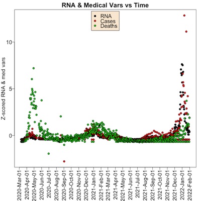 Next, let’s look at the time courses of RNA, cases, and deaths to see if there’s any
relationship. Plotted here (click to embiggen) is that time course.
- Each point is a single day.
- The color tells what type of variable we’re talking about; black is for RNA, red is for cases, and black is for deaths.
- It’s hard to put 3 or more variables on the same vertical axis, since they have wildly
different units and starkly different ranges (1000s of copies of RNA/ml vs 100s of
deaths, for example, have a 10x difference).
- If there were only 2 variables, I’d put an alternative vertical axis on the right. But with 3 variables, we can’t pull that trick.
- So instead, I’ve $Z$ scaled all of them, so they all have mean 0 and standard deviation 1. This means the vertical number is trickier to interpret (number of standard deviations away from the mean), but you can see whether the curves have the same shape.
- Note that in all waves, a peak in the black RNA points leads to peaks in red cases and green deaths, but by different amounts in each wave. In the first wave, there were a lot of deaths, but in the 3rd Omicron wave there were fewer. The waves are different.
Conclusion: There is pretty good evidence that a peak in wastewater RNA levels seems to be related to a peak in case rates and death rates shortly thereafter. But the quantitative relationship is unclear, as the waves were on different virus strains, with differently vaccinated populations, and with different medical standard of care treatments.
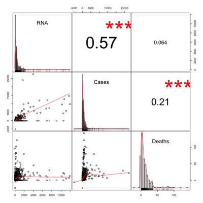 For our final exploratory analysis, we look at the
Pearson correlation among
our 3 variables: wastewater viral RNA levels, case counts, and death counts. The plot
(click to embiggen) shows:
- In the upper right triangle of the matrix are the Pearson correlations, with 3 red stars indicating that the highly statistically significant pairs (i.e., with very little chance under the null hypothesis of no relationship to see a crrelation this high).
- On the diagonal are histograms of the individual variables, giving you an idea of the distribution and presence of outliers for each variable.
- In the lower right triangle of the matrix are scatterplots of each pair of variables.
Now let’s interpret:
- RNA is highly correlated with cases at $R \sim 0.57$, but not so much with death at $R \sim 0.064$. This makes sense: viral RNA is still an indicator of infection which causes cases. But given the changes in virus variant, population vaccination, and medical technique, the death rates across the waves changed and the correlation is lower. We’d expect to see higher RNA/death correlation within a single wave, q.v.
- Death rates are significantly, though more weakly, correlated with case rates at $R \sim 0.21$. This also makes sense: you only get reported as a COVID-19 death if you have COVID-19! But, again since medicine, viral variants and vaccination change, the chances of dying have been going down and that explains the lower correlation of cases with death.
- Also, looking at the lower left corner, we see that death correlates with RNA at low values, but flattens out at high values. Perhaps a log transform, or more generally a Box-Cox transform, would make the relationship clearer here?
- Also we note with deep suspicion and some humor that there are examples where the case rate and even the death rate are reported negative. We’re reasonably certain that the resurrection of the dead would have been a major news item, so this is likely a data artifact. (That’s how you know you’re dealing with real data!)
Conclusion: There’s enough of a relationship here to try simple regression models, though it appears the distinctiveness of the waves will defeat a global model in favor of per-wave models. Life is a moving target!
Overall Analysis: Lag Times and Regressions
It’s a bit naïve, but we’ll just regress cases or deaths on RNA for various numbers of days of lag, i.e., various (positive) values of $l$ in:
\[\mathrm{MedVar}_t = \beta_0 + \beta_1 \times \mathrm{RNA}_{t - l}\]We’ll plot statistical significance (as $-\log_{10} p$) and strength of effect (as $R^2$), and see if they agree on a peak. If so, then that’s our optimal lag: wait that many days after an RNA observation to predict case counts or death counts.
A good scientist should always state the expected result beforehand, so here we expect that (a) the lag will be positive on the order of a week for cases to get diagnosed, and (b) death should have a lag longer than that, maybe 2 weeks.
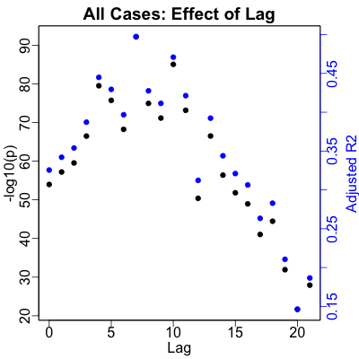
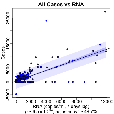 Here’s the result for cases, as predicted by RNA. We see that the optimal lag, as shown by
both significance and strength of prediction (the blue & black dots are on top of each
other) is in the peak at 7 days. That’s spot on the 1 week delay we predicted.
The regression reports a stupendous statistical significance of $p \sim 10^{-93}$. There’s also a very nice strength of effect: overall $R^2 \sim 50\%$, i.e., we’re predicting about half of what’s going on with the variance in cases, just by looking at sewage RNA levels.
By the numbers, this is a very good result! However, when you look at the plot, you see that there’s enormous scattering, and that most of the data points are around small values so the slope is dominated by what might be outliers. That’s a warning that although there is a significant and strong relationship, its use as a predictive biomarker might be limited.
Comme d’habitude, as people in the business say.
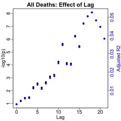
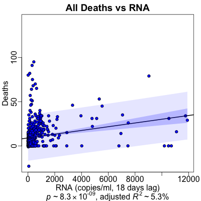 Here’s the corresponding result for death rates. The optimal lag, again by both
statistical significance and strength of effect, is at the peak at 18 days. That’s a
touch longer than the 2 weeks we predicted, but not by much! And anyway, we’re all for
people surviving longer than we guessed.
However, we see that the peak occured at a very strong statistical significance ($p \sim 10^{-9}$), but at a miserably useless strength of prediction ($R^2 \sim 5\%$). The regression plot confirms this: yes, there’s a pseudopod of points going out to the right and slightly up, driving the RNA/death relationship, but the mass of points cluster around the origin and go nowhere in particular.
(Of course we can’t help but note with some amusement the large number of resurrections from the dead, in that one datapoint with a negative death count. However did we miss the news?!)
This is what we expect, based on changes in virus, vaccination, and medical care. The waves are different when it comes to death rates, and combining them like this does not work.
So we’ve got a pretty solid relationship between sewage RNA levels and cases 7 days later, though the noise is high enough that it might not be useful for anything more than a general warning. The prediction of deaths from sewage RNA remains statistially significant but filled with enough noise to be rendered generally useless.
Per-Wave Analyses: Lag Times and Regressions
Next, let’s take apart the 3 (or maybe 4, depending on how we count Delta/Omicron on top of each other) waves in RNA and see how they’re different.
We divide the data up into wave subsets, by visual inspection of either the MWRA’s plot or the log RNA plot we made above:
- Wave1: 2020-03-01 to 2020-07-01.
- Wave2: 2020-10-01 to 2021-06-01.
- Wave2.5: 2021-06-01 to 2021-11-01. This is the Delta wave. It doesn’t quite get to go all the way back down before Omicron stomps on top of it like a disease-ridden yeti.
- Wave3: 2021-11-01 to 2022-02-01. This is the Omicron wave, starting before Delta has fully receded.
If our hypothesis about changes in virus, vaccination, and standard of care is at all reasonable, then we’d expect to see:
- Continued predictability of case rates from RNA, maybe even improved a bit, and hopefully with similarly sized regression coefficients.
- Dramatically improved predictability of death rates from RNA, given that the viral variant, population vaccination rate, and medical standard of care are being held constant within a wave.
Let’s see if that happens.
Wave 1
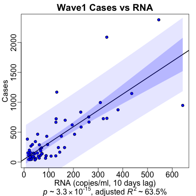
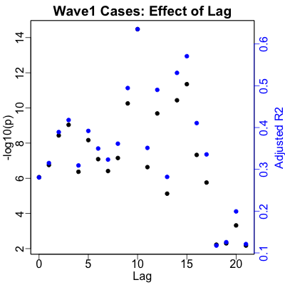 For case counts predicted by RNA, we get a slightly longer optimal lag time of 10 days,
i.e., wave 1 victims took a bit longer to get sick compared to the oveall dataset. While
the statistical significance ($p \sim 10^{-15}$) is slightly smaller (though still
stupendously significant!), the strength of prediction ($R^2 \sim 60\%$) is somewhat larger.
The plot also looks quite a bit better. There are more points away from the origin, so
we’re no longer relying on just a few outliers to drive the regression.
Some of this might be due to just having fewer data points than in the whole datset, but in general to my eye it appears the cases vs RNA regression looks very much more usefully predictive. In any case, the numbers are still way more than “good enough”.
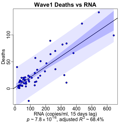
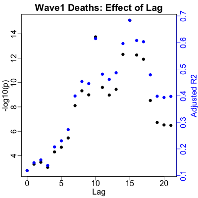 For deaths, the optimal lag decreases to 15 days, i.e., people in wave 1 died 3 days
quicker than average across the whole dataset. Wave 1 was brutal! The statistical
significance is still very good ($p \sim 10^{-16}$), but now the percent of variance
explained is dramatically higher ($R^2 \sim 70\%$ vs on $5\%$ in the overal dataset)!
We’re predicting 70% of the variance in the death rate from sewage RNA, and with a
reasonable-looking fit to boot.
Note that the vertical axis scale is comparable to the whole dataset. Most of the deaths occurred in the first wave, as befits improving medical treatment for later waves.
Conclusion: The case rate is comparably to slightly more predictable from RNA within wave 1. The death rate is dramatically more predictable. This makes sense, given our theory of changing viral variants, changing vaccination rates, and changing medical standard of care across waves affecting the death rate more than the case rate.
Wave 2
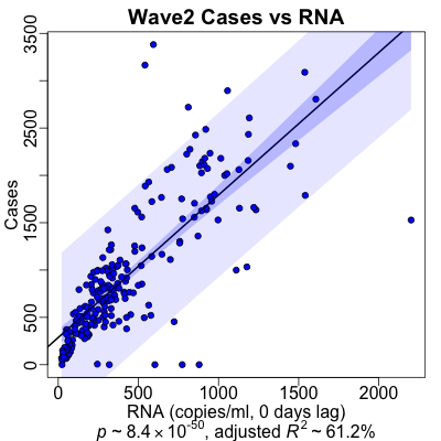
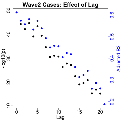 The wave 2 data is peculiarly different: the optimal lag is 0 days, and the data is
adamantly certain about this! People got sick faster in wave 2 than in any other wave
or across the dataset as a whole. The regression is insanely statistically significant
($p \sim 10^{-50}$), and the strength of effect remains robust ($R^2 \sim 60\%$).
Also, the plot looks quite good: we’re predicting more than half of what’s going on with case rates, which is very good indeed. (Though the 0 day delay between sewage RNA and case diagnosis is somewhat mysterious. It’s not a marginal effect, either: look at the strong negative slope of the $-\log_{10} p$/$R^2$ vs lag time plot…)
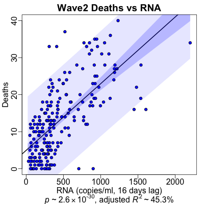
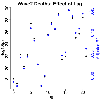 With deaths in wave 2, the lag is kind of all over the place. Strictly speaking, the
optimum is at 16 days, so we picked that in deference to the overall result of 18 days.
But really, looking at the plot, you could pick anything from 12 to 20 days and have a
defensible lag.
The death rate regression is also gratifying (except, of course, that it’s about death). We’ve got very high statistical significance ($p \sim 10^{-30}$) and high predictability ($R^2 \sim 45\%$). The plot looks pretty good too, so we’re predicting useful amounts of variance within this wave too, especially when compared to using the whole dataset.
Note also the change in vertical scale from the overall regression and the wave 1 regression: instead of hundreds of deaths a day, we have “only” 10s of deaths a day. This is what improvement in medical care and improvement in vaccination look like!
Conclusion: Just like the wave 1 analysis, the cases are still pretty predictable, and the death rate is much more predictable within this wave, compared to the whole dataset.
Wave 2.5 (Delta)
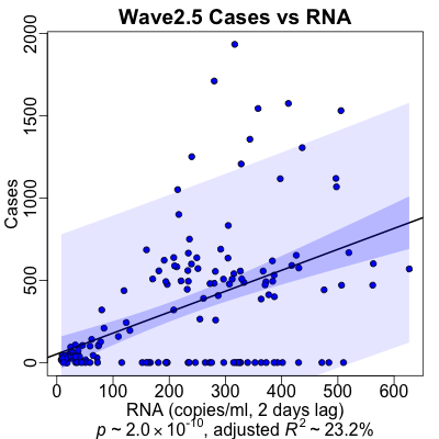
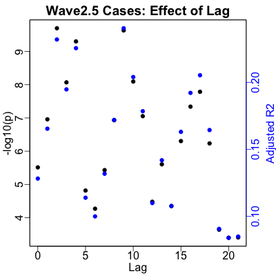 Here we have the Delta wave, or lat least the first 2/3 of it. We don’t get to observe
the full decline of the Delta wave, because the Omicron wave came along and yeti-stomped
it before we could observe its decrease. C’est la mort.
The optimal lag is a mere 2 days, like the very short lag in wave 1. However, the lag plot is more or less all over the place, and you could defend other choices without serious objection from me.
The case rate regression is statistically very significant ($p \sim 10^{-10}$), but the strength of effect is less than half what we saw in waves 1 and 2 ($R^2 \sim 23\%$).
Why is that?
Well, look at the plot: there’s a big chunk of cases along the horizontal axis, i.e., days of high RNA values in the Deer Island Treatment Plant but with no COVID-19 deaths! This is kind of interesting: it might be due to people finally taking public health seriously (masking and social distancing) or increasing vaccination levels leading to some immunity.
Or it could be something else even weirder is happening; we just can’t tell.
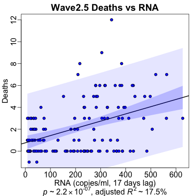
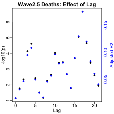 For the Delta wave, we return to a longer lag between RNA and death rates, at about 17
days. Unlike case rates, here the data’s preference seems relatively clear for 17 days.
The regression is by normal standards very significant ($p \sim 10^{-7}$), it’s less significant than the previous waves. Also, the strength of effect is slightly lower, but not by much ($R^2 \sim 20\%)$.
If you look at the vertical scale, you can see why: we’re down to well below 5 deaths per day! By any measure, this is heroic success, though nobody felt that way at the time. Medical care got better, and more people got vaccinated; this is what winning looks like.
Conclusion: One of the morals appears to be: though the SARS-CoV2 virus gets more infectious, we are faster about getting more vaccinated and smarter about treatment? That would be nice…
Wave 3 (Omicron)
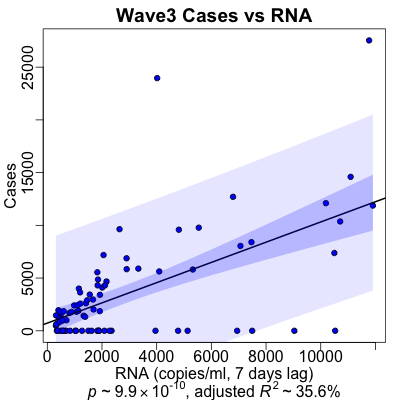
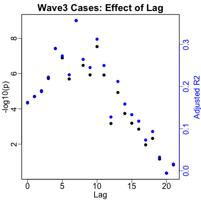 Finally, the dreaded Omicron wave!
We return to a lag time between RNA and case rates of 7 days, and the data is quite decisive about this preference. The regression for predicting cases is still quite significant ($p \sim 10^{-10}$), and the amount of predictability is still very respectable ($R^2 \sim 36\%$).
Not as dramatically good as waves 1 and 2, but then the disease is ramping down and here we’re really mixing the increase of Omicron with the decrease of Delta, so that’s a mixture for which we cannot control.
It’s very important to examine the vertical scale on the case regression here: note that the case rates went as high as 25,000 cases/day just in these 3 counties in Massachusetts! (Previous waves, in the case regression plots above, had a vertical scale that topped out around 2,000 to 3,000 cases/day.) While those were clearly outlier counts, there were clearly multiple days with 5,000 to 10,000 cases/day. Omicron is massively more infectious than previous waves, and we see that here.
It’s also important to look at the horizontal scale, the RNA copies/ml. For the first waves, the first tick was at 100-200 copies/ml. Here it’s at 2000 copies/ml: we have an order of magnitude more RNA in wastewater with Omicron, compared to previous waves. Omicron’s infectiousness is a massive effect.
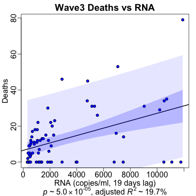
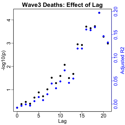 Here the lag between RNA and death counts is still pretty solid at 19 days. The
regression is the least statistically significant of all, though still very significant by
any reasonable standard ($p \sim 10^{-5}$). The strength of prediction is, if not
exactly high, still very much higher than if we look across the whold dataset
($R^2 \sim 20\%$ vs $5\%$).
The scale of the vertical axis shows a few more deaths than in wave 2.5. This is not because Omicron is more deadly; it is in fact not. However, it is so much more infectious that there are just way more cases, and hence more deaths.
Conclusion: We’re still getting infected a lot, but we’re not dying at nearly the same rate as at first.
Wave Summary
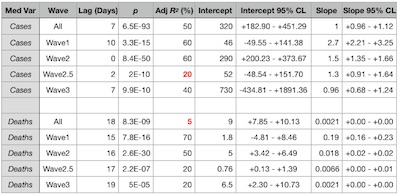 Ok, that’s a lot of data, and a lot of different analyses and sub-analyses. Let’s
summarize in a table of all the regression results (click to embiggen).
- Regressing across the whole dataset, including the relatively heterogenous waves:
- The predictability of cases was pretty decent, with 50% of the variance in hand with RNA. The plot showed lots of scatter, but there’s still something there.
- The predictability of deaths was miserable, at only 5% ofthe variance. This makes perfectly good sense: each wave had different viral variants, different fraction of the population vaccinated (increasing), and different medical standard of care (improving). So lumping them together, in retrospect, should have been not so good!
- Within each of the waves, repecting the individual character of the situations, we got
generally better results.
- Cases were pretty predictable, with lag times of 0 to 10 days. We predicted a week, so that’s not bad.
- Death rates all had a consistently longer lag time of 15 - 19 days, which makes sense. We predicted 2 weeks (14 days), but then we’re grumpy old pessimists here at Chez Weekend. It’s always good to hear we’re too pessimistic, even if it’s only hearing that people live about 1 - 5 days longer than we thought.
- Waves 1 and 2 were the most predictable (by $R^2$), in both case rates and death rates. This makes some sense, as they were well separated from other waves (unlike wave 2.5 and 3) and were not infectiousness outliers like wave 3.
- Looking at the rightmost column of the table, the 95% confidence limits on the regression slope are always bounded above 0, i.e., we always predict a positive association of sewage RNA and either cases or deaths.
- The magnitude of that association varies not too much for cases (0.96 - 2.7), so cases are kind of steadily predictable.
- However, the slope for death rates varies over 2 orders of magnitude (0.0021 - 0.19). This reflects the very different character of the waves and how outcomes differ when vaccination goes up and treatment gets better.
Limitations, or what we’d like to have done better
Let’s be honest about how limited this study is, and list some of the problems here:
- Medical data: Previously we used data from the COVID Tracking Project (shut down 2021-Mar-07), which included hospitalizations, ICU admissions, and other interesting medical variables. Here we had only case rates and death rates. It would be interesting to have a more nuanced dataset like that, but in the end we opted for the longer time series.
- Boston metro RNA vs county-level data: This time we attempted to use medical data geographically restricted to the MWRA’s service area. We were a bit confused there, as the MWRA delineates its service area by town, not county, as is appropriate for a built-up urban area. We should probably check carefully if Suffolk, Norfolk and Middlesex are the appropriate counties to use here.
- Data anomalies: There are a couple of high-RNA outliers in the data, that probably bent the regression models around a bit. There 2 days of negative death rates in the medical data, which is… peculiar.
- Confidence limits: The RNA data comes with columns that look like confidence limits, but they don’t actually bracket the value reported. So we don’t know how to use the uncertainty data, but would like to know.
- Test positivity rates: It would have been nice to consider test positivity rates as another predictor variable. However, the testing policy changed so radically (from basically unavailable to ubiquitous) over the period studied, I wouldn’t know how to handle it.
- Transformations: We should have considered some nonlinear transformations, e.g., log transforms or power transforms to account for the evident nonlinearity of the relationship of medical variables to RNA (especially at high RNA levels).
- Regression lines through the origin: We should have considered forcing the intercept to be 0 in the regression models, on the very good intuition that if there’s no virus, there are no virus-induced deaths. That would have meant more power for fitting the slope coefficient.
- Time series models: The right way to do this would have been with an ARIMA time series model instead of naive regression optimizing on a lag.
- Multiple hypothesis test correction: We made no attempt at this, as would be required for serious modeling. E.g., we tested 21 lags, but then behaved as though we’d chosen the lag in advance. That would have to be fixed in a thorough study.
- Binary classifier: Since the waves had different quantitative character, we should consider a binary classifier: given a level of RNA, are we in a wave or not?
- Crossvalidation: None of this has been crossvalidated! With only 3 (or 3-and-a-half?) waves to look at, that might be pretty difficult for regression. A classifier might be doable, though.
- Multivariate predictors: We’d like to use variant data (like $R_0$), population vaccination rates, and efficacy of standard of care as covariates with RNA. Then we could say something about the relative importance of those variables on case rates and death rates.
However, given the primary result that each wave is sui generis, the utility of wastewater RNA as a predictdive biomarker is at best complex and nuanced. It’s not the simple slam-dunk for which we were hoping.
But that’s how you know the data is real-world, and not a problem set assigned by your professor…
The Weekend Conclusion
Real life is messy: wastewater RNA definitely has predictive information in it, but the changing nature of the virus, the vaccination rates, and the efficacy of medical standard of care mean it’s not the only thing going on.
Fortunately, at least 2 of those things operate in our favor:
- As we get the last few vaccine-defiant knuckleheads vaccinated, the population as a whole has a better response. This is what “herd immunity” means.
- As time goes on, doctors and nurses learn how to take care of COVID-19 patients. Some of that is just better practice standards, but soon the antivirals like paxlovid and molnupiravir will really begin to bite, and any subsequent waves will be better.
Basically, we’re winning. Too slowly, and in the face of a subpopulation who are stupidly engaged in a death cult determined to bring all of us down… but winning.
And, hey: if you’re not yet vaccinated and boosted, go take care of that, ok? If you tell me about it, I’ll personally issue you a Weekend Certificate of Non-KnuckleHeadedness, or something.
You should live, and not die.
Addendum 2022-Feb-09: YLE weighs in on wastewater-based epidemiology
Today Katelyn Jetelina, writing at Your Local Epidemiologist, posted a nice survey of wastewater surveillance efforts across the US. [9]
Notes & References
1: F Kreier, “The myriad ways sewage surveillance is helping fight COVID around the world”, Nature, 2021-May-10.↩
2: A Kirby, et al., Using Wastewater Surveillance Data to Support the COVID-19 Response — United States, 2020–2021”, US Centers for Disease Control & Prevention Morbidity and Mortality Weekly Report, 2021-Sep-10. ↩
3: F Freyer, “People sick with COVID-19 face better odds of survival”, Boston Globe, 2020-Nov-08. ↩
4: K Jetelina, “State of Affairs: Jan 31”, Your Local Epidemiologist blog, 2022-Jan-31. ↩
5: Massachusetts Water Resources Authority, Biobot wastewater RNA data, retrieved 2022-Feb-01. Data is reported as a PDF export from an unavailable spreadsheet. We’ve archived the version of the PDF data here. We’ve also archived here the GZIP-compressed, tab-separated data file we extracted.↩
6: New York Times Staff, “GitHub Repository: covid-19-data”, GitHub maintained by the NYT, retrieved 2022-Feb-01. The file we snapshotted is us-counties.csv, which we’ve here GZIP compressed and archived. ↩
7: Weekend Editor, “Third wastewater/COVID analysis script in R”, Some Weekend Reading, 2022-Feb-04. There is also a transcript of running the analysis for peer review. ↩
8: Weekend Editor, “Joint dataset combining wastewater mRNA and county-level cases & deaths” and “Prediction dataset for wastewater mRNA and 3 counties sum of cases and deaths”, Some Weekend Reading, 2022-Feb-04. ↩
9: K Jetelina, “Wastewater: Taking surveillance to the next level”, Your Local Epidemiologist blog, 2022-Feb-09. ↩
Gestae Commentaria
Comments for this post are closed pending repair of the comment system, but the Email/Twitter/Mastodon icons at page-top always work.