Wastewater coronavirus RNA vs medical loads
Tagged:COVID
/
MathInTheNews
/
R
/
Statistics
Previously, we mentioned there were data showing the level of coronavirus RNA in metro Boston wastewater, and speculated that it might be predictive of medical loads like hospitalization and death rates. The truth turns out to be weirder than that (comme d’habitude).
Let’s… avoid further election anxiety, and pretend not so many of us vote for the Cruel & Stupid. Instead, let’s think about something also cruel & stupid, but excusably so, since it’s just a virus.

![]() We mentiond that the
Mass Water Resources Authority (MWRA), in combination with
Biobot Analytics, is applying
metagenomics
at the
wastewater treatment plant on Deer Island.
Basically, they’re measuring viral RNA (copies/ml) versus time in the wastewater, getting
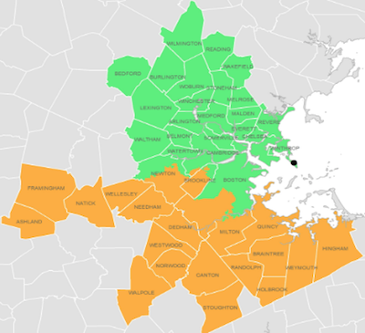
a near-perfectly unbiased sample of viral load in the entire toilet-using population of 43
communities around Boston. For complicated reasons, they divide the data into northern
& southern regions, but we can combine them if they’re correlated enough.
We mentiond that the
Mass Water Resources Authority (MWRA), in combination with
Biobot Analytics, is applying
metagenomics
at the
wastewater treatment plant on Deer Island.
Basically, they’re measuring viral RNA (copies/ml) versus time in the wastewater, getting
a near-perfectly unbiased sample of viral load in the entire toilet-using population of 43
communities around Boston. For complicated reasons, they divide the data into northern
& southern regions, but we can combine them if they’re correlated enough.
Research question
Does wastewater viral RNA level predict loads on the medical system like hospitalizations, possibly a couple weeks later?
- If yes, then we have a very nice community exposure measure to use for setting isolation policy and planning for surges in medical resource needs: a model like a time series ARMA(p, q) model, or even a simple regression model could be quite useful.
- If no, then… we really don’t know what the heck is going on!
Data
The data for Massachusetts medical loads from COVID and the MWRA wastewater RNA data are available for download (references 1 & 2). Of course, since it’s real-world data and not some classroom exercise, thre are issues:
- Medical use data (reference 1): The COVID Tracking Project provided a pretty straightforward spreadsheet, in csv format. There were 12 columns that were mysteriously empty, but perhaps they are for data only reported by other states. We parsed out the date, the incremental deaths, and the incremental hospitalizations, and computed 7-day rolling averages in R, using the rollmean() function from the zoo package. One apparent anomaly: the incremental hospitalization rate on 2020-09-02 is -91, i.e., an inexplicably negative value. This messes up the 7 day rolling average a bit, but everything else looks ok.
- Wastewater RNA data (reference 2): This… could have gone better. The data is theoretically available, but provided only in a PDF. Also, the PDF is constructed in such a way that a copy/paste takes some of the data in column order and others in row order, making a complete hash of everything. So I had to retype it by hand, pretty much. Either they just didn’t assemble the PDF competently, or it was malicious compliance with data disclosure (technically disclosed, but in a way to block any kind of peer review analysis). I hope it was the former. Also, there are plenty of missing days, so it’s an irregular time series.
Methods
The R script (reference 3) loads those data, cleans up some issues, and uses an inner join on the date fields to make a joint dataset (reference 4) giving the date and 7-day moving averages of wastewater RNA, hospital admissions/day, and deaths/day.
We first made some plots of the northern and southern district RNA measurements, vs time and each other. The goals were:
- to see if we could reproduce the time course plot from the MWRA web page and diagnose any errors, and
- to see if the 2 districts were sufficiently correlated that it might make sense to combine them by taking their mean, as an overall Boston metro RNA signal.

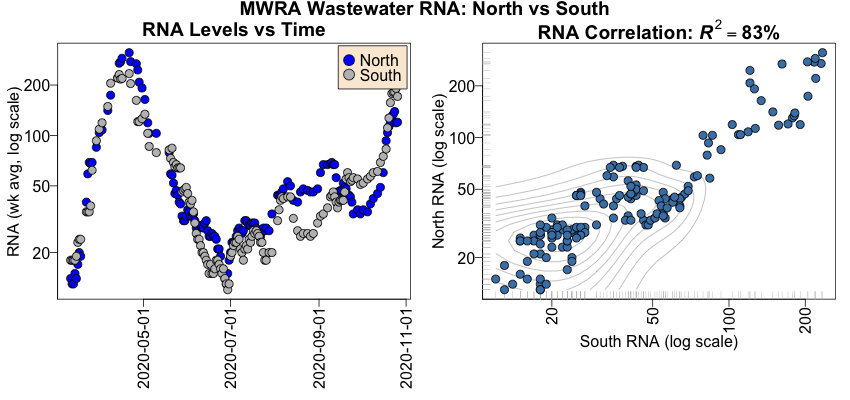
On the left is the time course plot, for the northern & southern districts.
- The RNA levels are 7 day trailing averages, so they correspond to the 7 day curves shown by the MWRA.
- We’ve put the RNA axis on a log scale, to see the details at low readings, but otherwise this is reasonable evidence that we’ve reproduced the MWRA’s data adequately well.
- Note in particular that in the first wave of infections, the blue and gray points are very tightly correlated, but that in the second wave (basically after July 1, entirely coincidentally the birth of this blog), they are more loosely coupled. This is very curious and we’ll return to it in a minute.
On the right, we’ve made a scatterplot of the northern versus southern RNA measurements. Each point is a single 7-day trailing average. If they were identical, we’d expect to see all the points on a diagonal. As it is, they’re pretty highly correlated: the squared Pearson correlation is $R^2 \sim 83\%$, i.e., knowing either explains 83% of the variance in the other. This is as highly correlated as real-world data usually get, so combining them by taking the mean of north & south measurements on a given day makes sense. (Though it might make sense to combine the original data, then take the 7 day rolling average. We did not explore that.)
Now we can start looking at the relationship between the mean RNA level and the hospitalization rate and death rate (rates per day, averaged over the trailing 7 days).

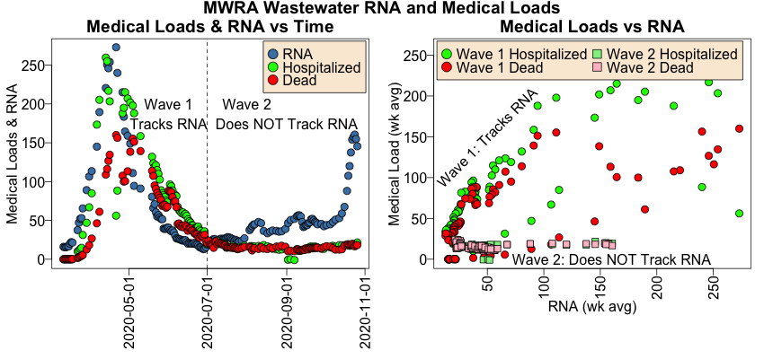
On the left is a time course showing the RNA level (steel blue), the hospitalization rate (green), and the death rate (red). I’ve divided it into first & second wave periods, splitting at July 1 where teh curves appear to return to baseline (and this blog was started; remember correlation is not causation!).
- Note that in Wave 1, the RNA goes up first, then a couple days later the infection rates go up, and a week or so later the death rate goes up. The same thing happens on the down side of Wave 1, where the RNA goes down first, followed by the others. This is approximately what we expected to see, and would have made a fine short-term predictor for medical loads coming in the next week or so.
- Would have. Because note in Wave 2, this relationship of medical loads to RNA is broken! The RNA rises beginning mid-October, just as fast as Wave 1 and (so far) about half as high. But… the hospitalization and death rates remain unmoved!
On the right, we scatterplot the medical load (hospitalization & death rates) vs the wastewater RNA. We do that separately, with Wave 1 using circular points and Wave 2 using square points.
- Note that the circular Wave 1 points very roughly confirm an increase the medical load when the RNA rises. It’s not linear, or much of anything, but the medical load gets bigger with a lot of noise.
- But look at the square Wave 2 points, all along the bottom: the RNA goes up and… nothing.
We can test this by looking at the correlations between RNA and medical loads. Looking at just the Wave 1 data, the Pearson correlation matrix is indicates $R \sim 0.77, 0.68$ which is pretty good predictive evidence for RNA:
             RNA.7 hospIncr.7 deadIncr.7
RNA.7         1.00       0.77       0.68
hospIncr.7      -        1.00       0.81
deadIncr.7      -          -        1.00
But if you look at the Wave 2 data, the situation is quite different, with Pearson $R \sim 0.10, 0.14$, i.e., miserably bad evidence of predictivity of RNA:
             RNA.7 hospIncr.7 deadIncr.7
RNA.7         1.00       0.10       0.14
hospIncr.7      -        1.00       0.71
deadIncr.7      -          -        1.00
Now, normally I’d go on from here to build some regression models with a time lag to predict medical load from RNA, or an ARMA(p, q) time series model. But when the data say both yes and no to predictive power, there’s no point in doing that until we understand why!
Conclusions
 So basically that’s it: the data say both “yes” and “no” as to whether wastewater RNA
predicts medical loads. It certainly looked like the first wave was saying the RNA was a
leading indicator of medical load in the immediate future, but the second wave said “nah”.
So we cannot say anything meaningful, beyond “well, that’s weird”.
Why might this be?
- Treatments: We’re entering the territory of speculation here, but among other things, we’ve learned a lot about COVID-19 in the last 7 months. We know not to do some things (hydroxychloroquine), and we know to do some others (dexamethasone to calm the cytokine storm, put patients in prone position — on their stomachs — when on a ventilator, and so on). Maybe that’s affecting hospitalizations and deaths? If so, that might mean something is working right, for once.
- Demographics: Also, I hear rumors that the demographics of COVID patients in hospitals is changing. In Wave 1, we didn’t yet fear COVID sufficiently. So, we got patients from all strata of society. Now, all the elderly and those with high-risk conditions realize that COVID will likely kill them, so they’re very cautious about avoiding it. That leaves us with the enormous young/student population, who are attempting to party in secret. They may be passing the virus around, with asymptomatic or low symptom results, thus no associated hospitalizations even though they increase the wastewater RNA. They may not understand the long-term damage COVID does even to the young. If COVID breaks out of their population and gets into their professors, families, and others this winter, it will be really ugly.
Or it could be something completely different. The reasons above are just stories I made up, not data. Grizzled old statisticians (and other quantitative folk) don’t trust stories; we trust data.
All we can conclude is that, based on these data, the wastewater RNA content looked promising, then it stopped working, and we don’t know why!
Added 2020-Nov-08:
The venerable Globe reports something similar (reference 5). People are surviving COVID-19 a bit better, and for approximately the reasons we speculated above:
… local doctors theorize that a higher percentage of infections among younger people, improved understanding of how to treat the illness, and less stress on hospital systems have contributed to the change.
The thing to watch for is contagion from the young to the old in the next few weeks. Also, we’ve stopped some of the stupidity we practiced earlier:
In the early days of the pandemic, people who tested positive or had early symptoms were advised to go home and come back only if they got sicker.
Combine this with improved infection control in nursing homes, and a reduction in the death rate starts to make sense. (Massachusetts deaths remain low at approximately 20/day. That’s what passes for “good news” nowadays, I guess.)
Still doesn’t explain why the RNA levels in wastewater don’t predict the infection rate, even if it doesn’t predict the death rate.
References
-
COVID Tracking Project, Massachusetts medical use data, retrieved 2020-Nov-02.
-
Massachusetts Water Resources Authority, Biobot wastewater RNA data, retrieved 2020-Nov-02.
-
Weekend Editor, Wastewater/COVID analysis script in R, Some Weekend Reading, 2020-11-04. There is also a transcript of running the analysis.
-
Weekend Editor, joint RNA & COVID medical load dataset, Some Weekend Reading, 2020-11-04.
-
F Freyer, “People sick with COVID-19 face better odds of survival”, Boston Globe, 2020-Nov-08.

Gestae Commentaria
Comments for this post are closed pending repair of the comment system, but the Email/Twitter/Mastodon icons at page-top always work.