Ukraine War Casualties: A Segmented Regression Model
Tagged:MathInTheNews
/
Politics
/
Sadness
/
Statistics
We’ve previously noted the increase in Russian casualties in Ukraine around 2024-Mar. Now we’ve extended our statistical model to a segmented regression model. It works quite well, for values of “well” that acknowledge the underlying pathos of the data.
The Motivation
This Crummy Little Blog That Nobody Reads has for some time been having… opinions about a variety of issues. One of them is the Russian invasion of Ukraine. [1] [2] [3] [4] [5] [6] [7] [8] [9] [10] [11] [12] [13] [14] [15] [16]
We’ve been collecting data on Russian casualties in Ukraine for quite a while. A timeline:
- 2022-Feb-24: Russia invades Ukraine, expecting a 3-day “special military operation.”
- 2023-Jan-22: Realizing more than 3 days had passed, your humble Weekend Editor began
collecting data, for 116 consecutive days, on Russian casualties and equipment loss as
reported by the Ukrainian Ministry of Defence. “Equipment” meant things such as trucks,
tanks, artillery, and so on.
- And, apparently, submarines. In a land war. With a country that has no navy. Someday, after Ukraine wins and rebuilds, that’s going to be hilarious. Zelensky, as a former comedian, will be well placed to Explain It All.
- We did lots of correlation analyses between the various equipment types, as well as regressions.
- But in the end, we only really stuck with the casualties.
- 2024-Apr-10: We began collecting casualty data on the date for each increment of 100k. (With one exception at 450k. That’s how you know it’s real data: you can see my mistakes, too!)
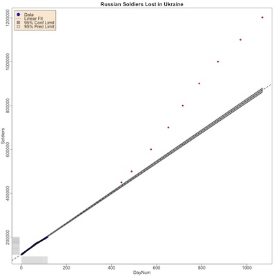
 The plot shown here is one of the results:
- The axes:
- The horizontal axis is time, measured in number of days since 2023-Jan-22.
- The vertical axis is the number of soldiers killed.
- Data points:
- The blue points, in the lower left, are the initial 116 consecutive days of data collected.
- The red points, sparse and in the upper right, are the days data was collected from 2024-Apr-10 to the present. The increments on the vertical axis are approximately 100k. (The exception is the first red data point, which is only 50k below the next one. Mea maxima oops.)
- Model fits:
- The dashed line is a least squares fit to the first 116 days.
- The gray band around it is the prediction confidence limit (the uncertainty if you use the regression line to predict 1 more point).
- The puzzle: note that all the red points are above the regression line, and clearly on a more steeply inclined upward trend.
Research question: Is this statistically credible evidence that something happened around day 420 or so (2024-Mar), to make Russian death rates increase?
Possible causes might be Russian reliance on human wave/meat grinder tactics that burn up their own soldiers, or Ukraine getting deadly clever about drone use, or several other things. We won’t explore the cause here; we just want to know if the data justifies that something happened, whatever the particulars.
Segmented Regression
Basically, it looks like the data is quite linear in time, it’s just that there’s a kink in the line around day 410, when the line bends upward but continues to be linear.
There’s a technique for that in statistics: segmented regression (also called piecewise regression, broken-stick regression, and lots of other names). In addition to the Wikipedia page just linked, there’s a nice tutorial slide deck by Alex Kaizer that’s quite readable.
The general idea is to consider regression models of the form:
\[\mbox{Soldiers}_t = \beta_0 + \beta_1 \mbox{DayNum}_t + \beta_2 \theta(\mbox{DayNum}_t - \psi) (\mbox{DayNum}_t - \psi) + \epsilon_t\]where:
- $t$ indexes data points in time,
- $\theta()$ is the Heaviside step function (0 for negative argument, 1 for positive argument, here used as an indicator for “after day $\psi$”, i.e., the fancy-pants modeling language for an “if” statement),
- $\psi$ is a parameter for estimating the time at which the kink occurs, and
- $\epsilon \sim N(0, \sigma^2_{\mbox{Soldiers}|\mbox{DayNum}})$ is the error usual error term, normally distributed around 0 with the conditional variance shown.
If we consider expectation values, the interpretation is immediately obvious:
\[\left\{ \begin{align*} E[\mbox{Soldiers}] &= \beta_0 + \beta_1 \mbox{DayNum} & \mbox{if } \mbox{DayNum} \lt \psi \\ E[\mbox{Soldiers}] &= \beta_0^* + (\beta_1 + \beta_2) \mbox{DayNum} & \mbox{if } \mbox{Daynum} \ge \psi \end{align*} \right.\]So $\beta_1$ is the slope before the kink, $\beta_1 + \beta_2$ is the slope after the kink, and $\beta_0^*$ is a new intercept depending on the slope difference and the location of the kink in a way about which we generally do not care, for most purposes.
Modeling the Data
There are perfectly reasonable parameter estimation methods for such a model, that will
tell us $\beta_1$, $\beta_2$, and $\psi$ along with their uncertainties. We used the
segmented library in R. The script, along with the original linear model script, and
all the datasets are available here for your peer review
pleasure. [17]
- We first tested objectively whether there was need for a kink in the linear model with the standard Davies Test, which basically tests the difference in slopes for significance, for a variety of choices of $\psi$ and a number of points on each side of it. If that had not come out significant, no further analysis would have been necessary and we would have been content with the original linear model.
- We did not attempt regularization via LASSO or equivalent, because there just aren’t any parameters to drop. Instead we compared our kink model to the overall linear model, to make sure our additional model complexity (2 more parameters, $\beta_2$ and $\psi$) was earning its keep by lowering the root-mean-square error of the model.
- We did 3-fold cross-validation, to make sure we were not over-fitting. Given that there are only 9 red points in the plot above, we did not dare go for more folds. We report below the performance of each of the 3 folds, and a final training run on the entire dataset.
Results
Need for a Kink in the Model
Davies test was ridiculously statistically significant, with $p \sim 1.62 \times 10^{-72}$. (R generally will not report a $p$ value less than $2.2 \times 10^{-16}$ without blushing, so that’s what appears in the transcript. We reached inside the data structure of the Davies test result to see the actual answer.)
So that’s very significant, and we can proceed to fitting the segmented models.
Cross-Validated Regressions
 The results of 3-fold cross-validation and a final fit on the entire dataset are shown
here. The RMS errors are, of course, the out-of-sample errors on the test fold (except
for the final global fit). The slope 2 reported here is $\beta_1 + \beta_2$, i.e., the
actual slope of the line after day $\psi$. “Linear” refers to a simple linear fit with no
kink, for comparison.
- The kink position $\psi$ stays quite stable across folds and in the final model, especially compared to the estimated standard deviation. This encourages us to believe that the kink is more or less where the model says it is.
- The 2 slopes are also pretty consistent across folds and in the final model, though the variation of slope 2 seems to be a bit outside the estimated standard deviation. I would say this is due to there being fewer data points (in red) after $\psi$, but that should have been encoded in a larger standard deviation?
- Both the linear model and the kinked model show excellent $R^2$. There’s not a lot of room to see improvement here, though the kinked model does get an extra 0.9% or so.
- The kinked model really begins to shine when we look at the RMS error, particularly on the out-of-sample test folds. It is dramatically less, like a factor of 5 or so.
The stability under cross-validation and the dramatic reduction in RMS error (compared to a simple linear model with no kink) make us believe the kinked-line model is the correct choice, beyond a simple linear model.
Interpretation
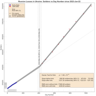
 Finally, here’s a plot of the model and the data, so you can see what’s going on (click
to embiggen).
- The axes:
- The horizontal axis is time, measured in number of days since 2023-Jan-22.
- The vertical axis is the number of soldiers killed.
- Data points:
- The blue points, in the lower left, are the initial 116 consecutive days of data collected.
- The red points, sparse and in the upper right, are the days data was collected from 2024-Apr-10 to the present.
- Model fits:
- The vertical line shows the position of $\psi$, the day of the kink at 2024-Mar-08. The vertical dashed lines to either side are the 95% confidence limits, at 2024-Feb-18 and 2024-Mar-26. Basically, they’re pretty tight, so we believe the kink is about where the model says it is.
- The solid black line is a least squares fit to the entire data, including the kink.
- The gray band around it is the prediction confidence limit (the uncertainty if you use
the regression line to predict 1 more point). I’m more than a little uncomfortable
with how narrow this uncertainty band is, its shape around the kink $\psi$, and how it
doesn’t seem to grow enough at the edges of the data. However, it’s what the
segmentedlibrary reports, and I haven’t investigated further. (Comments welcome!) - The dotted line on the right shows what the trend would have been without a kink, i.e., it continues the fit from before the kink.
Basically, the kink model follows the data much more closely, explaining why it has a much lower RMS error compared to a single straight line.
The ratio of kill rates before and after the kink is 1237.30 / 699.58 = 1.76. That is, the Ukrainians apparently got 76% more efficient at killing Russians on or about 2024-Mar-08.
The Weekend Conclusion
Yes, the Ukrainians did become about 76% more efficient at killing Russian soldiers on or about 2024-Mar-08.
The evidence for this is very good… for values of “good” that include fascists invading their neighbors, which is sadly now widely relevant.
(Ceterum censeo, Trump incarcerandam esse.)
Notes & References
1: Weekend Editor, “Another Grim Anniversary”, Some Weekend Reading blog, 2023-Mar-02. ↩
2: Weekend Editor, “Do the Ukrainian Reports of Russian Casualties Make Sense?”, Some Weekend Reading blog, 2023-Apr-15. ↩
3: Weekend Editor, “Update: Ukrainian Estimates of Russian Casualties”, Some Weekend Reading blog, 2023-May-01. ↩
4: Weekend Editor, “Updated Update: Ukrainian Estimates of Russian Casualties”, Some Weekend Reading blog, 2023-May-09. ↩
5: Weekend Editor, “Updated${}^3$: Ukrainian Estimates of Russian Casualties Hit 200k”, Some Weekend Reading blog, 2023-May-17. ↩
6: Weekend Editor, “Ukraine Invasion: 250k Russian Dead”, Some Weekend Reading blog, 2023-May-17. ↩
7: Weekend Editor, “Tacitus in Ukraine”, Some Weekend Reading blog, 2023-May-25. ↩
8: Weekend Editor, “Casualties in Ukraine: Grief Piles Higher & Deeper”, Some Weekend Reading blog, 2024-Apr-10. ↩
9: Weekend Editor, “Post-Memorial Day Thought: 500k Russian Dead in Ukraine “, Some Weekend Reading blog, 2024-May-31. ↩
10: Weekend Editor, “Ukraine: 600k Russian Dead”, Some Weekend Reading blog, 2024-Aug-27. ↩
11: Weekend Editor, “Ukraine War: 700k Russian Dead”, Some Weekend Reading blog, 2024-Nov-04. ↩
12: Weekend Editor, “Ukraine War: 800k Russian Dead”, Some Weekend Reading blog, 2025-Jan-08. ↩
13: Weekend Editor, “Ukraine War: 900k Russian Dead”, Some Weekend Reading blog, 2025-Mar-21. ↩
14: Weekend Editor, “Ukraine War: 1,000,000 Russian Dead?!”, Some Weekend Reading blog, 2025-Jun-12. ↩
15: Weekend Editor, “Ukraine War: 1,100,000 Russian Dead”, Some Weekend Reading blog, 2025-Sep-22. ↩
16: Weekend Editor, “Ukraine War: 1,200,000 Russian Dead”, Some Weekend Reading blog, 2025-Dec-31. ↩
17: Weekend Editor, “R script for analysis of Russian Casualties in Ukraine”, Some Weekend Reading blog, 2026-Jan-28.
There is also a transcript of running the script, for your review.
The data driving this analysis, in .tsv format, is also available for review.
The data driving the original analysis, in .tsv format, is also available for review by the persistent skeptic.
This whole mess depends on some idiosyncratic subroutine libraries of our own
construction, graphics-tools and pipeline-tools. We are happy to supply these to
exceptionally persistent skeptics who wish to reproduce these results. :-) ↩

Gestae Commentaria
Comments for this post are closed pending repair of the comment system, but the Email/Twitter/Mastodon icons at page-top always work.