Do the Ukrainian Reports of Russian Casualties Make Sense?
Tagged:MathInTheNews
/
R
/
Sadness
/
Statistics
Somebody asked me what to make of the Russian casualty statistics that the Ukrainian Ministry of Defence posts on Twitter every day. Two tentative conclusions: the data look a bit odd in spots (perhaps an artifact of how they collect it), and the Russians are losing soldiers and tanks at a sustained, alarming rate.
How long since the last post?
Yes, a long time. Yes, still post-COVID-19 brain fog. Yes, antidepressant is still frustratingly weak and/or vague. Yes, still wanna avoid talking about it, as though it were shameful.
Sorry.
What Russian casualty data, now?
 It turns out the Ukrainian Ministry of Defense has a Twitter account
(@DefenceU), because all the cool kids do nowadays. Unlike most
government propaganda channels, it’s actually interesting:
- For a while, there were frequent aerial videos from Bayraktar drones, showing small bombs dropped down the innocently open turret hatches of Russian tanks. With predictable results.
- Sometimes there are similar drone videos, spotting for artillery units that are miles away and constantly on the move to prevent counter-battery fire. With predictable results, sometimes gruesome.
- Sometimes there are tearfully heart-warming stories of soldiers rescuing grandmothers and cats. And then feeding & holding said grandmothers and cats. With predictable and warm results, momentary visions of heavenly care and forgiveness.
- Sometimes there are truly despicable stories of Russian artillery targeting schools, community theatres, or apartment blocks. With predictable results, usually terrible.
- Worst of all, the series called “Kids of the Bomb Shelters”. Stories of children terrified of random death from the sky, every night. With predictable results.
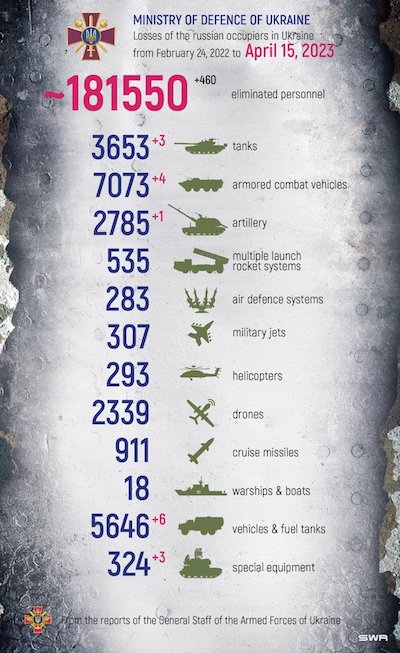 For today’s post, we’ll look at their daily reports of Russian casualty figures, broken
down by various military assets (soldiers, tanks, artillery, etc.). They report the same
categories every day, along with the amount of change from the previous day.
Now, you might argue, as we have done previously [1] when analyzing the rate of Russian tank losses on this Crummy Little Blog That Nobody Reads (CLBTNR), that one of the combatants is seldom the most accurate source of data. We compared the Oryx data (open source intelligence) as well as some essays by military analysts. Of course the Oryx data gives lower casualties, given they demand photographic evidence of everything. On the other hand, nobody believes what the Russians say. And I have no especial confidence that “military analysts” writing for western news media are especially well informed.
So the Ukrainian data, whatever its methodological flaws – you can’t just stroll out onto a battlefield to count bodies! – is somewhere near the truth. Or as close as we’re likely to get.
Ok, what’s it take to get those data?
So I dredged their Twitter account, and collected their daily reports for the 84 days from 2023-Jan-22 to today. [2] I’m pretty sure they’ve been doing this since at least last year, but 2023-Jan-22 was the limit of Twitter’s memory horizon. So we’ll analyze that time series of 84 days of 13 variables.
 Now, staring at an image is a terrible way to extract text data! So I did all the donkey
work of copying the Ukrainian data into a tab-separated, low-tech textual spreadsheet for
analysis. [3] It looks about like what you’re seeing here
in an image of the first 10 data rows (click to embiggen image):
- Each row is a report for a particular day, of the cumulative casualties up to that point.
- The first 2 columns are the day number from the start (day 1 is 2023-Jan-22) and the absolute date.
- The next 13 columns are the particular kind of military assets whose destruction is being counted: Soldiers, Tanks, ArmoredCombatVehicles, Artillery, … etc.
QC of the data
Then, being who we are, the next step was to write an R script to load, QC, and analyze it a bit. [4]
The QC phase is just to catch blunders, particularly those I committed when typing all this from images into spreadsheets:
- DayNum must start at 1, and increment by 1 for each row.
- Date must start at 2023-Jan-22, and increment by 1 for each row.
- All other rows must be positive integers, in a non-decreasing sequence row-wise. (E.g., a decrease in soldiers killed would mean somebody was resurrected from the dead. We presume this is not the case.)
We emphasize that this is very elementary QC on our part, given our COVID-19 diminished mind. But until the brain fog clears, this is as much as our capability can handle.
Some characteristics of the data
The inutility of WarshipsAndBoats
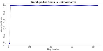 One column, called WarshipsAndBoats, is where the Ukrainians proudly count the number of
significant sized Russian ships they’ve sunk. And you have to hand it to them: sinking
the Moskva was pretty impressive!
But as you can see here, the data points are remarkably constant: a single sinking on 2023-Jan-23, and then stuck at 18 for the rest of the study period. So we’ll remove this essentially constant thing from further analysis.
Looking at correlations
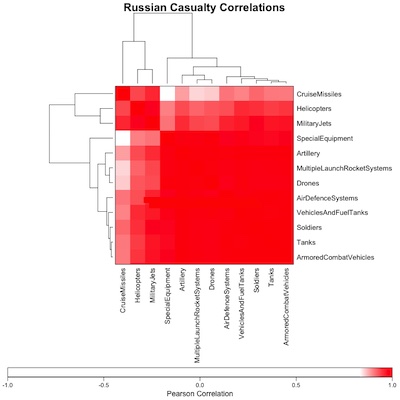 First let’s compute the matrix of
Pearson correlations
among the remaining 12 variables (excluding DayNum and Date). What we’re looking for here
are groups of variables with high positive (or negative) correlations. They’re doing the
same thing together (or the opposite thing, which is the same thing with a minus size like
a mustache disguise). We also want to see if the 12 variables form natural blocks that
should be considered together.
Here we’ve computed that Pearson matrix, and then biclustered the rows & columns to make any block structure evident (click to embiggen, of course). A couple things stand out:
- As you can see from the color legend at the bottom of the image, it becomes obvious that all these measurements are highly, highly correlated. The range of correlation coefficients is from 0.83-1.00! For some practical purposes, they might as well all be measuring the same thing: loss of one kind of asset implies the eventual loss of other kinds of assets.
- However, if you take a bit of a flier and believe the row & column dendrograms, you
can see 2 separate blocks of highly correlated variables. They’re still highly
correlated with the others, just slightly less so.
- In the upper left, we see that 3 variables (CruiseMissiles, Helicopters, and MilitaryJets) are one block. This may make some sense: with the exception of drones which are in the other group, these consist of things that can get shot down out of the sky.
- In the lower right, we see the other 9 variables all form one joint block where the nearly solid red indicates near perfect correlation.
So we’re measuring at most 2 things (stuff that gets shot from the sky, and everything else). But really, with correlations this high you might argue along with me that really there’s just 1 thing being measured here, 12 different ways.
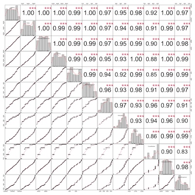 Let’s also look at a detailed correlation chart. This shows the same variables (alas, not
in the same order as forced by the dendrograms above; look at the diagonal cells to tell
what’s what, and click to embiggen).
- The diagonal cells show a histogram (gray) of the variable on that row & column (same variable because it’s the diagonal), and a kernel density estimation curve (red). This gives you a general idea of the distribution of values.
- The plots below the diagonal are pairwise scatterplots. Look, for example, at the plot of Soldiers vs Tanks near the upper left corner. Clearly, these are very, very correlated!
- The (slightly!) lower correlation of CruiseMissiles, Helicopters, and MilitaryJets is either because their scatterplot with other variables shows some curvature, or in the case of CruiseMissiles because they are only fired on certain days.
- Above the diagonal, we see the Pearson correlation and an assessment of statistical
significance in red asterisks.
- The values of correlation are insanely high.
- The statistical significance is also insanely good.
These are heavily, heavily correlated measurements!
Looking at pairwise associations and regression models
The small block of 3 variables
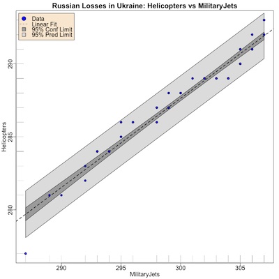
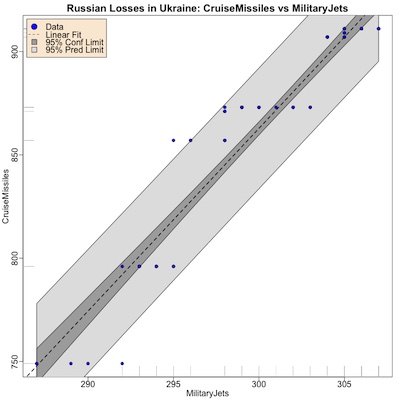
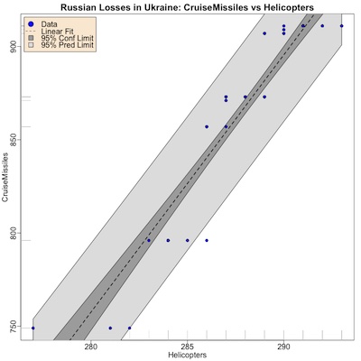
First, let’s consider that block of 3 correlated variables: CruiseMissiles, Helicopters, and MilitaryJets. We can look at each of them vs the others, as shown here, hoping to discover something like the time structure of helicopter attacks vs cruise missile attacks.
A word or two about how to interpret these regressions:
- You can of course, click to embiggen any of these plots.
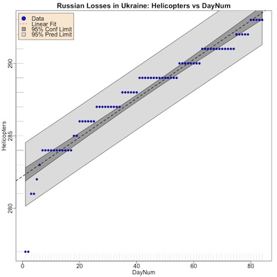
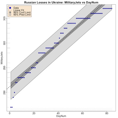
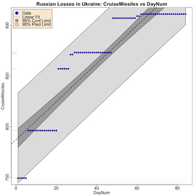
- The legend at the top tells us that the blue points are the data, the black dashed line is the regression line.
- All regressions were significant (way more than you’d expect, except for the strong correlations in the data).
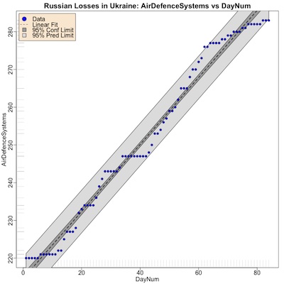
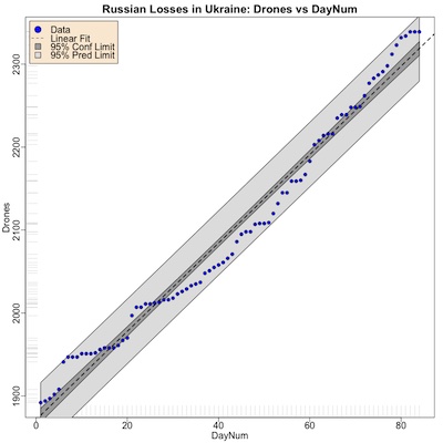
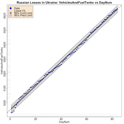
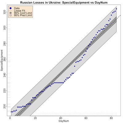
- The dark gray band is the 95% confidence limit, i.e., sort of like the standard error of the mean: we’re 95% sure the regression line as a whole should be in the dark gray band.
- The wider light gray band is the 95% prediction limit. If you’re trying to use the model to predict one more data point, we’re 95% sure the vertical axis value should be in the light gray band.
So what do we learn here?
- Helicopters and military jets are correlated, and sort of predict each other (first graph). They tend to be used to attack Ukraine (and get shot down) every couple days.
- Cruise missiles, on the other hand, look clearly different in the middle & bottom plots. This is because cruise missiles are used only every several weeks, not every several days like military jets and helicopters.
Conclusion: While helicopters and military jets are a constant pain, there is a time structure in the cruise missile attacks. Maybe intelligence and logistics can uncover whatever Russian supply chain problem this likely is, and capitalize on it?
Next, let’s consider each of CruiseMissiles, Helicopters, and MilitaryJets vs time (actually DayNum, with day 1 being 2023-Jan-22).
Conclusion: What we see here is another version of what we saw above:
- For helicopters and military jets, there’s a bit of a stairstep architecture here, the flat parts showing days without Russian losses. But the fit is pretty satisfactory.
- On the other hand, cruise missiles are used much more intermittently, with long(ish) pauses between days when some get shot down (and others not).
That time structure of cruise missile attacks for some reason intrigues me, and cases me to wonder if the Ukrainians can exploit it.
The large block of 9 variables
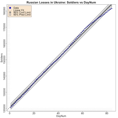
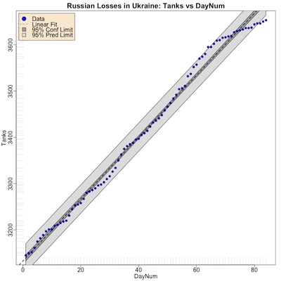
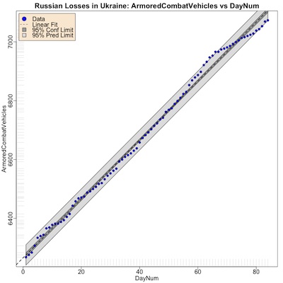
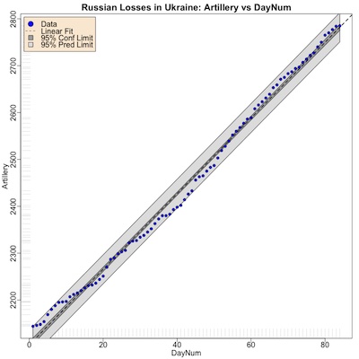
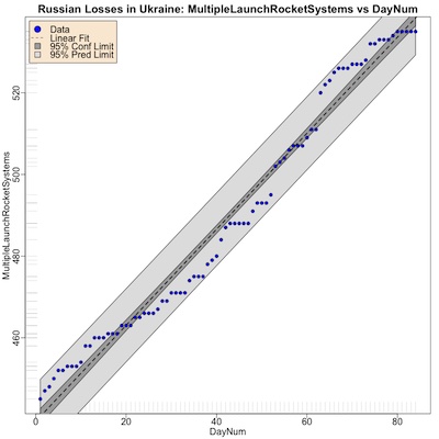
Next let’s consider the larger correlation block of 9 variables. These are so heavily correlated that I’m not going to do any of the pairwise plots. Instead, we’ll look at all of them versus time, to see if we can discover trends in either mean values or noise.
Click through to embiggen the graphs, and see if you agree with my thoughts:
- A few variables are extremely smooth functions of time, like Soldiers and VehiclesAndFuelTanks. One of the hallmarks of fudged data is often a suspicious lack of noise. We have no real grounds for such suspicion here, so it’s just a discomfort. Perhaps it’s something to do with their data collection process?
- Loss rates for Tanks and ArmoredCombatVehicles look pretty similar, understandably.
- Loss rates for MLRSs and air defence systems look pretty similar too, also understandably. Special equipment looks similar to them also, but I have no idea what they classify as “special equipment”.
Conclusion:
- The data are unexpectedly highly correlated.
- A few variables, like Soldiers, show an improbably smooth time course.
- All of them show a steady, grinding trend without much in the way of jumps from dramatic battles. Since the data only go back go 2023-Jan-22, this maybe understandable.
What analyses would you do?
Ok, that’s more or less what I could think of for exploratory analysis in 1 day. Since all the variables were so surprisingly highly correlated, I avoided trying anything sophisticated that might lead to Multicollinear Hell. (Been there, done that, didn’t care for it.)
What analyses would you like to do (or like to see me do)?
The Weekend Conclusion
Recall my specific military knowledge is entirely negligible. I’m just fishing through some data of unknown quality here. This has been an exploratory, hypothesis-forming look through the data. Here are the things that stood out a little bit for me:
- It’s a little worrisome that some of the variables, e.g., Soldiers, are so narrowly linear and low in noise. For example, some friends and former colleagues used such an analysis to detect fraud in the Russian COVID-19 vaccine report, where the efficacy breakdowns by age were implausibly smooth to have come from the experiment as designed. [5] We don’t have such evidence here, but are slightly concerned.
- The extremely high correlations among otherwise independent measures are somewhat concerning. It might, of course, mean that the Russians are just brute-forcing the same attacks over and over, with the same result each time.
- There appears to be some time structure in the use of CruiseMissiles in particular. They only occur on certain days, which a good military logistics & intelligence team in Ukraine might be able to exploit.
- From looking at the regression reports in the transcript below, the Russians are losing over the last quarter something like 757 soldiers/day and about 7 tanks/day, according to regression models with $R^2 \sim 99\%$. These are staggering loss rates. (As we discussed previously, modeling “when they run out of tanks” is hard, since they’re now apparently shipping WW2-era T-54’s to Ukraine.)
Addendum 2023-Apr-17: When will Russian casualties hit 200,000?
People were speculating when the Ukrainian-reported Russian casualties would hit 200,000. So I updated the data to be current as of 2023-Apr-16 (85 days of data), and asked the regression model. Here’s what that looks like, asking the model to predict when casualties are 200,000 using the root-finder uniroot() in R:
> uniroot(function(dn) { predict(mdl7, newdata = data.frame("x" = dn)) - 200000 }, interval = c(85, 150))
$root
[1] 105.1125

$f.root
1
0

$iter
[1] 1

$init.it
[1] NA

$estim.prec
[1] 44.88746
The model would have us believe that happens on or about day number 105, where day 1 is 2023-Jan-22. If we assemble a table of predicted death counts and their 95% prediction intervals, we get this:
> foo <- data.frame(DayNum = 100:110, Date = as.Date("2023-01-22") + 99:109, predict(mdl7, newdata = data.frame(x = 100:110), interval = "prediction")); colnames(foo)[3:5] <- c("Soldiers", "LCL", "UCL"); foo

   DayNum       Date Soldiers      LCL      UCL
1     100 2023-05-01 196141.4 194189.5 198093.3
2     101 2023-05-02 196896.1 194942.2 198850.1
3     102 2023-05-03 197650.9 195694.8 199606.9
4     103 2023-05-04 198405.6 196447.4 200363.7
5     104 2023-05-05 199160.3 197200.0 201120.6
6     105 2023-05-06 199915.1 197952.6 201877.5
7     106 2023-05-07 200669.8 198705.1 202634.4
8     107 2023-05-08 201424.5 199457.6 203391.4
9     108 2023-05-09 202179.3 200210.1 204148.4
10    109 2023-05-10 202934.0 200962.5 204905.5
11    110 2023-05-11 203688.7 201714.9 205662.5
So that says the mean estimate of the Russian casualty count reaches 200,000 on 2023-May-07. The 95% prediction interval on that day is 198705 - 202634.
If you want to be 97.5% sure the estimate exceeds 200,000 on a given day, then you don’t use the mean estimate, you use the lower confidence limit (LCL). That exceeds 200,000 on 2023-May-09.
Of course, international media sources using their own independent data-gathering methods, have long since been asserting that Russian casualties are above 200,000; some of the references below have made that claim as far back as early February (probably drawing on the same data source, or even quoting each other). [6] [7] [8] [9] [10] [11] [12] [13] [14] [15]
Even Wikipedia’s dozen or so sources put the Russian losses at around 200,000 last February. [16]
So the uncertainties are quite wide. But at least the Ukrainian MoD isn’t the most optimistic, which would nudge us toward not believing their data. The fact that they’re more conservative than news outlets and less conservative than the more stringent OSInt efforts like Oryx leads us to believe the Ukrainian MoD a bit more.
Notes & References
1: Weekend Editor, “Another Grim Anniversary”, Some Weekend Reading blog, 2023-Mar-02. ↩
2: Ukrainian Ministry of Defence, “Dailly Russian Casualty Reports”, Twitter, 2023-Jan-22 to 2023-Apr-15.
For convenience, I have assembled all these images into a .zip file for peer review. ↩
3: Weekend Editor, “Tab-separated value spreadsheet of Ukrainian Daily Russian Casualty Reports”, Some Weekend Reading blog, 2023-Apr-15.
This is quite deliberately in a low-tech text format (tab-separated values) so that it can be peer reviewed by anybody with access to just about any spreadsheet, or even editor. ↩
4: Weekend Editor, “R script to analyze Ukrainian reports of Russian casualties”, Some Weekend Reading blog, 2023-Apr-15.
There is also a textual transcript of running this, so you can check that it says what I told you.
You might have to rename the script, create a data directory, and put the .tsv file in it with the appropriate name to make this work. Ask if there’s a problem. Here at Château Weekend, we are peer-review-friendly. ↩
5: KA Sheldrick, et al., “Plausibility of Claimed Covid-19 Vaccine Efficacies by Age: A Simulation Study”, Am J Ther 29:5 (2022-Sep-Oct), e495-e499. DOI: 10.1097/MJT.0000000000001528. ↩
6: AN Simmons & NA Youssef, “Russia’s Casualties in Ukraine Near 200,000”, Wall Street Journal, 2023-Feb-04. ↩
7: R Du Cann, “Russians dead or wounded near 200,000 as shocking new report shows Putin’s losses”, Daily Express, 2023-Apr-12. ↩
8: H Cooper, E Schmitt, T Gibbons-Neff, “Soaring Death Toll Gives Grim Insight Into Russian Tactics”, New York Times, 2023-Feb-02. ↩
9: D Axe, “It’s Possible 270,000 Russians Have Been Killed Or Wounded In Ukraine”, Forbes, 2023-Feb-07. ↩
10: S Dasgupta, “Nearly 200,000 Russian troops have been killed in Ukraine, US officials say”, The Independent, 2023-Feb-03. ↩
11: N Cecil, “Putin’s troops in Ukraine hit by 200,000 casualties and 60,000 deaths, says UK”, The Evening Standard, 2023-Feb-17. ↩
12: K Nicholson, “Putin’s Invasion Has Led To 200,000 Russian Casualties And A High Death Toll, UK Says”, Huffington Post, 2023-Feb-17. ↩
13: J Mueller, “Russian deaths in Ukraine surpass all its war fatalities since WWII combined: study”, The Hill, 2023-Feb-28. ↩
14: C Panella & J Epstein, “More of Russia’s soldiers have died in Ukraine — a war Putin thought would be over in days — than in all its wars since World War II combined, new analysis finds”, Business Insider, 2023-Feb-28. ↩
15: J Epstein, “More than twice as many Russian troops as Ukrainians have been killed in Putin’s war, leaked estimates show”, Business Insider, 2023-Apr-10. ↩
16: Wikipedia Editors, “Casualties of the Russo-Ukrainian War (2022 Russian Invasion of Ukraine)”, Wikipedia, estimates of 200k dead in 2023-Feb retrieved 2023-Apr-16. ↩
Gestae Commentaria
Comments for this post are closed pending repair of the comment system, but the Email/Twitter/Mastodon icons at page-top always work.