Politics vs mask use & vaccine uptake in the US
Tagged:COVID
/
MathInTheNews
/
PharmaAndBiotech
/
Politics
/
Statistics
Does political alignment in the US inform medically-relevant behaviors like mask use and vaccine uptake? Alas, yes: but not in a good way.
The basic question
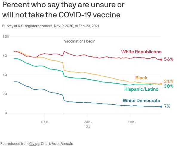
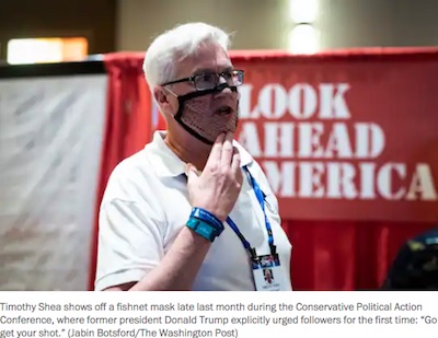
We know that some things help people avoid COVID-19, and hence avoid a pretty awful level of danger of disability or death: mask usage and vaccination. Unfortunately, we know that both of those are deeply, desperately, angrily resisted in the US in the red states. Their reasons almost don’t matter: their behaviors lead to death and disability, as well as the spread of increasingly vaccine-resistant variants to the rest of us, so they are public health problems for all of us.
Can we quantify that relationship statistically?
Mask usage
 For no particularly obvious reason, the efficacy of masks is constantly under challenge.
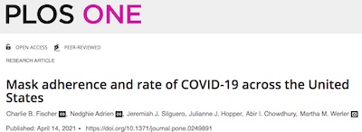
So, first up is a paper by Fischer, et al. [1] in
PLoS ONE
documenting the effect of masking over the last year. Their work is nicely summarized by
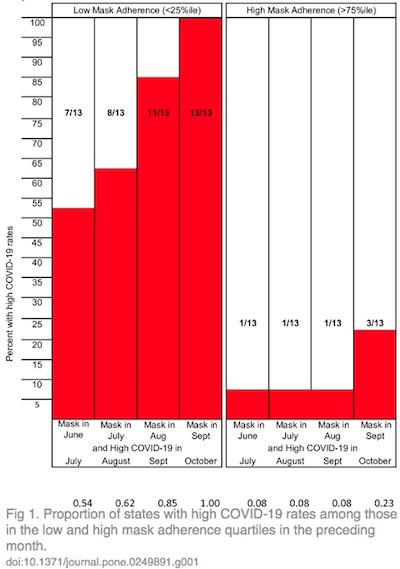
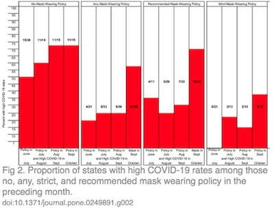
2 figures from their paper, reproduced here:
- Figure 1 shows the effect of mask adherence and the date of adopting a mask policy. The vertical axis is proportion of states with high COVID-19 rates. On the left are the states with bottom-quartile adherence, and on the right the top quartile. Clearly high mask adherence saved lives. Within each group, they show the date at which a mask policy was adopted. Clearly early mask policy saved lives.
- Figure 2 similarly shows the strength of the mask policy in 4 groups: nothing, any policy at all, recommended but voluntary masking, and required masking. Clearly, required masking saved lives. In each group, they show the date of adoption of the policy. Clearly early required masking saved lives.
Conclusion: The empirical data on high COVID-19 rates indicate that compliance with mask policy saved lives, early mask policy saved lives, and required mask policy saved lives. Anybody who argues otherwise has other priorities than saving lives, and that is bad.
I’m kind of surprised we need the scientific literature to tell us things this obvious. But… here we are.
Low vaccine uptake in red states
 We
previously remarked that vaccine uptake in red areas seemed lower,
to the point that people were capitalizing on it to escape shortages in their blue areas.
It appears that this is continuing, according to an AP report on red state vaccine
uptake. [2]
The reporter, Russ Bynum, noted that in the CDC’s list of states with their rates of vaccine uptake, the top states were blue and the bottom states were red. This appears to be directly linked to partisanship: citing an AP poll, 36% of Republicans said they would resist getting vaccinated, vs 12% of Democrats.
This matters. Quoting Dr Howard Forman, professor of public health and management at the Yale School of Medicine:
“We could see substantial outbreaks for a long time,” Forman said. “It will determine whether we go back to normal in some cases.”
A suspicious look at actual data
Here at Chez Weekend, we wondered if that anecdotal report would really withstand statistical scrutiny: can we quantitatively related usage of vaccine supply & fraction of population vaccinated with partisanship at the state level?
Why, yes. Yes, we can.
The available data
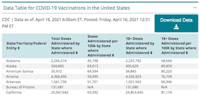
- We can get state vaccination rates directly from the CDC. [3] They offer the usual complex spreadsheet, which we simplify down to the state, the % of vaccine supply used, the % of population with at least 1 dose, and the % of population fully vaccinated.
- The state voting data we previously curated from the Wikipedia summary of the 2020 election [4], for our January impeachment vote analysis. So we’ll re-use that.
 We combined those 2 datasets into a single omnibus dataset [5],
a sample of which is shown here. It shows the state name, the voting data (Biden %, Trump
%, Trump Margin, and whether it was a Trump state, and the vaccine usage data (%
population with at least 1 dose, % population fully vaccinated, and % of vaccine supply
already in people’s arms). The voting data is for the 2020 election, and is final. The
vaccination data was updated by the CDC as of 2021-Apr-16.
We wrote an R script to load & standardize the datasets, combine them with a left outer join into the omnibus dataset, and do the following statistical analyses. [6] A transcript of running it is also available in the references, for peer review.
Statistical hypothesis testing
We did both discrete and continuous analyses:
- Discrete analysis: we binned up the states into those whose popular vote was for Trump and those which were not (boolean column “TrumpState” in the omnibus dataset). We then did 1-sided, unequal variance, $t$-tests to determine if % vaccination uptake, % population with 1 dose, and % population with full doses were greater in non-Trump states. The resulting $p$-values were multiple hypothesis test corrected to FDRs using the Benjamini-Höchberg method.
- Continuous analysis: Mollified that the discrete analysis was significant (q.v.), we then did a regression analysis of the vaccination variables on the % Trump margin in the popular vote in each state. This tells us whether the effect is a step function, or whether just a little increment in partisanship has an effect as well. We report the overall $R^2$ of the regression, as well as the $p$-value of the slope coefficient and its multiple hypothesis test corrected FDR.
 Here is a summary of the statistical significance of the relationship between Trump margin
and the 3 vaccine usage measures:
- The column tTest.FDR tells us that the $t$-test is significant for all 3 measures of vaccine usage, with $\mathrm{FDR} \sim 10^{-6} - 10^{-3}$. There is a real vaccine hesitancy in the red states.
- The continuous analysis confirms this. The regression $R^2 \sim 13\% - 37\%$ values are not huge, indicating significant variance in the data, but a degree of real trend nonetheless. The slope coefficient in the regression model has highly significant $\mathrm{FDR} \sim 10^{-6} - 10^{-3}$, indicating that there’s not a chance in hell this is accidental.
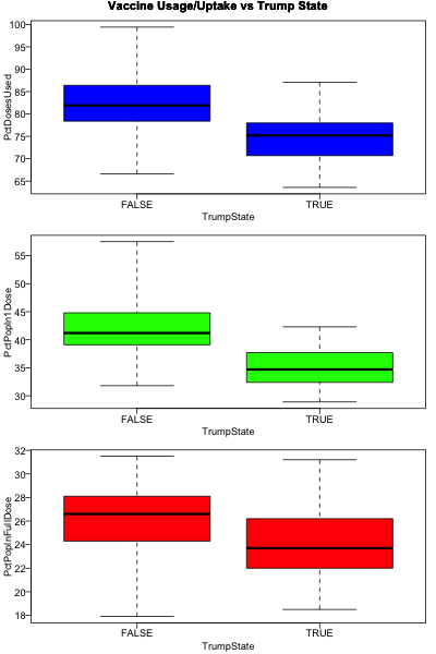 Here’s what the boxplot of vaccination measures vs Trump margin looks like. The black bar shows
the median, the colored box shows the upper & lower quartile, and the whisker shows the range
of the data. In all cases, the outcome is worse in Trump states. The difference is
statistially significant by $t$-test FDR.
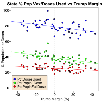 Next, here’s what the regression of vaccine measures vs Trump margin looks like:
- Each state is a circle on the plot. The Trump popular vote margin in the state is on the horizontal axis.
- The colors indicate the vaccine measure: % of doses actually used vs sitting in a freezer in blue, % population with at least 1 dose in green, and % population with full doses in red.
- The considerable scatter around each regression line explains why the $R^2$ values were significant, though not spectacular.
- In each case, we see a downward trend with Trump margin: states with more Trump voters use less vaccine, and have less of their population protected.
- The effect is weakest with % population fully vaccinated, as expected from having the smallest $R^2$ in the table above. That’s because it’s hard at this point to have a lot of people fully vaccinated, given the chronic vaccine shortages, bungled sign-up mechanisms, and glacial sped of vaccination.
The Weekend Conclusion
Yes, the Trumpy areas of the US are both less likely to use the vaccines they have on hand, and consequently have less of their population partially or fully protected. The effects are statistically significant in both discrete and continuous measures. The effect size is large enough to be bothersome from a public health perspective, as Howard Forman said above re delaying the return to some form of normalcy.
Worst of all, we’re all stuck with the consequences of this knuckleheadery.
What to do?
Beats me. I wish I could figure out how to persuade people not to be self-destructive. (In this, as in so many other matters!)
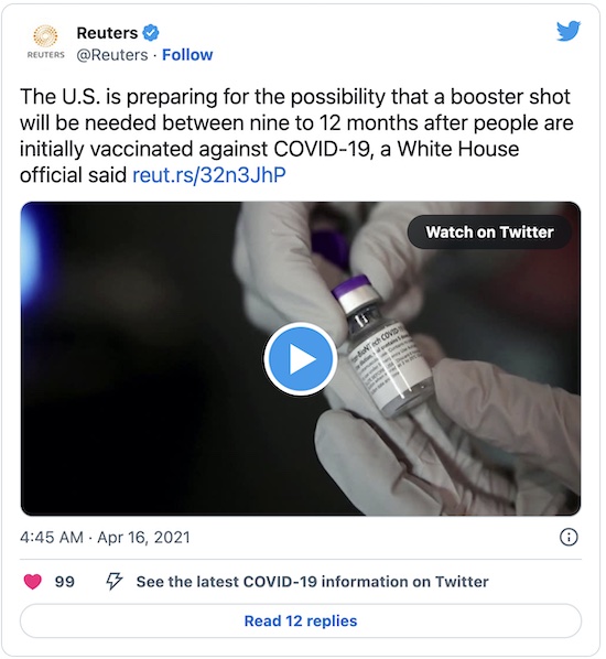
The consequences of slow/low vaccination rates are that viral variants are inevitably taking over, one of which will eventually have an escape mutation to evade current vaccines. Then we’ll need booster vaccines again. Fortunately, we know that those are already under development, and that the FDA is prepared for accelerated approvals like the yearly flu virus variant vaccines.
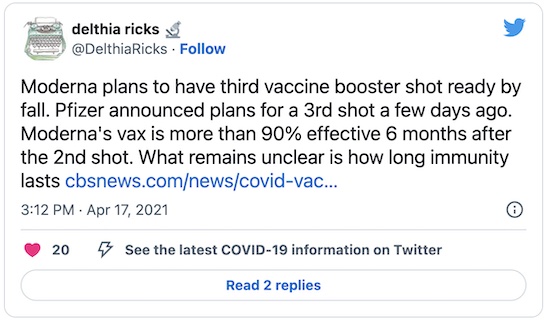
Personally, I was putting the probability of the need for boosters this fall at about 60%. It might be time to raise this estimate, as it’s beginning to dawn even on the mainstream media:
One could wish for the times to be less fraught with self-inflicted wounds from stupidity. But again… here we are.
Addendum late 2021-Apr-19
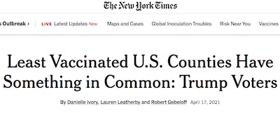 I just discovered, after writing the above, that the New York Times is also on the
case. [7] Here we did a state-level analysis; the NYT
reporters show a somewhat more fine-grained county-level analysis that reaches the same
conclusion. (Though oddly, except for a county-level map, their graphics are all
state-level. Hmpf. NYT, I guess.) Also, it does not appear they did any statistical
hypothesis testing to assess the significance of the relationship, as we did here; they’re
busy with compelling story aspects of individuals.
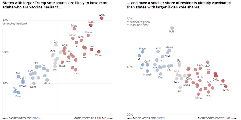
Their graph on the right is approximately the same as the green regression line in our plot
above:
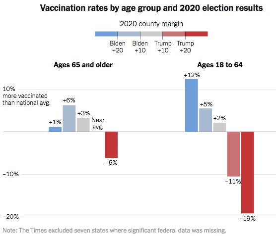
Normally, we’d expect older people to be more conservative than younger groups, and to see
that reflected in vaccination rates. Not so; the NYT shows us the resistance effect persists
across age (though the youngs who do accept vaccination (dark blue bar) appear to do so in slightly
higher numbers):
O tempora, o mores! It appears that Jacobson v Massachusetts may become a regrettable inevitability, just for survival.
Notes & References
1: C Fischer, et al., “Mask adherence and rate of COVID-19 across the United States”, PLoS One 16:4, e0249891, 2021-Apr-14. DOI: 10.1371/journal.pone.0249891.↩
2: R Bynum, “Red states on U.S. electoral map lagging on vaccinations”, AP News, 2021-Apr-14. ↩
3: Centers for Disease Control, “COVID Data Tracker (Vaccinations): Data table for COVID Vaccinations in the United States”, CDC COVID Data Tracker, data as of 2021-Apr-16 6:00am ET. Archived in a simple CSV file here.↩
4: Wikipedia, “2020 United States presidential election (results by state)”, retrieved 2021-Feb-15. ↩
5: Weekend Editor, Omnibus dataset of state popular vote and vaccine usage, from “Why did Republicans block a Trump impeachment guilty verdict?”, SomeWeekendReading blog, 2021-Feb-24. ↩
6: Weekend Editor, R script for analysis of vaccine uptake vs Trump margin, SomeWeekendReading blog, 2021-Apr-19. There is also a text file transcript of running the script, for peer review. ↩
7: D Ivory, L Leatherby, & R Gebeloff, “Least Vaccinated U.S. Counties Have Something in Common: Trump Voters”, New York Times, 2021-Apr-17. ↩

Gestae Commentaria
Comments for this post are closed pending repair of the comment system, but the Email/Twitter/Mastodon icons at page-top always work.