Vaccination vs Hospitalization Rates: Simpson's Paradox
Tagged:COVID
/
JournalClub
/
MathInTheNews
/
PharmaAndBiotech
/
SomebodyAskedMe
/
Statistics
Somebody asked me about why the vaccines are high efficacy with rare breakthrough infections, but we can see a high fraction of the hospitalized are vaccinated? Right, very puzzling. Then somebody else asked me what I thought of an article about Simpson’s paradox in the context of COVID. Ding, ding, ding, ding!
Who asked what now?
Commenter Kto asked in a comment on Vaccine Efficacy, Delta Variant, and CDC changes about why we’re seeing reports of so many vaccinated people being hospitalized with COVID-19, if breakthrough infections are supposed to be so rare. I thought the Israeli and Qatari data said otherwise, but Kto produced a reference to some UK data that disagreed. Very puzzling…
Then Gary Cornell asked if I’d seen an article at COVID-19 Data Science on applying the Simpson paradox to explaining exactly that thing!
This is why you always listen to people.
Ok, what’s this Simpson’s paradox thing?
Simpson’s paradox is one of those delightful and maddening things about statistics where you think there’s a clear conclusion, but when you look closer everything either falls apart or goes the other way. There’s an elementary introduction in Wikipedia that’s pretty good [1], and a more detailed technical summary in the Stanford Encyclopedia of Philosophy [2].
 I’d always heard of this as the Yule-Simpson paradox, and wondered who the various people
were. It turns out to be a fascinatingly weird bit of history: first published by Karl
Pearson in 1899 [3], then by Yule in
1903 [4], it was more or less ignored or not understood for
the next half century! When Simpson finally published about it in
1951 [5], it finally stuck in the minds of scientists.
Moral: for anything that took the scientific community half a century to wrap their brains
around, we should probably expect it to be a slippery little git that’s hard to
understand.
Is that gonna stop us from trying? No, of course not.
 For one thing, it’s important: Simpson’s paradox was at the root of a famous lawsuit
alleging that Berkeley discriminated against women in grad school
admissions [6]. While it’s a long and tangled tale, the gist
seems to be:
- A naïve look at overall admissions said that women who applied to grad school were less likely to get in than men, and that this was statistically significant.
- However, women at that time tended to apply to very competitive departments who admitted fewer applicants, though all well-qualified, of either gender.
- Men at that time tended to apply to somewhat less competitive departments who admitted more applicants, though well-qualified, of either gender.
- So even though neither of those 2 groups of deparments was particularly biased, the overall numbers looked biased under naïve aggregation.
- So a naïve aggregation without taking into account men’s and women’s department preferences and the competitiveness of those departments made it look like Berkeley was discriminating. But a closer look said men and women were subjecting themselves to different levels of scrutiny, and the effect went away.
People feel strongly about sex discrimination, and for excellent reasons. But if you don’t look at the details, you’ll see discrimination where there is none… and miss it where it really is. Neither mistake serves the interest of fairness.
Yeah, yeah… c’mon, what is it really?
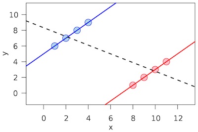 Consider this plot from the Wikipedia article.
- If you sample from the blue group, you’ll think there’s a positive trend between whatever the vertical and horizontal axes are.
- If you sample from the red group, you’ll think the same thing.
- But if you aggregate the red & blue groups overall, the trend reverses and becomes negative.
The source of this problem is that there’s some confounding variable which makes the red & blue groups different. If you happen to sample just one or the other, you don’t get to see that confounding variable. But if you aggregate the red & blue groups, the confounder overwhelms any in-group effect and indeed reverses it.
But what’s that got to do with COVID-19 vaccination rates and hospitalization rates?
 Heh… watch this!
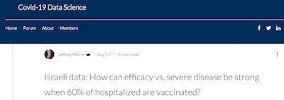
A brilliant article by Jeffry Morris at Covid-19 Data Science [7] looks at an apparent paradox: how can you say the vaccines are effective, when 60% of people hospitalized for COVID-19 are vaccinated?!
Let’s go through his paper in some detail, since it’s a very good invocation of Simpson’s paradox to explain why the vaccines work better than you think. Which is, after all, good news. And we can’t afford to pass up good news.
He’s aggregated data from the Israeli government dashboard, snapshotted below in the references. The part getting the nervous side-eye is the fraction of hospitalized patients who are vaccinated:
| Age | Severe Unvax | Severe Vax | ||||
|---|---|---|---|---|---|---|
| All | 214 | 301 |
People jump, without justification, to 2 frightening but erroneous or irrelevant conclusions:
- Vaccine Efficacy: It looks like more vaccinated people are sick, so the vaccine efficacy is negative!
- Wrong Probability: It looks like 301 / (301 + 214) = 58% of the hospitalized are vaccinated!
In some ways, this is just a basic blunder with Bayes Rule. They’ve computed the probability you were vaccinated, given that you’re already hospitalized: $\Pr(\mathrm{vax} | \mathrm{hospitalized})$. That is, very approximately, nonsense. The relevant thing to know is instead is the probabilty of getting hospitalized, given that you’re already vaccinated: $\Pr(\mathrm{hospitalized} | \mathrm{vax})$. The two are of course related by Bayes Rule, if you know the base rates of vaccination and hospitalization.
But there are 2 more serious errors that are at the root of Simpson’s paradox:
- The first is a blunder from not understanding vaccine efficacy: both the vaccinated rate and the unvaccinated rate have to be normalized by the sizes of their populations, not just the hospitalized populations. Israel right now has about 78% vaccinated (below), so you’d expect to see more cases from among the vaccinated!
- The second error is to ignore age groups. The elderly are both more likely to be vaccinated, and more likely to be hospitalized if they do get infected anyway. That is to say, age is confounded both with vaccination rate and hospitalization!
Adjusting for population sizes of vaccinated and unvaccinated
So first, let’s adjust for the population sizes of vaccinated and unvaccinated, and compute the probabilities, not the frequencies:
| Age | Population Unvax | Population Vax | Severe Unvax | Severe Vax | ||||||||
|---|---|---|---|---|---|---|---|---|---|---|---|---|
| All | 1,302,912 (18.2%) | 5,634,634 (78.7%) | 214 (0.0164%) | 301 (0.0053%) |
So we see that the fraction of population vaccinated is estimated as:
\[\Pr(\mathrm{vax}) = 5{\small,}634{\small,}634 / (1{\small,}302{\small},912 + 5{\small,}634{\small,}634) = 81.2\%\](The table above reports a slightly different number, because sometimes youths age 0-12 were not included, and the partially immunized with only 1 shot are not included. Details can be harmonized from Morris’s spreadsheet. But ballpark… 78% - 81%.) So there were a lot more vaccinated than unvaccinated people.
The probabilities we want are now calculable too:
\[\begin{align*} \Pr(\mathrm{hospitalized} | \mathrm{unvax}) &= 214 / 1{\small,}302{\small,}912 &= 0.0164\% \\ \Pr(\mathrm{hospitalized} | \mathrm{vax}) &= 301 / 5{\small,}634{\small,}634 &= 0.0053\% \end{align*}\]Clearly, the vaccinated are in a better position as far as lower chance of hospitalization, since the unvaccinated are about 3.1x more likely to be hospitalized! Also, the vaccine efficacy is still pretty good:
\[VE = 1 - \frac{\Pr(\mathrm{hospitalized} | \mathrm{vax})}{\Pr(\mathrm{hospitalized} | \mathrm{unvax})} = 1 - 0.0053 / 0.0164 = 67.6\%\]That’s certainly better, now that we’ve properly normalized and computed the relevant probabilities… but not good enough yet!
Still not good enough: stratify by age
Even though that looks much better after accounting for the much larger vaccinated population, it’s still way too pessimistic!
That’s because in the Israeli population, 2 things are true:
- The older people are vastly more likely to be vaccinated than the younger.
- Older people, vaccinated or not, if they get an infection are more likely to be hospitalized.
That means age is an underlying correlate of both vaccination and hospitalization! If you don’t factor out age, then you’re going to think vaccinated people get hospitalized more often, only because vaccinated people tend to be older. Conversely, you will underestimate the efficacy of vaccination, because the unvaccinated population are hospitalized less because they are younger, not because they are unvaccinated!
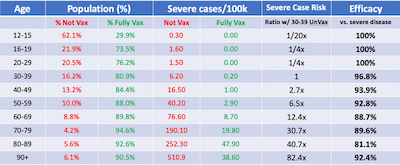 Rather than work through each row of a table of age strata with our own R scripts, let’s
just jump to Morris’s very clear table. This is stratified by both vaccination status
and by age. What can we see from it?
- The next to last column compares the severe disease risk of an age cohort versus the 30-39 year olds. While the elders are at more risk than the youngers, it’s clear that is almost exclusively due to sickness in the unvaccinated subset (from inspection of the 2 columns to the left).
- The last column shows the vaccine efficacy, comparing like for like by age & vax stratification, ranges from a worst case 81% for 80-89 year olds, to best case 100%.
Conclusion: So we see that the hospitalization risk is mostly explained by age, once you properly normalize by the population sizes of vaccinated and unvaccinated.
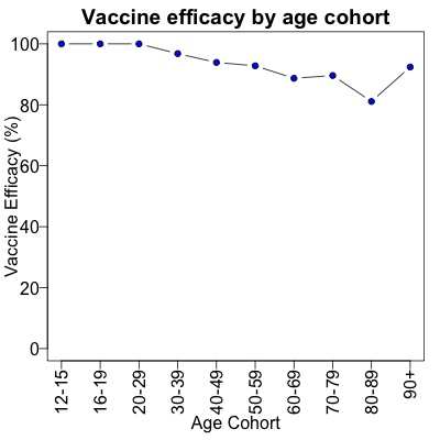
In fact, the vaccine efficacies are still quite high. Let’s plot the vaccine efficacy by age cohort, using a little R script [8]. Here we plotted the vaccine efficacies from Morris’s table above, properly normalized by vax/unvax population size and stratified by age. Only the elderly have a vaccine efficacy below 90%, and even then not by much.
That doesn’t look so bad, now does it?
Simpson’s paradox is important: you will think your data means something other than the truth, if you attempt to ignore it! Here, the crucial fact is that age is correlated both with having been vaccinated and with likely to be hospitalized when infected.
The Weekend Conclusion
The Israeli data is quite hopeful. After declining to commit the blunder of aggregating data with an underlying correlate (age correlates with vax status and hospitalization), and after declining to commit the blunder of computing the wrong Bayesian posterior, we find we have evaded Simpson’s paradox. The vaccine efficacies are still quite high.
So get vaccinated.
Addendum 2021-Aug-30: Mainstream media catch on
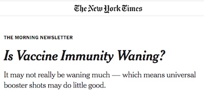 This morning I woke to a New York Times newsletter touting an
article [9] noting that vaccine efficacy isn’t really waning,
it’s just Simpson’s paradox. This is very satisfying; the mainstream media are catching
up, a bit.
At first glance, the Israeli data seems straightforward: People who had been vaccinated in the winter were more likely to contract the virus this summer than people who had been vaccinated in the spring.
Yet it would truly be proof of waning immunity only if the two groups — the winter and spring vaccine recipients — were otherwise similar to each other. If not, the other differences between them might be the real reason for the gap in the Covid rates.
As it turns out, the two groups were different. The first Israelis to have received the vaccine tended to be more affluent and educated. By coincidence, these same groups later were among the first exposed to the Delta variant, perhaps because they were more likely to travel. Their higher infection rate may have stemmed from the new risks they were taking, not any change in their vaccine protection.
Statisticians have a name for this possibility — when topline statistics point to a false conclusion that disappears when you examine subgroups. It’s called Simpson’s Paradox.
This paradox may also explain some of the U.S. data that the C.D.C. has cited to justify booster shots. Many Americans began to resume more indoor activities this spring. That more were getting Covid may reflect their newfound Covid exposure (as well as the arrival of Delta), rather than any waning of immunity over time.
Indeed.
Addendum 2021-Aug-31: More mainstream media: Jordan Ellenberg in WaPo
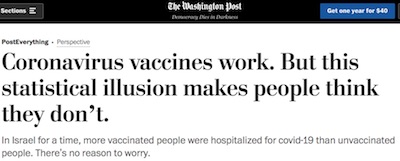 I was gratified to see another piece in the WaPo on the subject, this time by prominent
mathematician Jordan Ellenberg. [10] I don’t know him
personally, but know people who know him and by reputation. His reputation is that he is
very smart, very careful, and a remarkably good person. I particularly liked the
shout-out to his mom, who pointed him at Morris’s blog post.
Simpson’s paradox is a warning that the whole of the data often looks weirdly different than the sum of its parts. In the case of Israel — as a number of epidemiologists and other scholars have pointed out — what explains the surprising hospitalization figures is largely the relative ages of vaccinated and unvaccinated people.
…
If everyone were vaccinated, then all hospitalized people would be vaccinated – and that obviously wouldn’t mean vaccination was useless.
Nailed it.
Addendum 2021-Sep-02: Vaccine efficacy confidence intervals

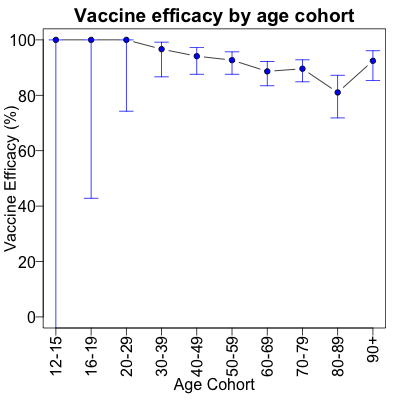 I just realized that we can take Morris’s spreadsheet and extract the Israeli population
counts, stratified by age and vaccination status. That’s important because we can
calculate the vaccine efficacies ab initio, along with their confidence intervals. So I
did that, with a little R script. [11]
Note that the calculation of the confidence intervals has a few problems when one of the arms has 0 infections: in those cases – check the first 3 rows of the table – the infection counts in both arms are so low we can’t achieve statistical significance. It’s very hard to get confidence intervals on rare events, because you have to take astronomically large numbers of observations to make the rare events happen enough times! So don’t take seriously the wide confidence intervals when the efficacy is 100%.
Here’s the resulting plot. Other than the silly-wide CI’s at 100% efficacy, you can see that the vaccines remain strong across all ages, and that we are quite certain that is the case.
Simpson’s paradox is really, really misleading people here. There may be arguments for a booster shot, but apparently these data are not one of those arguments.
Addendum 2021-Sep-03: Gary Cornell’s explainer in Slate
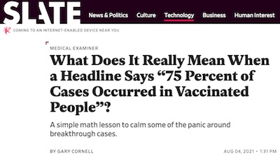 Mathematician & publisher Gary Cornell had
a piece related to this on his
blog,
about how the base rate fallacy is
tripping people up here. Basically, don’t ignore the background rate at which something
happens in favor of compelling foreground anecdotes! It’s from before we’d figured out that
Simpson’s paradox was active here, but it does point out the normalization problem.
A revised & extended version of that has been published in Slate. [12] It’s worth your time to read. In a way, it points out how meaning-free it is to say “75% of those hospitalized for COVID were vaccinated”. It’s the Bayesian error we pointed out above: knowing $\Pr(\mathrm{vax} | \mathrm{hospitalized})$ is useless, but knowing $\Pr(\mathrm{hospitalized} | \mathrm{vax})$ is usefully predictive.
Transforming from one to the other with Bayes’ Rule requires knowing the base rates, $\Pr(\mathrm{vax})$ and $\Pr(\mathrm{hospitalized})$. Simpson’s paradox comes in after that, because both of those are related to age.
Are we getting through, here?
Notes & References
1: Wikipedia contributors, “Simpson’s paradox”, Wikipedia, retrieved 2021-Aug-27.↩
2: J Sprenger & N Weinberger, “Simpson’s Paradox”, Stanford Encyclopedia of Philosophy (Summer 2021 Edition), Edward N. Zalta (ed).↩
3: K Pearson, “On the Theory of Genetic (Reproductive) Selection”, Phil Trans Roy Soc Series A, 192 (1899), 260–278. ↩
4: GU Yule, “Notes on the Theory of Association of Attributes in Statistics”, Biometrika 2:2 (1903), 121–134. DOI:10.1093/biomet/2.2.121. ↩
5: EH Simpson, “The Interpretation of Interaction in Contingency Tables”, Jnl Roy Stat Soc Series B (Methodological), 13:2 (1951), 238–241. DOI:10.1111/j.2517-6161.1951.tb00088.x. ↩
6: PJ Bickel, EA. Hammel, JW O’Connell, “Sex Bias in Graduate Admissions: Data From Berkeley”, Science 187:4175 (1975), 398–404. DOI:10.1126/science.187.4175.398, PMID:17835295.↩
7: J Morris, “Israeli data: How can efficacy vs. severe disease be strong when 60% of hospitalized are vaccinated?”, Covid-19 Data Science, 2021-Aug-17. I’ve snapshotted his aggregated, translated, and normalized data from the Israeli government data dashboard on 2021-Aug-15 here. ↩
8: Weekend Editor, R script to plot normalized, age stratified Israeli vaccine efficacies, Some Weekend Reading blog, 2021-Aug-29. ↩
9: D Leonhardt, “Is Vaccine Immunity Waning?”, New York Times, 2021-Aug-30. ↩
10: J Ellenberg, “Coronavirus vaccines work. But this statistical illusion makes people think they don’t.”, Washington Post, 2021-Aug-31.↩
11: Weekend Editor, “R script to plot normalized, stratified Israeli vaccine efficacies and confidence intervals”, Some Weekend Reading blog, 2021-Aug-29. The tab-separated value file used as an input was derived from Morris’s data. There is also a transcript of running the script. ↩
12: G Cornell, “What Does It Really Mean When a Headline Says ‘75 Percent of Cases Occurred in Vaccinated People’?”, Slate, 2021-Aug-04. ↩
Gestae Commentaria
Comments for this post are closed pending repair of the comment system, but the Email/Twitter/Mastodon icons at page-top always work.