COVID-19 Continues to Kill Conservatives
Tagged:COVID
/
Politics
/
Statistics
Charles Gaba has updated his county-level COVID-19 vax rates and death rates, versus percentage of Trump voters. It’s not pretty.
Previously…
Last April, we did some regressions of state vaccination rates on state % Trump margins. It showed a depressingly statistically significant result: Trump states were not only less vaccinated, they weren’t even using the doses they had, back when they were scarce.
Then last July, Charles Gaba on acasignups.net showed the horrifying county-level data. The county level data was difficult to assemble properly and completely, but the trend of Trumpiness against vaccination was blunt and clear.
Then at the end of October, Gaba updated with a simple bar plot: stratify counties by deciles of % Trump voters and see the death rate in the most Republican is 6x higher than the most Democratic.
Now he’s updated to the latest data, in both vax rates and death rates. Oy, vey.
The ugliness of the present moment
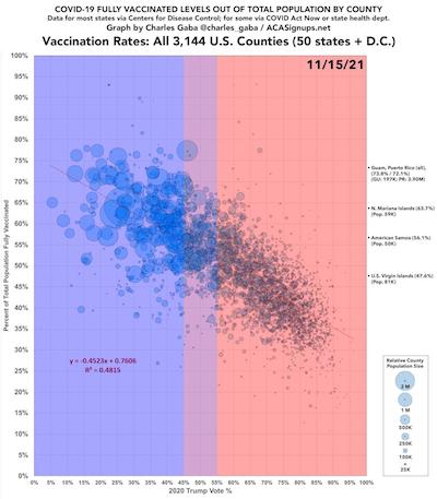
 First, consider the 2021-Nov-15 update on county vaccination levels vs county % Trump
votes. [1] We can see several interesting things from this
plot of 3,144 US counties:
- There is a definite negative trend of vaccination rates with increasing Republican voting. In fact, the regression coefficient is a whopping -0.45 between the horizontal and vertical percentages (0% – 100%, so they’re on the same scale). So for every percent increase in Trumpiness, there’s about half a percent decrease in vaccination!
- The radius of the bubble around each point shows the county population. There are large-radius circles around the blue Democratic points, and tiny little circles around the red Republican ones. Democrats cluster in cities, while Republicans live in small towns and rural areas. We’re geographically segregated. Another acquaintance of mine says people in rural areas never even hear progressive messages in the news, other than Republican distortions into horror fictions.
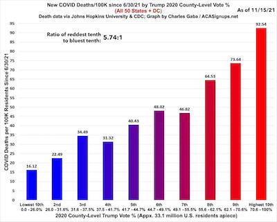
 Next, let’s look at COVID death rates in a simple bar chart [2]:
divide up the counties into deciles by % Trump vote, then plot the death rate per 100,000
for each. Color them by voting status, and observe the trend:
- Again, the very strong correlation of high Republican votes associated with high death rates! Honestly, I thought people who used phrases like “GOP death cult” were exaggerating, but now it’s just the literal truth.
- And it’s not a small effect: the reddest decile has a 5.74x higher death rate than the bluest decile. I’m happy to live in the bluest decile, but horrified at the self-inflicted wounds in the red areas. It doesn’t have to be that way!
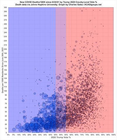
 Finally, and most devastatingly, consider the vax rate scatterplot above, but now redo it
wit the COVID-19 death rate. [3] These data are through
2021-Nov-12:
- There’s a brutal trend, nonlinearly increasing upward very fast, of death rates with Trump voters. It’s even worse than the vax rates!
- As the trend is nonlinear, a linear regression or use of Pearson correlation is likely inappropriate. Quantile regression would have worked, as would a Spearman rank-order correlation. (Hint, hint.)
- The geographic separation into blue cities and red small towns/rural areas is confirmed.
The Weekend Conclusion
Being Republican is hazardous to your health. And your neighbor’s health.
Notes & References
1: C Gaba, “Weekly Update: U.S. #COVID19 Vaccination Levels By COUNTY & Trump 2020 Vote”, ACASignups.net blog, 2021-Nov-15. ↩
2: C Gaba, “Weekly Update: #COVID19 Case/Death Rates By County, Partisan Lean & Vaccination Rate”, ACASignups.net blog, 2021-Nov-15. ↩
3: C Gaba, “America 2021 in one image”, Twitter, 2021-Nov-13. ↩

Gestae Commentaria
Try using the logarithm of the death rate instead – I guess it’d become much closer to linear
Absolutely. Sure does look like that, doesn’t it?
I was actually thinking of a Box-Cox transformation, one special case of which is a log transform. Then optimize for the $\chi^2$ of a linear fit to choose the optimal parameter in the B-C transform.
Also, sometimes it’s useful to do a rank parametric statistic on the untransformed data, to be sure any result is not an artifact of transformation. So that’s why I wanted a Spearman correlation.
But it seems Gaba hasn’t released the raw data. Given how hard it is to collect, he may not want to. I guess I could ask him.