It's Always Been 2 Americas for COVID-19
Tagged:COVID
/
JournalClub
/
MathInTheNews
/
PharmaAndBiotech
/
Politics
/
Sadness
COVID-19 has brought to light a lot of disparities in the US. Today’s scientific paper is about just how certainly we know the Trumpy parts of the country, especially the South, were COVID-19 disasters: hundreds of thousands of excess deaths due to mask defiance, vaccine refusal, and malign conservative disinformation.
Source material
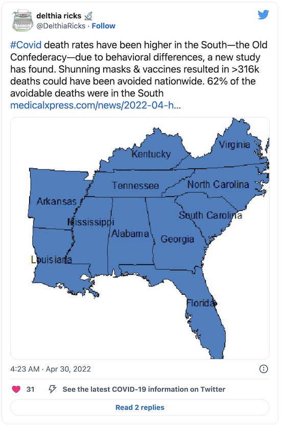
The choice of paper for today’s JournalClub started with a tweet. I don’t use Twitter, nor do I tolerate much about it. (I hear some unpleasant rich dudebro bought it. But I hated Twitter before it was fashionable to hate Twitter! Just a fashion-forward curmudgeon, that’s me.) Still, somebody saw the tweet, pointed somebody else at it, who then pointed me at it.
And so, here we are, as all the existentialists say.
(Or: “And so it goes”, in the malebolge of social media.)
That certainly sounds interesting, and indeed in line with some of our own work on state-level voting patterns and vaccine uptake as well as the spectacular county-level data analyzed by Charles Gaba. But now we’re talking peer-reviewed scientific journal papers, use of excess mortality instead of wildly inaccurate/delayed death reports, and all that. What’s the source?
 The tweet itself points us at a short article in Medical Xpress [1],
which frankly reads more like a press release from the Georgetown University Medical
Center. I mean, it’s not exactly wrong, but it is cheerleading.
Fortunately they planted enough clues (though not a URL!) to track down the article in PLoS ONE by a crew from Georgetown. [2]
(Disclosure: Once upon a time, I was a referee who peer-reviewed a couple papers in PLoS ONE. But it was only a couple times, and it was almost 2 decades ago. Can you forgive me?)
Let’s look through the paper!
A read-through of the paper
The general situation is, appropriately enough, summarized in the abstract of the paper:
- Using excess mortality (all-cause deaths observed, minus expected deaths from something like a 10 year trailing average) gets around the problems with delayed reports, death certificate shenanigans, and so on. Whatever’s different this year from the trailing 10 year average is a suspicious factor for causative analysis. Like, maybe… COVID-19?
- Their excess mortality model says there were 895,693 excess deaths attributable to COVID-19 from
2020-Jan-03 through 2021-Sep-26.
- That’s 26% more than the officially reported COVID-19 deaths, i.e., COVID-19 deaths are woefully under-reported.
- The Northeast was most honest about reporting COVID-19 deaths (reports more or less match excess mortality), and the South was the worst (COVID-19 severely under-reported compared to excess mortality).
- Initially, there were a lot of deaths in the Northeast, but that was when the virus was new & unknown, and there were no vaccines. Once enough was known, the Northeast improved but the South had the most deaths: 48% of deaths, with only 38% of the population.
- The Northeast’s death rate was 42% lower than the nation, while the South’s was 26% higher.
- Subtracting off the excess mortality of the best-performing region (the Northeast) leads
to an estimate of “avoidable” deaths, if each region had used masks and vaccinated like
the Northeast.
- There were 316,234 avoidable deaths (270 per 100,000 population).
- 62% of those were in the South.
- The authors used pre-defined census regions, to avoid any suspicion that they were fishing for a result by isolating high-performance and low-performance areas to exaggerate differences.
There’s a lot of technique behind the paper, only glancingly mentioned in the text.
For example, they used “Farrington surveillance algorithms, which use over-dispersed Poisson generalized linear models with spline terms to model trends in counts, accounting for seasonality,” but sadly showed no equations in the paper itself. I’m not going to dive into the math behind that just to guess at what they might have done, so instead I’ll just spot them the usual credit for having cleaned up their data appropriately, with standard algorithms.
Their references are also fascinating, such as how exactly they sourced their excess mortality data from the CDC. I won’t go into that here, but if you’re a data junkie (and you know who you are!) then this is a good paper to mine.
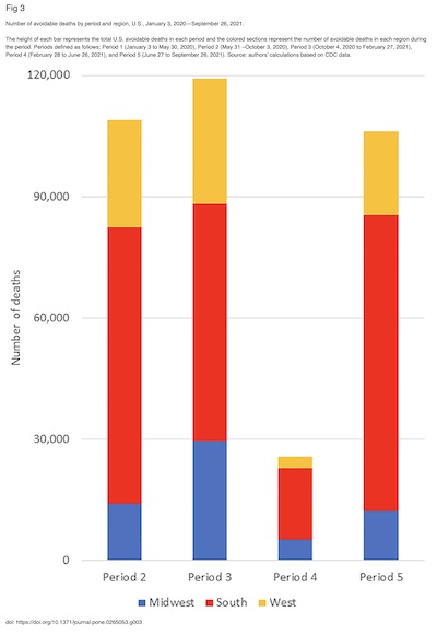 Now let’s have a look at their figures, reproduced here. (Click to embiggen.)
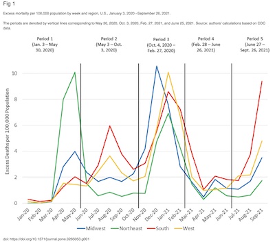
- Figure 1 shows excess mortality per 100,000 population vs time, color coding each of the
4 census districts.
- Previously, when we did regression of hospitalization and death rates on wastewater viral mRNA, we found that each wave was sui generis. These authors have found more or less the same thing, and thus have divided up the study period into 5 periods for separate analysis.
- Note that the first wave was before vaccines, and really before we understood much about how SARS-CoV2 is transmitted or how to treat it. Nothing much could be done then. That’s when the Northeast looked pretty bad, mostly because we had more contact with the outside world and just got it first.
- But after that, once the pandemic had spread to the South, they were consistently either the worst or second worst in terms of excess mortality.
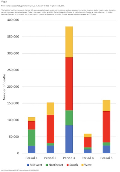
- Figure 2 breaks down the time course of Figure 1 into total deaths by census region and 5 periods. Note that in each bar after the first, the red band for the South is the largest.
- Figure 3, to me, is the real meat of the matter. It’s all about the amount of
avoidable mortality (honestly reported COVID-19 deaths minus the Northeast) that is avoidable
via better policy.
- Period 1 was the start of the pandemic before we knew how it was transmitted, how to treat the infection, or had any vaccines. They viewed none of the excess mortality there as avoidable. We were still figuring it out. (However, they did later do a rudimentary sensitivity analysis using period 1, but I’ll leave it to those interested to read the paper to find out the details. Basically, it worked.)
- For periods 2 - 5, they could identify the best-performing region (it was always the Northeast) and subtract that from the excess mortality for the other regions. Presumably if other regions had followed the policies of the best-performing region, they could have reduced their excess mortality to similar levels.
- Here it becomes really obvious: the South had enormous levels of avoidable excess mortality!
While the authors wisely (and delicately) refrained from attributing this difference to anything in particular, surely we all cannot help but notice the rampant disinformation, denial that COVID-19 is real, mask defiance, and vaccine refusal as possible causes.
- A follow-on analysis would use this “avoidable excess mortality” as a dependent variable in some sort of predictive regression model.
- The prediction covariates, the independent variables, would be degree of mask compliance, degree of vaccination, whether schools were shifted to remote learning, etc.
- An honest version of such a model would also include confounding factors like age distribution, income, and education where the South is “different”. Regressing on those as well would (partially) control for their effects.
- A LASSO model would help in objective feature selection.
The Weekend Conclusion
You might, with some reason, accuse me of being a proud New Englander. The Northeast is my home, for 45+ years now. I am happy to live here. As a card-carrying member of the classic “liberal intellectual East Coast elite”, I’m not particularly happy about the South and its politics. But I do not want those people to die!
Add up the butcher’s bill: 316,234 avoidable deaths, 62% of which were in the South. That’s 316,234 * 0.62 = 196,065 dead Southerners, victims of their malign conservative governments and outright disinformation & superstition. 196,065 Southerners would have lived and not died, had their governments only encouraged the COVID-19 policies of the Northeast.
Add to that the rampant under-reporting of COVID-19 deaths in the South, as evidenced by the excess mortality model’s higher numbers than the deaths “officially” reported as COVID-19.
The conservative policies of the South and other red areas of the US killed their own citizens. And then their institutions lied about it, by under-reporting COVID-19 deaths.
I may not love the South, and Southerners may not love me. But nobody deserves that! (Hey, quiz question: if a political party murders your cohort and then lies to you about it, should you respect them and vote for them?)
I love Southerners enough that I want them to live, and not die.
Notes & References
1: Georgetown University Medical Center, “Higher COVID-19 death rates in the southern U.S. due to behavior differences”, Medical Xpress, 2022-Apr-28. ↩
2: M Stoto, S Schlageter, JD Kraemer, “COVID-19 mortality in the United States: It’s been two Americas from the start”, PLoS ONE 17:4, e0265053, 2022-Apr-28. DOI: 10.1371/journal.pone.0265053.
There’s also my personal marked-up PDF, if for some reason you’re curious about what I highlighted on my first read-through. ↩

Gestae Commentaria
Comments for this post are closed pending repair of the comment system, but the Email/Twitter/Mastodon icons at page-top always work.