
American Revealed Preferences, According to Markets
Tagged:ArtificialIntelligence
/
CorporateLifeAndItsDiscontents
/
Investing
/
Politics
/
Sadness
What do markets reveal about American cultural preferences and priorities?
Revealed Preferences
How can we know what people really think?
It’s a hard problem. People will sometimes refuse to answer. Sometimes they’ll engage in varying degrees of lying, by telling you what they think you want to know or what will make them look good. This is one of the banes of political scientists designing polls, sociologists designing experiments, and psychologists pleading with therapy clients to be truthful. It takes a lot for a therapist to establish a safe, non-judgmental environment.
 There’s a line, attributed approximately to CS Lewis, in
the 1993 movie Shadowlands
(sentimental but watchable… mostly), about understanding literature:
There’s a line, attributed approximately to CS Lewis, in
the 1993 movie Shadowlands
(sentimental but watchable… mostly), about understanding literature:
Aristotle said plot is character, forget psychology.
Forget the inside of men’s heads, judge them by their actions.
Now, I’m not much on Lewis personally, though I do know a Lewis scholar who is always an interesting listen. But I’ve always been fascinated by this idea, because it cuts through all the untestable theories of what a character might be thinking, and concentrates on observables. This gratifies the flinty heart of a grizzled old physicist and statistician. It’s so much cleaner than the pseudo-psychological theories I was (mis-)taught as an undergrad!
 In economics, there’s — surprise! — a similar principle, called
revealed preferences, invented by
(Nobel laureate) economist Paul Samuelson in 1938. Never mind what people tell you they
want; watch what they do. In the case of economics, this amounts to how they spend
their time and money. Markets can reveal a great deal about a population, based on what
people choose, when they are free to do so.
In economics, there’s — surprise! — a similar principle, called
revealed preferences, invented by
(Nobel laureate) economist Paul Samuelson in 1938. Never mind what people tell you they
want; watch what they do. In the case of economics, this amounts to how they spend
their time and money. Markets can reveal a great deal about a population, based on what
people choose, when they are free to do so.
(Though we should more often discuss the forces limiting what they can choose. Most Americans at this point would choose single-payer universal health care, but that’s never allowed to be a choice. Universal Basic Income works every single time it’s been tried, but it is always pushed away suspiciously by the wealthy and powerful.)
But limitations and availability biases of market choices notwithstanding, let’s look at what our markets have to say about the US in the first part of the 21st century.
Alas, it is not pretty.
What Our Markets Say About Us
Let’s look in turn at what we work to make cheaper, who gets paid for that & how much they get paid over others, what mostly makes up our stock markets now, and where job growth has been recently.
What We Work to Make Cheaper
We’ve written before [1] about the chart below from — of all places! — the American Enterprise Institute. [2] As I said before:
Let’s get this out of the way first: I despise the American Enterprise Institute. They’re a hard-right think-tank, issuing mostly propaganda papers that undermine anything like sensible policies in health care, equality… You name it, if I’m for it they’re guaranteed to be against it with some plausible-sounding reason that facile, glib, and evil.
So it’s doubly important for me to note when I agree with them, because that’s a point sharply made.
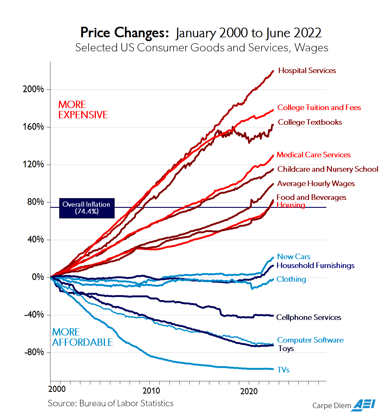 In this case, we’re looking at prices of various goods over time, over a 22 year period.
The vertical axis is a percent change from baseline. (This ignores the important effect
of the hedonic treadmill, in which
better goods become available, or goods become so much better, that they are simply
incomparable with the past.)
In this case, we’re looking at prices of various goods over time, over a 22 year period.
The vertical axis is a percent change from baseline. (This ignores the important effect
of the hedonic treadmill, in which
better goods become available, or goods become so much better, that they are simply
incomparable with the past.)
But note that the blue curves, which have gotten cheaper, are largely physical goods that are mostly luxuries. The red curves are mostly services like health care, child care, education, and so on. They are necessities.
So we have an economy which can work to make things better, but which mostly concentrates on luxuries. The necessities get increasingly out of reach. The AEI will moan loudly, complaining about some pernicious nonsense like the evils of socialism. I, on the other hand, moan equally loudly about the pernicious effects of catering to the desires of the wealthy (in the words of bank robber Willie Sutton: “Because that’s where the money is.”).
There’s something else going on here about trade, because many of the cheaper goods are tradeable and thus get their prices competed down in world markets. But we’ve tried pretty hard to dismantle that with tariffs.
So the conclusion seems to be: the rich can always afford the necessities but care little whether the poor can do so, with the result that we value luxuries over necessities.
To Whom the Spoils Go
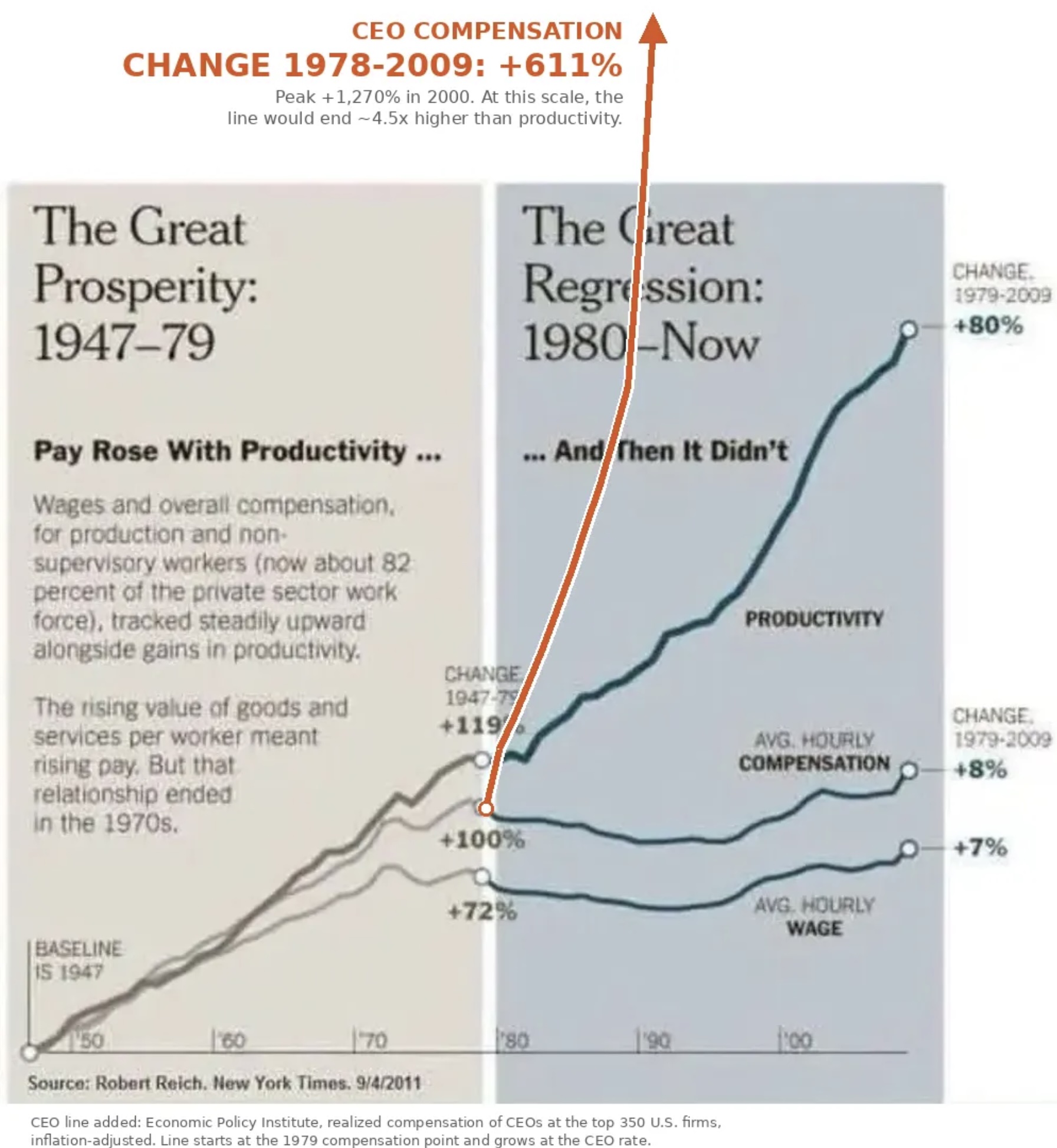 The graph shown here, from former labor secretary and professor of public policy Robert
Reich, shows a plot of wages and productivity versus time, from 1950 – 2010 or so.
The vertical axis shows growth rates of each. Note the huge divergence which began
roughly at the time of Reagan’s instituting conservative economic policies:
The graph shown here, from former labor secretary and professor of public policy Robert
Reich, shows a plot of wages and productivity versus time, from 1950 – 2010 or so.
The vertical axis shows growth rates of each. Note the huge divergence which began
roughly at the time of Reagan’s instituting conservative economic policies:
- Worker productivity continued to grow, partly because of automation, computers, and telecommunications. It reached 80% growth at the end of the period.
- However, pay initially kept track with productivity — you were paid for what you produced — but only until Reagan. After Reagan wages were basically flat, while productivity kept going up.
In other words, under the policies begun in 1980, the rewards for productivity went to management and stockholders, not to employees.
Some wag has added a red curve, showing CEO compensation. It had an offscale 611% growth! So yes, profit from increased productivity went to management, but mostly to upper management in the C-suites.
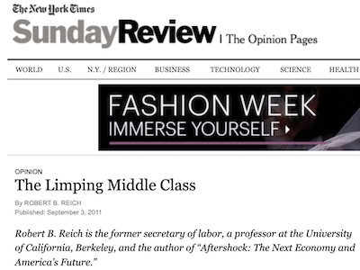
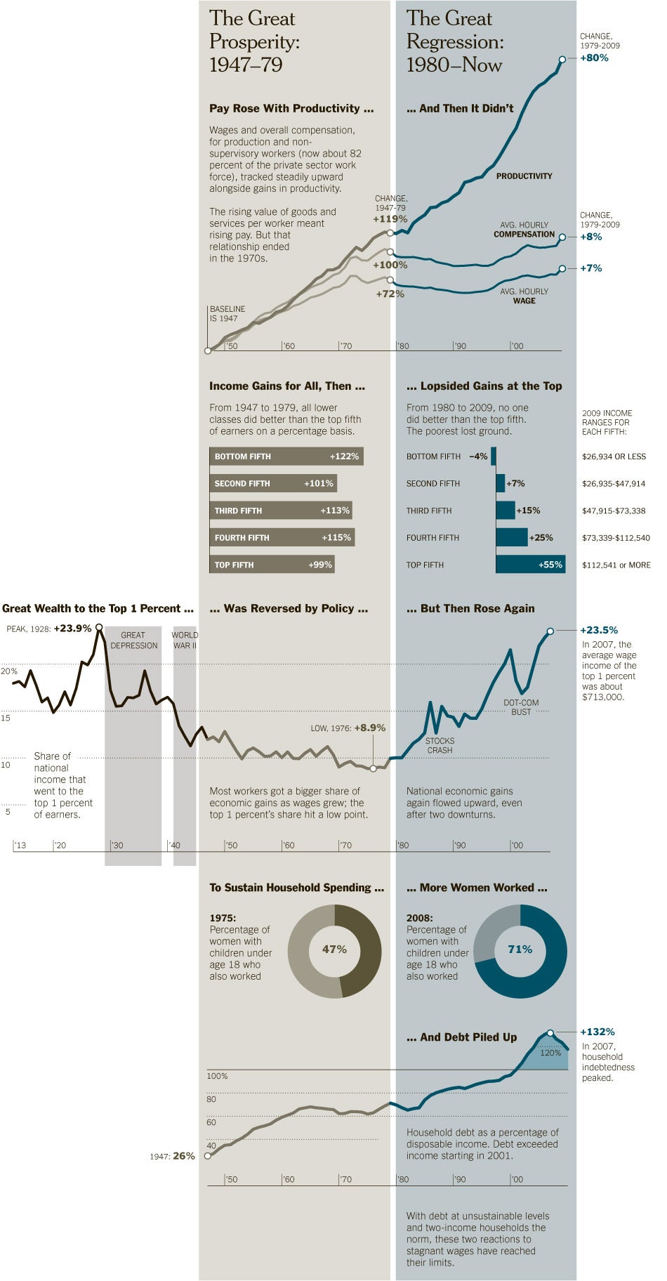
 Let’s dig in a bit here. The original source is an article by Reich in the New York Times
in 2011. [3] From that source, we can retrieve the full
version of the original plot, which has considerably more information as shown here (click
to embiggen!).
Let’s dig in a bit here. The original source is an article by Reich in the New York Times
in 2011. [3] From that source, we can retrieve the full
version of the original plot, which has considerably more information as shown here (click
to embiggen!).
There is more here than in the simple plot being circulated:
- A histogram shows income gains across the quintiles of earners, before and after 1980.
- Before 1980, the gains were pretty equally shared. Each quintile got a roughly equal boost in income, percentage-wise. On an absolute basis, this still means most of the gains go to the top, since a percent of their larger incomes means more money than at the bottom. But it’s still roughly fair on a percentage basis.
- But after 1980, the gains are not only steeply biased to the top quintile, the bottom quintile actually lost money. We were so enthusiastic about rewarding the already rich that we penalized the poor.
- Next is a graph over time of the share of wealth going to the top 1%.
- In the early 20th century, the term “Gilded Age” was invented to describe the opulent wealth at the top, and the reverse for the rest of us.
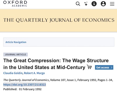
- Beginning in the 1930s, the New Deal policies began to reverse this. Economists Claudia Goldin & Robert Margo called the mid-20th century the “Great Compression” [4], because of the way the remedies for the Depression compressed the income bands.
- But in 1980 when those policies were weakened, our wealthy and powerful immediately yanked the economy back into their service, directing most income gains to the top again. Apparently, they feel economic aristocracy is the natural state of humanity, irrespective of everyone else’s opinions on the matter of their own lives.
- The last piece is an interesting commentary on women’s entry to the work force. While there is a great deal to the idea that admitting women to the work force was a result of their laudable empowerment, there is also an economic argument. Given stagnant wages and the relentless increase of costs for necessities like housing, health care, child care, and education, people were economically forced into two-income status. And yet… prices kept up and debt increased.
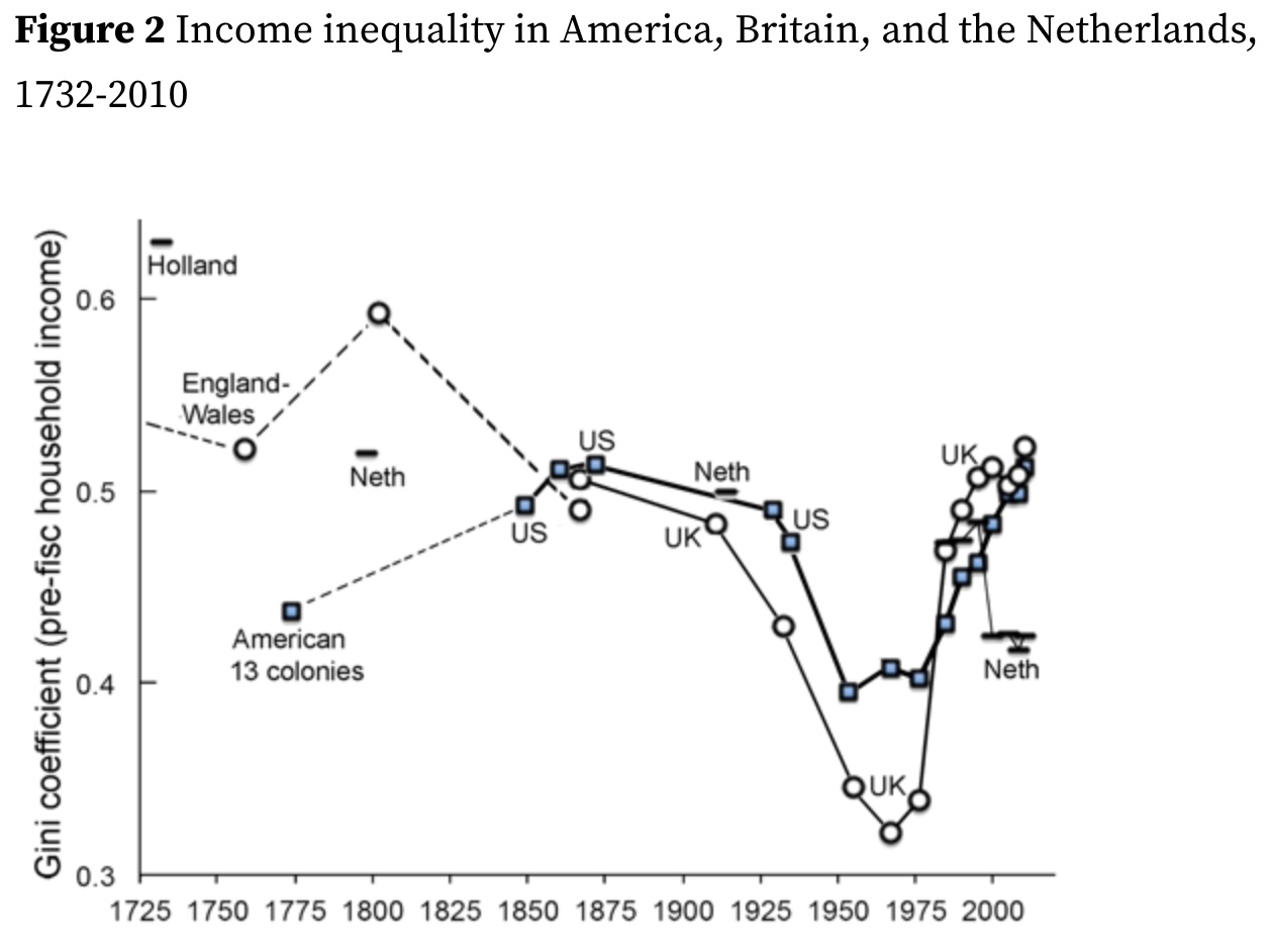 This very much reminds me of the Gini coefficient
about which we’ve previously written. [5] The Gini
coefficient measures wealth inequality in a certain precise way. The plot here, from CEPR,
shows the US & UK measurements since the mid-1800s, along with some historical
estimates. It’s brutally clear that the mid-20th century policies like the New Deal led
to a much fairer economy, as well as the post-war boom. It’s also clear that beginning
about 1980, we abandoned those policies in favor of the rich.
This very much reminds me of the Gini coefficient
about which we’ve previously written. [5] The Gini
coefficient measures wealth inequality in a certain precise way. The plot here, from CEPR,
shows the US & UK measurements since the mid-1800s, along with some historical
estimates. It’s brutally clear that the mid-20th century policies like the New Deal led
to a much fairer economy, as well as the post-war boom. It’s also clear that beginning
about 1980, we abandoned those policies in favor of the rich.
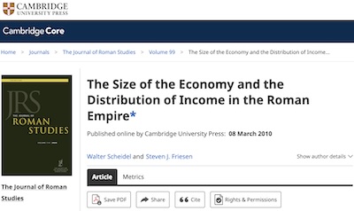 Looking back at that blog post, I remembered how shocking it was to hear that our present
inequality is apparently comparable to that of the Roman empire [6],
with its patricians and slaves! In fact, or inequality is not comparable, it is
worse: Rome was estimated by Scheidel & Friesen at a Gini of 0.42 – 0.44,
while we are now at about 0.5.
Looking back at that blog post, I remembered how shocking it was to hear that our present
inequality is apparently comparable to that of the Roman empire [6],
with its patricians and slaves! In fact, or inequality is not comparable, it is
worse: Rome was estimated by Scheidel & Friesen at a Gini of 0.42 – 0.44,
while we are now at about 0.5.
We are now more unequal than the Roman Empire. That is a revealed preference: unless legally forced otherwise, we enable a class of wealthy aristocrats.
What Makes Up Our Stock Markets Now
If you’re an incorrigible reader of this Crummy Little Blog That Nobody Reads (CLBTNR), then you know that we’ve been making our investments in the Weekend Portfolio more and more defensive over time (e.g., [7] and previous referenced posts).
One of the things that’s driven me to become more of a capital preservation investor is the concentration of the US stock market into Big Tech, mostly AI, companies to a degree that is utter madness (even beyond the madness of thinking LLMs are a good idea). So we’ve heavily invested outside the US, biased toward small value companies, and have a whacking lot of bonds both in the US and internationally.
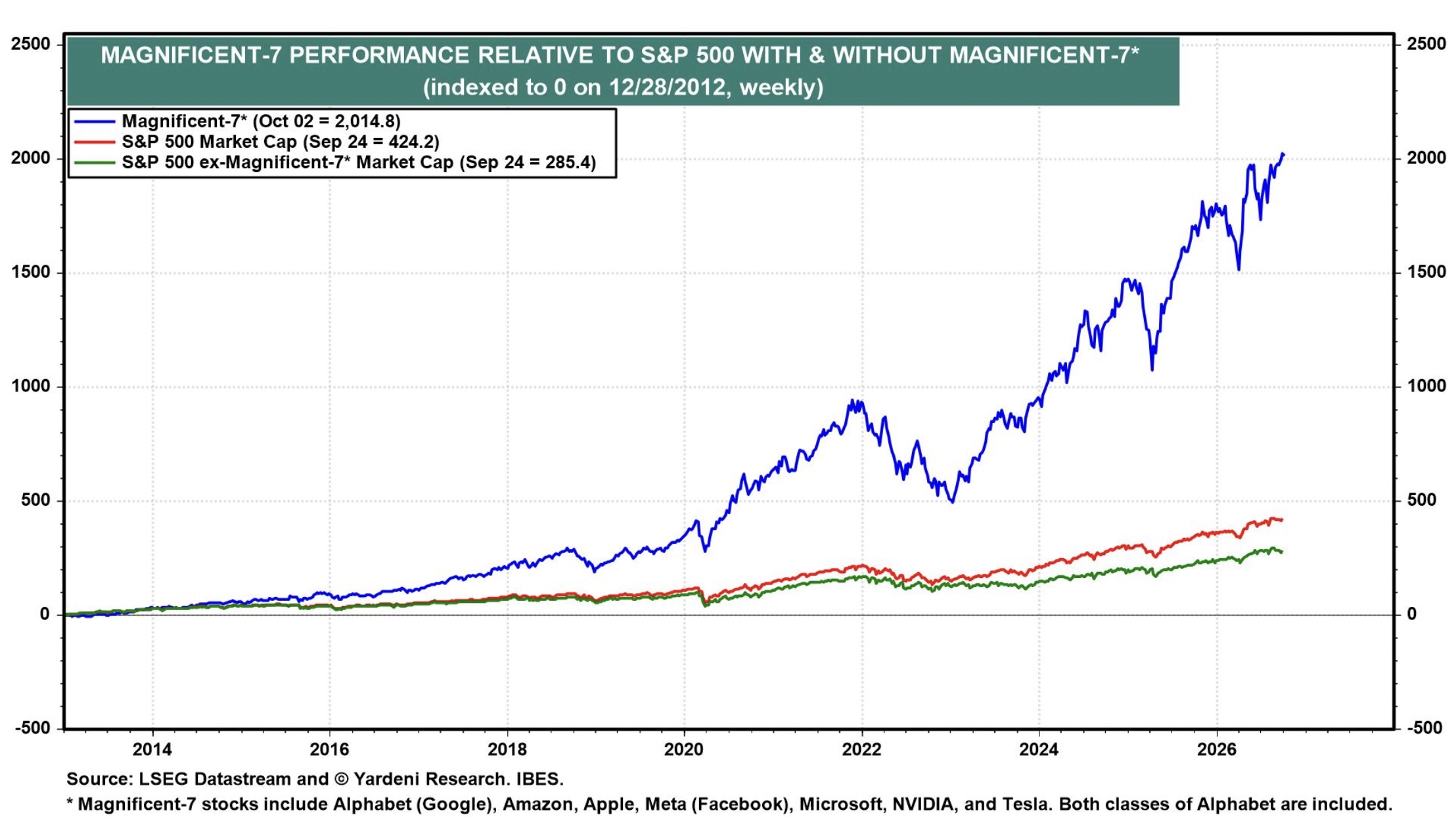 Does that make sense? Consider
the plot here,
from
economist Ed Yardeni, has the goods:
Does that make sense? Consider
the plot here,
from
economist Ed Yardeni, has the goods:
- The horizontal axis is time from 2013 to mid-2026.
- The vertical axis shows the market capitalization of various subsets of the US market. They have all been “scaled” to be 0 at the start of 2013. (Which makes no sense to this grizzled old statistician: scaling should be a normalization resulting in starting at 1. But… ok. Let’s take him at his word that he’s somehow make everything start at the same place.
- The 3 curves show the S&P500 (about the top 70% of the US market by market capitalization), the “Magnificent 7” (big tech, mostly AI stocks), and the S&P without those 7 stocks.
The clear message is that almost all the growth in the last 13 or so years has been very concentrated in those very few bets on AI and tech. By more than 4 to 1, in fact! This is, in a word, madness: we are pursuing wealth not by creating valuable goods and services, but by taking bets on a bubble and hoping to get out before it bursts.
Quite a revealed preference, no?

 Let’s check with another source.
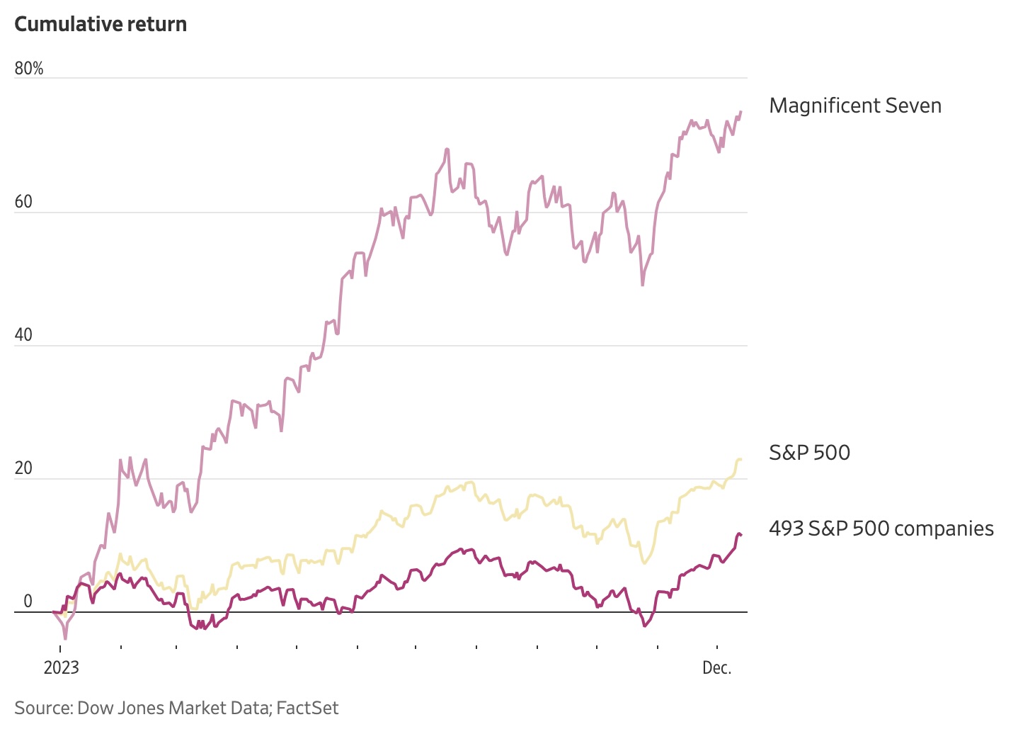
Hardika Singh, writing in the Wall Street Journal a couple years ago [8], produced this plot. She’s using Dow Jones datasets instead of whatever Yardeni used, and is looking over a slightly different time period. Also, she’s measuring cumulative return (which I like a bit better as a metric).
But her conclusion is unchallengable: almost all the growth in the US stock market has been due to the Magnificent 7, despite their continual loss of money on their AI investments.
We are perched upon a precipice.
Where Job Growth Has Happened, and What We’re About to Cut
Finally, let’s look at job growth.
This is from Australian-American economics professor at Michigan, Justin Wolfers:
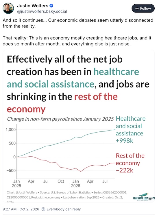
Now, look carefully: almost all the US jobs growth in the last year has been in health care and social services. The rest of the economy is shrinking.
Republicans, in their wisdom, passed some trillion-dollar cuts in Medicare and Medicaid. In typically cowardly fashion, they are scheduled to take effect only after the upcoming elections, so if Democrats are elected they can be blamed. We are also eliminating the education pathways that lead to those careers, as in declaring that nursing is not a profession so it’s ineligible for financial aid for nursing students.
The Weekend Conclusion
Our revealed preferences say that we cling desperately to some rather nasty values. Presently, that will bite us.
(Ceterum censeo, Trump incarceranda est!)
(Et ceterum censeo, index Epsteiniani divulganda est!)
Notes & References
1: Weekend Editor, “US Social Priorities, in 1 Chart”, Some Weekend Reading blog, 2026-Jan-16. ↩
2: MJ Perry, “Chart of the Day… or Century?”, Carpe Diem blog at the American Enterprise Institute, 2022-Jul-23. ↩
3: RB Reich, “The Limping Middle Class”, New York Times Sunday Opinion section, 2011-Sep-04. NB: Regrettably paywalled, but the usual archival sites work.
NB${\,}^{\mathbf{2}}$: The date on the byline is 2011-Sep-03, the date on the times header is 2011-Sep-04, and the date on the image is 2011-Sep-06. Probably just archival bookkeeping problems at the NYT. ↩
4: C Goldin & R Margo, “The Great Compression: The Wage Structure in the United States at Mid-century”, Qrtly Jnl Econ 107:1, 1992-Feb-01, pp. 1-34. DOI: 10.2307/2118322.
NB: To avoid a regrettable paywall, the link above is to a working paper version, NBER Working Paper #3817. ↩
5: Weekend Editor, “On Inequality & Cornering Markets in Times Ancient & Modern”, Some Weekend Reading blog, 2025-Dec-07.↩
6: W Scheidel & SJ Friesen, “The Size of the Economy and the Distribution of Income in the Roman Empire”, Jnl Roman Studies 99, 2009-Nov. DOI: 10.3815/007543509789745223. ↩
7: Weekend Editor, “Defending the Weekend Portfolio Even Moref”, Some Weekend Reading blog, 2026-Feb-07. ↩
8: H Singh, “It’s the Magnificent Seven’s Market. The Other Stocks Are Just Living in It.”, Wall Street Journal, 2023-Dec-17. NB: Regrettably paywalled, but the usual archival sites work. ↩
Gestae Commentaria
Comments for this post are closed pending repair of the comment system, but the Email/Twitter/Mastodon icons at page-top always work.