US Social Priorities, in 1 Chart
Tagged:CorporateLifeAndItsDiscontents
/
Politics
/
Religion
/
Sadness
Do our commitments of money & time reveal our priorities as a society?
Our Priorities
I’ve forgotten who told me this, years ago. It was something like: “Show me where you spend your money and your time, and I’ll tell you what your priorities are.” I both love and hate that saying. On the one hand, it invites introspection about how well one lives ones values. On the other hand, it strongly invites guilt in someone like me prone to depression, anxiety, and excessive scrupulosity.
Still, it seems like we ought to be able to do something like that society-wide: do our social priorities reveal our values?
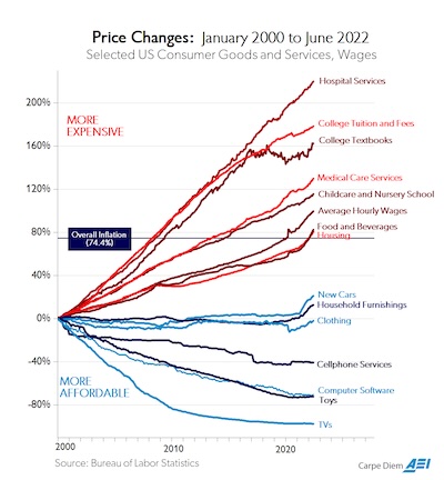
 This graph [1] was prepared by Mark J Perry, of the American
Enterprise Institute. Let’s get this out of the way first: I despise the American
Enterprise Institute. They’re a hard-right think-tank, issuing mostly propaganda papers
that undermine anything like sensible policies in health care, equality, … You
name it, if I’m for it they’re guaranteed to be against it with some plausible-sounding
reason that facile, glib, and evil.
I say this so you will take me seriously when I say this graph captures… something… important about the American zeitgeist.
- The horizontal axis is time in years, 2000-Jan to 2022-Jun, so 22 years.
- The vertical axis is the relative change in price over that time.
- Each curve is for a particular type of goods & services.
- The red curves have increased more than inflation; the blue curves have increased less, or even dramatically decreased.
NB: There’s a bit of wool being pulled over your eyes here, sometimes called the hedonic treadmill. That says the nature of goods changes over time, usually for the better. We become accustomed to that improvement, and often erroneously project it into the past. A car from the 2000 model year is not the same as a care from the 2022 model year!
Most consumer electronics are like this, due to rapid change. Other things are like this too, such as health care: you’d much rather have a cancer diagnosis in 2022 than in 2000, because we can help you a lot better now! So you might expect health care to be more expensive, but then why do you expect consumer electronics to go the other way?
So we shouldn’t take this as absolute truth, and extending it to longer time periods would probably be even more misleading. But for 22 years, let’s think about where prices increased with inflation and where they decreased, and why.
The thing to note is the nature of the goods and services on the red and blue trajectories.
- The blue curves – stuff that’s gotten cheaper in real terms – are mostly physical goods, and in some cases luxury goods.
- The red curves are largely services, like health care, child care, and higher education.
Now, there can be many reasons for that rather dramatic divide.
-
The AEI folk will rant endlessly and senselessly about ‘socialism’, claiming that government intervention in health care caused the price increase.
This is, of course, pernicious nonsense. Western European countries are far more credibly social democratic in their universal health care polices, and they do not see this kind of price increase while seeing better health care outcomes than the US.
Far more likely is that the price rise is the product of a large number of private entities each seeking ‘their share’ of the large flow of health care money. Look at an itemized health care bill in the US sometime: do you even recognize some of the entities demanding a share of your insurance payment? I often do not!
-
A somewhat more likely interpretation is that the services are mostly not tradeable, whereas the physical goods are largely tradeable. The graph covers a time period when there was a lot of relatively tariff-free trade, and thus pricing pressure on manufacturers to be at least as good as the imported stuff.
Of course, in the US we’ve dismantled that world with the Trumpian tariffs, military violence, kidnappings domestic & foreign, and general bombast. Perhaps in the future we will see the blue curves rise sharply with the impairment of international trade? Or will we see all the curves collapse in a deflationary disaster, like the last time we shut down global trade in the Great Depression?
-
But the most likely interpretation, to my non-economist intuition, is that this chart shows us what we care about the most.
To our blame:
- We value luxury goods like TVs, computers, and cars a lot, but…
- We do not value social goods that improve the lives of all of us, like health care, education, child care, clean air & water, and cheap, nutritious food.
To the extent that this shows us where we spend our time & money making things better, this is a moral insight into the flawed nature of our society.
The Weekend Conclusion
We know better, but we are sadly reluctant to do better.
So let us encourage each other to do better.
I can do better. So can you.
(Ceterum censeo, Trump incarcerandam esse.)
Notes & References
1: MJ Perry, “Chart of the Day… or Century?”, Carpe Diem blog at the American Enterprise Institute, 2022-Jul-23. ↩

Gestae Commentaria
Comments for this post are closed pending repair of the comment system, but the Email/Twitter/Mastodon icons at page-top always work.