COVID-19: Officially 1 Million US Dead
Tagged:COVID
/
MathInTheNews
/
PharmaAndBiotech
/
Politics
/
Sadness
/
Statistics
[Tone warning: Angry post.] We reached yesterday a grim and disgraceful milestone in the US, having at least 1 million COVID-19 dead. And that’s just the official count.
Cumulative COVID-19 deaths around the world

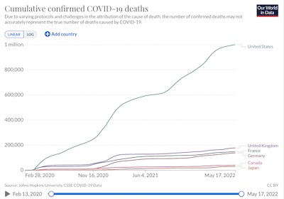 From Our World in Data comes the terrible news that the
US now has ≥ 1 million official COVID-19 deaths. [1]
(They repackage and visualize the excellent COVID-19 data sourced from Johns Hopkins
University.) Shown here is the time course of cumulative deaths officially assigned to COVID-19 for
the US and several comparably developed nations. (You can fiddle with the plot at
Our World in Data to choose which countries to include.) Some curious facts to note:
- The US is dramatically higher. Indeed, a bit of fiddling about on the Our World in Data reveals that the world has a total of a bit over 6 million official COVID-19 deaths compared to the US at 1 million. Think it through: the US has 4.25% of the world population, but 16% of the world official COVID-19 deaths. We have 4x the death rate we should, if we had even vaguely sensible public health policy comparable to the rest of the world.
- Most of the rest of the developed world clusters together; the US is clearly an outlier, and not in a good way.
Cumulative COVID-19 deaths, per million, around the world
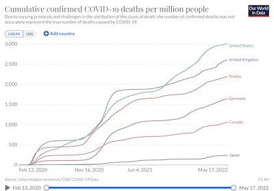 Now, you might argue that this should be scaled by population: since the US has more
people than Japan, of course there are more deaths in the US, right?
Not really. Here are the cumulative deaths per million for the same countries, from the same source at Our World in Data. While you might argue it’s not quite as awful, 2 brute force facts remain:
- The US is still the worst case.
- In comparison to Japan, where masking was never an issue, the US is more than 10x worse. Having sane public health policy and the ability to follow it is a survival matter.
At the beginning of the pandemic, the Weekend Editrix had been contemplating a trip to Japan to visit family. Had she taken that trip and gotten stuck in Japan, she’d have been far safer than by remaining here in the US. (There would have been other issues, like lapse of visa. Other issues can be fixed; dying of COVID-19 could not. So the trade-off might have favored evacuating her to Japan if we’d known all this. Fortunately, we could isolate pretty well and got through it in the US quite well so far.)
Excess mortality: How do we know it’s about COVID-19?
We emphasize the above are official deaths, because of the politicized crap dropped on the subject by the right-wing denialists: “from COVID” vs “with COVID”, insistence on pre-existing conditions, and so on. As a result, official counts are always underestimates.
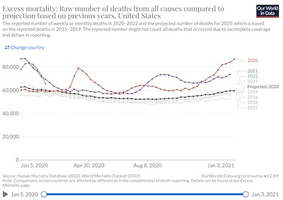 One way to probe a little closer to causality is to use something called the excess mortality
measure. We’d like to know if, by comparing to recent years that are reasonably similar
except for the pandemic, we see differing death rates. If so, then we are at least a
step closer to assigning the excess in deaths to whatever’s different, i.e., COVID-19.
The first plot here, explained at Our World in Data [2], should give you the idea:
- The 5 gray lines at the bottom represent years 2015-2019, showing weekly death rates in the US vs time.
- While there’s some intra-year variation (higher deaths in mid-winter, lower in mid-summer), the point is they are all comparable: this is the “normal” baseline against which we compare the pandemic years.
- The black line at the bottom shows what we would predict for 2020, based on the baseline years of 2015-2019.
- The red, purple, and (short) green lines show the actual death rates for 2020, 2021, and the start of 2022. The point here is that they are different, and much higher than either the prediction for 2020 or the baseline years 2015-2019.
- That excess with respect to baseline is the excess mortality for those years.
- To the extent that the COVID-19 pandemic is the main difference between 2020-2022 vs 2015-2019 (e.g., no major wars directly involving the US) then we can largely attribute the excess mortality to COVID-19.
The advantage of all this foofraw is that it cannot lie: it does not depend on whether a death certificate says “COVID-19” or not, nor does it depend on “with COVID-19” vs “from COVID-19”, nor does it depend on local right-wing governments refusing to report COVID-19 deaths… none of that. It just counts deaths, which are always reported one way or another.
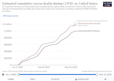 The folks at The Economist have made a machine-learning model to estimate the true
butcher’s bill and its 95% confidence interval in the US (and rest of world,
q.v.). [3] [4]
- It says we probably hit 1 million US COVID-19 deaths late last year, around 2021-Dec-20.
- We now should have around 1.21 million dead (95% CI: 1.17 - 1.32 million). That is, the “official” estimate of 1 million is an understatement by about 21% (possibly as much as 32%). I’d have expected an even larger underestimate, but then I’m a cranky old man.
- Note that this model was last updated 2022-May-08. So while it is reasonably current, it’s not up-to-date as of this exact day.
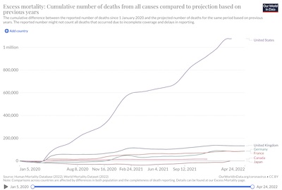 The folks at OWiD did something similar, computing just the central estimate without
confidence intervals, but doing so
for many countries. Plotted here is the number of cumulative deaths for the US (a
depressingly large positive outlier) and the usual developed nations cited above.
- It also says we probably hit 1 million dead in early- to mid-January, roughly comparable to what the model from The Economist predicted above.
- It says we have about a 10% underestimate of US deaths, somewhat more optimistic than The Economist’s model above.
- Note, however, that the excess mortality in Japan is negative: they all became very cautious and adopted near-universal masking. Probably this stopped influenza or something in its tracks along with COVID-19, so they actually have had fewer than expected deaths in the pandemic years.
- I absolutely do not understand the little dip in the US curve at the right-hand end! As a cumulative curve, it must be monotone nondecreasing, so something’s odd there.
- Also note this model was last updated early May, so it’s almost a month or so behind.
Excess mortality & underestimates around the world
So the US has glaring underestimates of COVID-19 deaths, though not as bad as I’d feared.
What about the rest of the world?
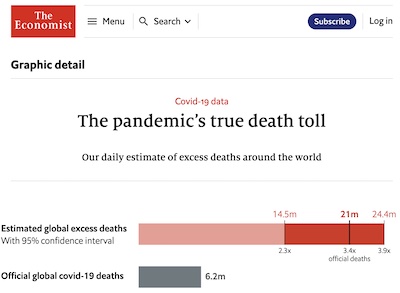
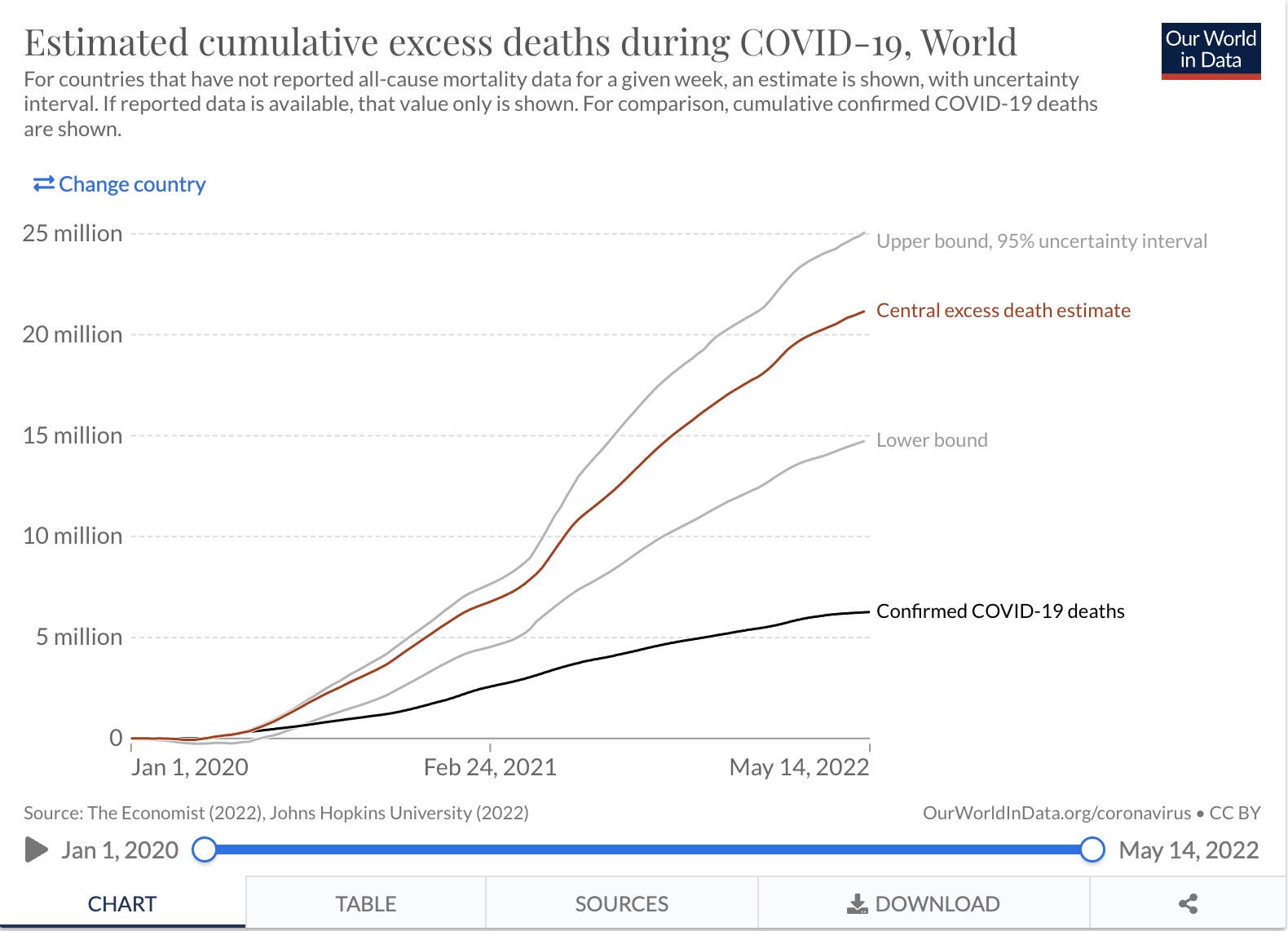 The model from The Economist says:
- Official estimates are only 6.26 million dead world-wide.
- The excess mortality model says around 21.18 million dead (95% CL: 14.74 - 25.07 million)!
- So the official estimates are underestimates by a factor of 3.38 (95% CL: 2.35 - 4.00).
- Note that this model was last updated early in 2022-May when we last checked it. It is quite current, though not this exact day.
The degree of worldwide underestimate of the total deaths here is just stunning.
This may slightly undermine our case above that the US has been uniquely incompetent. Unfortunately, it does not make the US look any better, but just makes everyone else look worse.
These grievous times are not those for which we, or anyone, were hoping. (“Tempus adest dolorum, hoc quod non optibamus”, as the old song most definitely does not go!)
Yeah, but what could we have done?
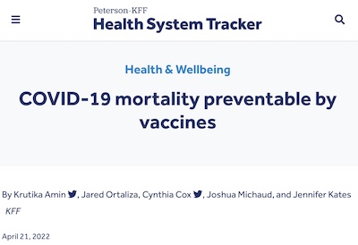
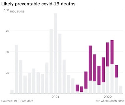
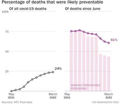 From Philip Bump in the WaPo comes a report that about 1/4 of the million now dead could
have been prevented by vaccination alone. [5] He’s
reporting on an update of some Peterson/KFF research by Amin,
et al. [6]
- The first plot here shows the number of US COVID-19 deaths each month.
- The gray bars, especially in the beginning, are not avoidable with vaccines (mostly because vaccines were then not yet widely available).
- The but when the bars start to turn purple, we have widely available vaccines that were widely refused… and those people became widely dead. Avoidably.
- NB: The rightmost month, 2022-Apr, had incomplete data at the time and is therefore all gray.
- The second plot here shows it gets worse with time: while the overall fraction of preventable deaths is about 25% (including the early months when there was no vaccine), the more recent months are just vile. About 60% of recent deaths were preventable, had people only had the wit to ignore disinformation and get vaccinated!
Bump goes on to point out that this isn’t just the average American bungling of COVID-19. It is very specifically Republican-caused death:
Since this analysis is based on national data, the researchers didn’t break down the number of preventable deaths per state. But we would be remiss if we didn’t note that this phenomenon is not independent of politics.
Over the course of the period during which vaccinations were broadly available, KFF has been assessing the partisan divide in vaccine uptake. There are gaps in the likelihood of being vaccinated by age and race. But the broadest gap seen in KFF’s data is by party. Last November, it estimated that the unvaccinated were three times as likely to be Republican as to be Democrats.
That correlates with where coronavirus deaths are occurring. During the period since September in which the delta and then omicron variants struck, it was consistently counties that voted for President Donald Trump in 2020 that saw more per capita deaths. Lower vaccination, more death.
It is rare that there is a political issue that translates directly into literal death. This is one. Skepticism about vaccination – an impulse stoked opportunistically by Republican politicians such as Rep. Marjorie Taylor Greene (R-Ga.) and right-wing media figures such as Fox News’s Tucker Carlson – suppressed immunization rates among Republicans. More than 200,000 people died without the protection that the vaccines demonstrably offered.
And that’s just with vaccination. Imagine if we had all played by the rules of public health policy: worn masks in public, avoided unforced public gatherings, isolated when testing positive, self-reported cases, and so on.
Spreaders of disinformation have murdered at least a quarter million in the US. Likely more, when you consider the degree to which they’ve undermined other public health measures. Likely more to come, when you consider how they’ve undermined confidence in vaccination against childhood diseases.
So… yeah, we could have done something, but were prevented by malignant right-wing zealots. Like some malignancies, I fear this one may be terminal for American democracy and prosperity.
 I mean, it could be worse: both Eritrea and North Korea have used
no vaccines at all. [7] The Eritreans at least have the
excuse of being continually in a state of near complete meltdown. The North Koreans, on the other
hand, have refused donations of vaccines because they’re continually in a state of near complete
authoritarian insanity. US conservative politics, with its fact-free idolatry of Trump
and his eerily similar authoritarianism, is beginning to resemble North Korean fact-free
idolatry of Kim.
Some perspectives
 Emory Parker, writing at STAT News [8], has attempted to
use public health data to give us a short history of the pandemic in 5 phases. We won’t
go through every detail of his article here, but some highlights are worth reviewing (if
only in order to tempt you to read the whole piece):
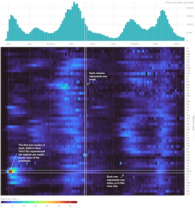
- First is a very informative heatmap.
- At the top is the rate of dying over time. You clearly see the wave structue, and appreciate that winter 2020-2021 was really bad, as were fall 2022 and winter 2021-2022.
- Below that is a color grid: rows are still time (aligned with the death rate plot), and the vertical axis is for each US state (from west to east; I would prefer for them to have been hierarchically clustered – as is customary in heatmaps – to uncover state similarities, but a geographic sort is sort of ok).
- The color in each cell indicates the death rate at that place and time; the color key is at the bottom.
- You can clearly see a number of features:
- The initial peak in early 2020 in NYC is just awful. This inspired several conservative acquaintances of mine to opine, “Those coastal cities are getting slammed” as if it were somehow a liberal problem. The Trump administration actually decided not to act, since the states with other countries didn’t vote for them anyway.
- Then you can see the clear wave structure. Also, you can see why summer 2021 was such a hopeful time, though it turned out to be just a lull between waves.
- Also, some waves didn’t cover the whole country: fall 2021 was primarily in the
conservative west and south, but never made it to the east coast where stringent
public health guidelines were more likely respected.
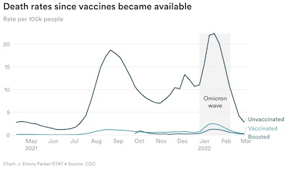
- Next, the point is sharply made that this is a pandemic of the unvaccinated, almost
solely:
- The horizontal axis is, of course, time. The vertical axis is death rates per 100,000 people.
- The 3 curves are for the unvaccinated (high death rate), vaccinated (low death rate), and boosted (very low death rate) populations.
- The dramatic, vivid, and obvious conclusion: the willfully unvaccinated are at fault for almost all deaths since mid-2021, when vaccines became widely available. Remaining unvaccinated is volunteering to die, and attempting to bring down the rest of socieity with you.
In other words: it didn’t have to be this bad, except that we were stupid.
There’s a lot more in Parker’s article, including a subtle point about age groups (COVID-19 didn’t kill as many young people because young people die less frequently from everything, but it did become one of the leading causes of deaths among the young; rural areas resisted vaccination and thus had loads more people dying as a consequence; poverty is a risk factor for everything; US health insurance is terrible; and so on).
His conclusion (emphasis in original):
These five patterns show how SARS-CoV-2 exacted a toll few could have imagined in the spring of 2020. The why of one million is a story of both scientific achievement which saved some lives and of systemic failures which cost far too many. Of heroism and sacrifice beset by distrust and partisanship. Of collective action weighed against individual risk and responsibility.
…
Whether or not we are done with the virus, it seems the virus will do its best to stay with us.


 Finally, a news article by Ewen Callaway in the respected journal Nature [9]
gives us an idea of what’s happening with SARS-CoV2 viral evolution and the resulting COVID-19 surges.
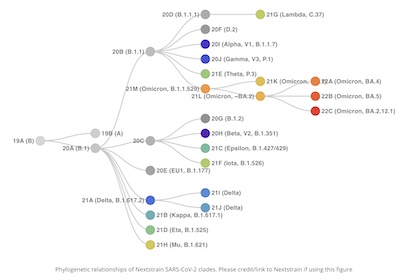
He’s using data from CoVariants/NextStrain [10] to make the
point that viral evolution is happening because not enough people are vaccinated, with the
result that some new strains evolve to cause new waves of misery and death.
The proximate cause of the article is the emergence of the BA.4 and BA.5 strains in South Africa. Where vaccination is low, viral mutations will happen. That’s causing another wave in Africa, which will spread around the world soon.
Why? Because the virus is evolving! Shown here is the cladogram (“family tree”, more or less) of the various more widespread SARS-CoV2 variants. (There are thousands more; these are the ones that got serious notice because they were widespread and threatening.) Time proceeds left to right. The root of the tree on the left is the original Wuhan strain. The rest is mostly our fault for failing containment, public health, and vaccination.
When you see a cladogram like this – frantically growing sideways to be very bushy, then all branches except one dying out – that’s a sign of evolution in action. The bushiness is rapid mutation and formation of new variants. The single surviving line is rapid environmental selection for the “best” spreader (i.e., the “worst” for humanity).
“Think of it as evolution in action.” [11]
The Weekend Conclusion
We should be ashamed, but I doubt we will be. Our capacity for shame has been too severely impaired. One must first have the knowledge of what’s correct, and then acknowledge a fault with respect to that knowledge, in order to experience shame.
The malign influence of conservative politics may have made us too stupid to survive. And so: here we are, dying. More than we can even admit to each other.
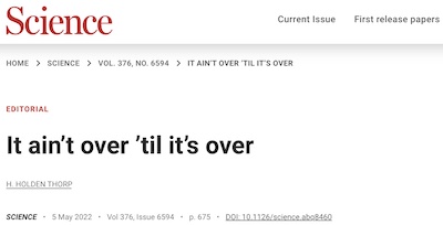 An editorial titled – with grim humor – “It ain’t over ‘til it’s over”, by
Holden Thorp in the respected journal Science [12],
conveys some of the frustration scientists are feeling with people’s decisions to ignore
the pandemic and pretend it’s over. That’s called giving up and dying. (Note that while
writing this editorial, Thorp himself got COVID-19, and began taking paxlovid.) Let’s let Thorp’s
last paragraph have the last word here (with a bit of emphasis from your humble Weekend Editor):
SARS-CoV-2 is rapidly mutating and recombining, and more variants and subvariants – potentially more pathogenic – are on the horizon. The world is still barely vaccinated, and even in wealthy countries like the United States, resources are inequitably distributed. It absolutely ain’t over. And this is no time to drop the ball.
Notes & References
1: H Ritchie, et al., “Coronavirus (COVID-19) Deaths”, Our World in Data, updated 2022-May-18. ↩
2: C Giattino, et al., “Excess mortality during the Coronavirus pandemic (COVID-19)”, Our World in Data, version of 2022-Apr-19. ↩
3: The Economist Staff, “The pandemic’s true death toll: Our daily estimate of excess deaths around the world”, The Economist, retrieved 2022-Apr-23. This article presents their machine learning model’s estimates of excess mortality by country. NB: Behind an execrable paywall. ↩
4: The Economist Staff, “How we estimated the true death toll of the pandemic: Dealing with potential outcomes, known unknowns, and uncertainty”, The Economist, retrieved 2022-Apr-23. This article explains their model’s methodology. NB: Behind an execrable paywall. ↩
5: P Bump, “Quarter of U.S. covid deaths were probably preventable with vaccination”, Washington Post, 2022-Apr-21. ↩
6: K Amin, et al., “COVID-19 mortality preventable by vaccines”, Peterson-KFF Health System Tracker, updated 2022-Apr. ↩
7: MYH Lee & MJ Kim, “As world reopens, North Korea is one of two countries without vaccines”, Washington Post, 2022-Apr-24. ↩
8: JE Parker, “The ‘five pandemics’ driving 1 million U.S. Covid deaths”, STAT News, 2022-May-10. ↩
9: E Callaway, “Are COVID surges becoming more predictable? New Omicron variants offer a hint”, Nature 605, 204-206, 2022-May-06. DOI: 10.1038/d41586-022-01240-x. ↩
10: E Hodcroft, “CoVariants”, CoVariants.org, retrieved 2022-May-13. ↩
11: L Niven & J Pournelle, Oath of Fealty, Baen Books, 2007. ↩
12: HH Thorp, “It ain’t over ‘til it’s over”, Editorial in Science 376:6594, 675, 2022-May-05. DOI: 10.1126/science.abq8460. ↩

Gestae Commentaria
Comments for this post are closed pending repair of the comment system, but the Email/Twitter/Mastodon icons at page-top always work.