The US State Department's Typeface Problem: A Modest Proposal
Tagged:ArtificialIntelligence
/
CorporateLifeAndItsDiscontents
/
Obscurantism
/
Politics
/
ϜΤΦ
It appears that the Trump State Department has ordered a typeface switch, because apparently sans-serif typefaces are too DEI. I wish I was making that up.
They Did What Now?
 We’ve known for some time that they’re petty, racist, and stupid. But every day, there
appears news showing that they’re still worse than we expect. And so it is today: the
US Department of State has been ordered to change typefaces in all their
documents. [1]
What could possibly have been the reason for that?
According to The Guardian, Biden’s Secretary of State, Anthony Blinken, ordered a switch to the Calibri typeface in 2023. Apparently there’s evidence that Calibri is more legible to people with certain visual impairments, and possibly to screen-reader software for the blind. Well… that was just too DEI for the Trumpers! So they are now demanding a switch back to Times New Roman. In a cable seen by The Guardian, they say:
To restore decorum and professionalism to the Department’s written work products and abolish yet another wasteful DEIA program, the Department is returning to Times New Roman as its standard typeface.
…
This formatting standard aligns with the President’s One Voice for America’s Foreign Relations directive, underscoring the Department’s responsibility to present a unified, professional voice in all communications,
Apparently sans-serif typefaces lack “decorum”, do not exude “professionalism”, and thinking that you might want to make your documents readable by the visually impaired is “another wasteful DEIA program”. They probably think it’s more manly, too.
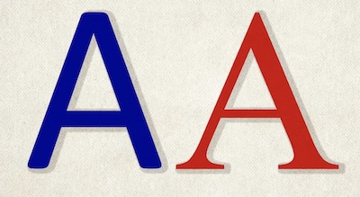
 Here you can see the difference, in an illustration helpfully provided by The Guardian.
Calibri, a sans-serif typeface, is on the left. Time New Roman, a serif typeface, is on
the right. The main differences are that the sans-serif font has uniform stroke weights,
no serifs at the ends of the strokes, and is in several places a bit “pointier”.
Now, if instead of banning Calibri they had banned Comic Sans, I could have given them a break. Typeface aficionados love to hate Comic Sans, but of course in my position as resident barbarian I don’t mind it. That sort of over-refined taste is like audiophiles who claim to hear differences in music only when they use Very Expensive Cables: pretty clearly self-delusion, but largely harmless beyond wasting money.
But this is something much worse: the mere fact that the switch to Calibri was made for readability for vision-impaired people was enough to give it the stink of disability and hence subject to DEIA witch-hunting. Like witch-hunting, they’re pursuing something that fundamentally doesn’t even exist, but Trumpers have long had impaired reality testing.
Also, it relates in a spooky way to something we previously wrote about on this Crummy Little Blog That Nobody Reads (CLBTNR), about right-wing bias in training LLM AI models. [2] In “Fit #4” of that post, we looked at right-wing bias of LLM AIs trained on a large corpus of old newspapers. You’d think that training on substantially everything would remove viewpoint bias, but…
- Right-wing newspapers have always been the preference of the rich.
- Hence, right-wing newspapers had more money to work with. This meant that:
-
They could print on higher-quality paper that was more likely to be preserved.
Thus there’s a right-wing selection bias even if you scan “everything”.
-
They could afford to buy/license typefaces that might have improved legibility compared to the free alternatives of the day. Since everybody wants to be mistaken for a member of the upper class, we’ve spent a lot of time with those typefaces, making them more recognizable by OCR software that scans them in comparison to the fonts used by more pedestrian publications.
Thus there’s a right-wing bias in what text is generated by the OCR, upon which the LLM AIs are trained.
-
Add that to the unexamined right-wing political bias of what’s “worth preserving”, and you end up with quite a bias indeed toward the viewpoints of the wealthy and the conservative, even where it seemed impossible for such bias to exist.
Interesting fact: the Times New Roman typeface was created for The Times of London, quintessentially a conservative British newspaper. In modern times, this has made it quintessentially the conservative choice. I won’t hold that against Times New Roman; it’s perfectly acceptable as fonts go. But it also means an alliance with historical conservatives, and that may explain the (possibly subconscious) love the Trumpers show for it.
That, and their venomous hatred of making any accommodation at all to those with any disability at all. Heaven forbid people should read what the US State Department writes.
A Modest Proposal
In keeping with Jonathan Swift’s 1729 satirical essay “A Modest Proposal”, I have a modest proposal of my own for the Trumpers.
It turns out, in Unicode, you can add diacritical marks (basically accents and such) to just about any letter you like. In fact, they compose in an unlimited way: you can add them on top of each other, to your heart’s content.
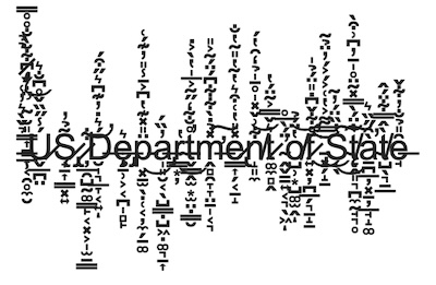
If you really don’t care about readability by those with visual impairments, and want to flaunt it by making things hard to read even by those with perfect vision, then the staff of the LingoJam web site has something for you: Cursed Text. [3]
 Basically you give the Cursed Text generator some ordinary text, and it will add
controlled amounts of chaos by putting in an absurd amount of diacritical marks. Here,
for example, is how “US Department of State” would appear with a very modest amount of
such chaos — maybe 5% of the amount possible in the UI on LingoJam. (Though I note that,
ironically enough, it chooses by default a sans-serif typeface underneath all the cursing.)
That’s about as contemptuous of your readers as you can get, short of actually spitting in their eyes. Seems about on-brand for Trump.
I’m sure if the US State Department wants to use this as their new logo, a royalty agreement can be worked out for them to pay a very reasonable annual license fee to Your Humble Weekend Editor and the owners of the LingoJam web site.
The Weekend Conclusion
Look, they’re already determined to bring curses on themselves. Why not be straightforward about being a curse upon humanity? After all, they’re not shy about all their other evil behavior.
(Ceterum censeo, Trump incarcerandam esse.)
Notes & References
1: Reuters Staff, “Typeface of ‘wasteful’ diversity: Trump’s state department orders return to Times New Roman”, The Guardian, 2025-Dec-09. ↩
2: Weekend Editor, “LM AIs Are Still Buckets of Warm Sewage & Broken Glass: An Agony in 7 Fits”, Some Weekend Reading blog, 2025-May-21.
The part about right-wing bias because of typefaces in newspapers for rich people is in Fit #4. ↩
3: LingoJam Staff, “Cursed Text”, web site accessed 2025-Dec-29. ↩

Gestae Commentaria
Comments for this post are closed pending repair of the comment system, but the Email/Twitter/Mastodon icons at page-top always work.