COVID-19: How Bad Was the Unemployment?
Tagged:CorporateLifeAndItsDiscontents
/
COVID
/
Politics
/
Statistics
Let’s see how job losses and rebounds (not COVID-19 rebounds, this time) look for the pandemic, compared to previous episodes of economic unpleasantness.
Still rebounding
Yes, here at Chez Weekend we’re still fighting a COVID-19 rebound post-paxlovid. Well, your humble Weekend Editor is. The Weekend Editrix and the Weekend Publisher have exiled me to the 2nd floor while they luxuriate on the first floor, with full fridge access.
The staff at our doc’s practice were slightly disappointing today, trotting out the line that the “CDC says there’s no evidence”, while refusing to consider additional evidence or to let me talk to anybody else.
Nevertheless, we persevere. (Immunologically, if not pharmacologically.)
The other rebound
What about the economic effects of the COVID-19 pandemic, on things like employment?
 Our go-to source for data on this, as with so many things economic, is the generally
excellent Calculated Risk. A recent article [1] updates us
on the unemployment situation as of July, and compares with other recessions and panics in
the 20th and 21st centuries.
Now, the thing I like about Calculated Risk is this: rather than look microscopically at the current moment, they take a step back and look at the broad sweep of things over time. This is so much better than the usual media coverage, which will tell you something like the point change in the Dow Jones and no more: despite the facts that the Dow is about the worst possible index with its 19th century construction methods, the point change is irrelevant compared to percent change, it gives you no idea how other market sectors (small cap, foreign ex-US, and bonds) did, and no insight into economic conditions that might cause trends. Fortunately, Calculated Risk does better.
Post-WWII Percent Job Losses
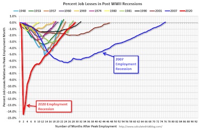
 First, consider the percent job losses in post-WWII recessions:
- Each curve is a recession, with the start year associated with a color in the legend at top.
- All recessions have been given the same time origin, so you can compare how fast or slowly the resolve.
- By taking a percent of jobs, we see how much damage each recession did, given the size of the economy of the day.
A couple of things stand out:
- Most recessions resolve within about 18 months, and trim about 1% - 5% or so of jobs.
- There is an alarming tendency for recessions in the last 30 years to be much longer: check out 1990 (black), 2001 (brown), 2007 (blue), and 2020 (red). One might argue that 2007 doesn’t quite count because it was a financial panic, and those have always take longer to resolve. On the other hand, all of these are basically post-Reagan, when Republicans removed a lot of the economic safeguards in the US.
- The depth of each one is interesting: the 2007 recession was scary at the time, because of its depth and lifetime, but the depth was nothing compared to the COVID-19 recession of 2020! That was a lightning-fast decline in employment, followed by recovery as fast as the faster of historical recessions. Again, not exactly typical?
I’m not quite sure what moral to draw here, certainly not what it means for policy. But it seems the 2007 financial panic was terrifying for its depth and lifetime, while the 2020 pandemic recession was terrifying for its depth, though the speed of recovery was good.
Not entirely coincidentally, we note that the red line for the 2020 pandemic recession has just reached 0%, i.e., employment recovery.
Labor Force Participation Rate & Employment to Population Ratio
Next, let’s consider unemployment. Unfortunately, there are numerous unemployment rates, called mysterious things like U3 and U6.
Basically, the differences come down to who’s counted as a potential worker and who is not. U3 only includes people actively seeking employment, whereas U6 includes those who are delicately called “discouraged workers”, as well as part-timers who want full-time work. U6 will always be higher. During the Reagan administration, several versions of the index were reported so they could throw out all the discouraged workers and make things look better.
So there are way too many games to be played with unemployment rates, and a regrettable history since Reagan of doing so.
That’s why I like the labor force participation rate and the employment to population ratio:
- The participation rate is people in the work force (presumably from tax receipt data) divided by the civilian noninstitutional population that are “actively looking for work”.
- The employment to population ratio is just the number of people with jobs divided by the number of people not institutionalized, with no opportunities to monkey with the definition.
So the participation rate gives you some of the flavor of U3/U6, in that it only includes people who show some evidence of wanting a job (or not being shut out due to systemic racism or age discrimination), while the second makes no excuses at all.
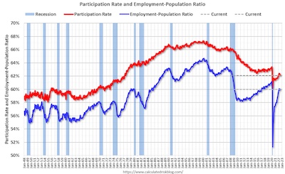
 So here’s what those look like, over time.
First, consider the red curve, which is the labor force participation rate, and hence has a certain amount of gamesmanship to make it prettier by blocking out “discouraged workers”, the victims of systemic racism/sexism, and age discrimination. Even with that going for it, the trend is clear: downward from the late 90s. There are a couple years when it went sideways, but it never increased.
This shouldn’t – I think – be affected by an aging population. The aged are not actively looking for work, and hence are excluded?
Conclusion: We keep using crises to amputate more and more people from the workforce, and never quite recovering.
Second, consider the blue curve, which is the very straightforward employment to population ratio, no excuses:
- It’s always below the labor force participation rate, i.e., more pessimistic. That’s because it takes a broader view of which people count, and forces us to consider them.
- The result from the labor force participation rate, of decline since the 1990s, still holds true.
- However, we can see some more detail here, where workers keep getting lopped off the
lists of people who count:
- The dot-com recession of 2000 was a steep decline, followed by a recovery of about half the losses.
- Then came the financial panic of 2007, which was even worse. It too was followed by a slow recovery of about half the losses.
- Then came the pandemic recession of 2020, which was terrifyingly fast and deep. It recovered more than half, but not quite all.
Conclusion: It seems clear that the last 30 years has been a story of recurring crises, each of which destroys a sector of jobs, from which we never quite recover.
The slogan of “never let a serious crisis go to waste” (variously attributed, but nowadays to conservative policies of privatization and dismantling social safety nets) seems to be in full operation.
The Weekend Conclusion
I am a grumpy old man, of firmly liberal beliefs. Also, only very lightly informed on the subject of economics, so my opinions here are more of the knee-jerk variety that anything well thought out.
Perhaps you noticed that already, though.
Notes; References
1: W McBride, “July Employment Report: 528 thousand Jobs, 3.5% Unemployment Rate”, Calculated Risk, 2022-Aug-05. ↩

Gestae Commentaria
Comments for this post are closed pending repair of the comment system, but the Email/Twitter/Mastodon icons at page-top always work.