COVID-19 loves Republican politicians
Tagged:COVID
/
MathInTheNews
/
Politics
/
R
/
Statistics
Suppose you had 2 groups of politicians, but one of them thought a pandemic was “fake news”, refused to wear masks, congregated indoors with no social distancing, blocked public health spending, mocked public health guidance, was proud of their ignorance, and were just in general jerks about the subject. Do you think they’d get infected with the disease more often than their opponents?
Well, I would certainly think so! But is there any data to guide us in that opinion?
Some initial hints
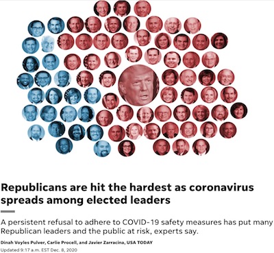 USA Today ran an article last
December [1] making a partial case for this, looking at the President,
Congress, and some haphazard sampling of state-level officials.
I didn’t want to write about it, because it was clear that their statistical sampling was not so good. They only looked at the state-level data where it was easily available, apparently with not terribly much attempt to ferret out the rest. This introduces all sorts of biases, e.g., the states that are most transparent with their data might be most likely to be blue states. So, let’s not fall for the availability heuristic, confirmation bias, or the representativeness heuristic.
Instead, let’s look at it as preliminary, anecdotal evidence. Even so, the anecdotes are terrifying:
Republicans’ refusal to adhere to safety measures puts not only the elected officials themselves at risk, but also the public, health experts told USA TODAY. Those who hold office set the example of expected behavior. And it starts, they said, with the commander in chief.
“We’re incredibly frustrated, angry, sad and despondent,” said epidemiologist Eric Feigl-Ding, a senior fellow at the Federation of American Scientists. He likens it to Trump piloting a plane on a trajectory to crash with 330 million Americans aboard.
“Epidemiologists who know how to steer this plane are pounding on the cockpit door begging him to please listen, please follow the evidence,” Feigl-Ding said. “It’s a living nightmare.”
Living nightmare? Yeah, that checks out.
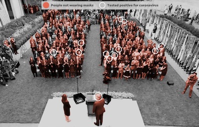 And it’s not hard to see why epidemiologists feel this way. Consider this photo of the
2020-Sep-26 Rose Garden ceremony when Trump nominated Barrett to the US Supreme Court
(another stone in my sandal!). USA Today has colorized the photo to indicate the people
not wearing masks, and circled those later testing positive for COVID-19.
I mean, look at these fools! Almost no masks. Almost no social distancing. Madly spreading the virus betwixt each other, placing their own lives in danger as well as the lives of their families. It’s just brutally stupid, and they’re proud of it. That’s the Republican brand, gradually since Reagan: brutal, stupid, and proud of it.
Got any better data?
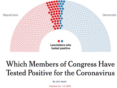 As it turns out, the New York Times just published an article by
John Keefe [2] which provides us with some better data, at
least sampling-wise. They looked at Congress, so that’s 535 data points, and they got all
of them. (With a few nits about non-voting delegates/commissioners, because Nothing is
Ever Simple.)
The nice thing here is that they defined their sample population before analyzing the data (as opposed to the USA Today article which just took partial data and pretended it was complete or a random sample).
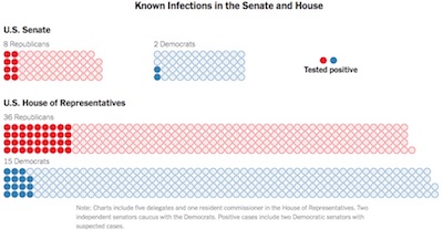 So… whadda we got here?
For each chamber, they report:
| Senate | Healthy | Infected | |
|---|---|---|---|
| Republicans | 43 | 8 | |
| Democrats | 46 | 2 |
| House | Healthy | Infected | |
|---|---|---|---|
| Republicans | 177 | 36 | |
| Democrats | 211 | 15 |
There are a couple of anomalies here:
- The total number of Senators tracked here is 99, instead of 100. Who’s missing?
- The total number of Representatives tracked here is 439, instead of 435. The NYT figure caption mentions that totals “include five delegates and one resident commissioner”. That’s 6 extras, whereas we have only 4 extras, so the explanation isn’t exact. But it acknowledges that we shouldn’t hit exactly 435.
Little nits like this are how you know the data is real, sadly enough. But offhand, it certainly looks like a larger fraction of Republicans are infected. Is it enough to be statistically significant, so we should believe it, though? Calculemus!
Analysis
If we combine both houses, we can make a contingency table of party by infection status (using R, as is the custom of my tribe):
> nRepub <- 51 + 213; nRepubInfected <- 8 + 36
> nDemo  <- 48 + 226; nDemoInfected  <- 2 + 15
> mx <- matrix(c(nRepubInfected, nRepub - nRepubInfected, nDemoInfected, nDemo - nDemoInfected), nrow = 2, byrow = TRUE, dimnames = list(c("Republicans", "Democrats"), c("Infected", "Healthy"))); mx
            Infected Healthy
Republicans       44     220
Democrats         17     257
Fisher’s exact test (devised, according to legend, for the problem of The Lady Tasting Tea) is sort of the canonical way to ask if the row & column proportions in a contingency table are really different. A small p-value means there’s very little chance the differences are random, and that the effect is real. Here $p \sim 10^{-4}$, so it’s significant:
> fisher.test(mx)
	Fisher's Exact Test for Count Data

data:  mx
p-value = 0.0001251
alternative hypothesis: true odds ratio is not equal to 1
95 percent confidence interval:
 1.634637 5.802785
sample estimates:
odds ratio
  3.017528
Another way to test this is using a test of proportion. It tests just what we want to know: whether getting infections are more likely among Republicans than Democrats (i.e., the null hypothesis is that they’re the same). Here again, a tiny $p \sim 2 \times 10^{-4}$ tells us the effect is real (i.e., it is highly unlikely that the infected proportions of 16.7% and 6.2% could really be the same with the difference explained by chance alone):
> prop.test(mx)
	2-sample test for equality of proportions with continuity correction

data:  mx
X-squared = 13.618, df = 1, p-value = 0.0002241
alternative hypothesis: two.sided
95 percent confidence interval:
 0.04764203 0.16160372
sample estimates:
   prop 1    prop 2
0.1666667 0.0620438
Finally, Keefe’s article notes that the background against which this should be compared is the national average of the COVID-19 infection rate, estimated at 6.5%. The infection rates in each party’s politicians can be calculated pretty straightforwardly (NB: identical to “prop 1” and “prop 2” reported in the test of proportion we just did):
> transform(mx, PctInfected = round(100.0 * Infected / (Healthy + Infected), digits = 1))
            Infected Healthy PctInfected
Republicans       44     220        16.7
Democrats         17     257         6.2
So the Democrats are infected at a rate of about 6.2%, well in line with the national average of 6.5%. But the Republicans clock in at 16.7%, which is just disease-ridden, and statistically significantly so!
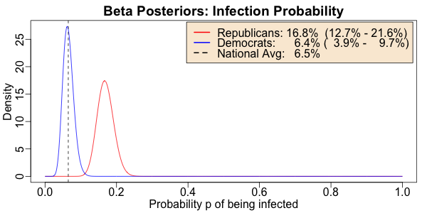
Now we might argue that the samples aren’t large enough to be certain of those proportions, and we should get some uncertainty measures to see if 16.7% of Republicans is really greater than 6.5% of all Americans. (Though this is exactly what the above tests examine, so here we’re just making convincing pictures for people who don’t want to try to understand statistical tests.)
For that, we do our usual Bayesian analysis: start with the prior that the probabilty of being infected is uniformly distributed, and after observing $K$ infections out of $N$ politicians, we have a posterior Beta distribution:
\[\begin{align*} \Pr(p) & \sim \mathrm{Uniform}(0, 1) \\ \Pr(p | N, K) & \sim \mathrm{Beta}(K + 1, N - K + 1) \end{align*}\]> source("~/Documents/laboratory/tools/graphics-tools.r")
> ps <- seq(from = 0, to = 1, length.out = 1000)
> repubs <- dbeta(ps, shape1 = nRepubInfected + 1, shape2 = nRepub - nRepubInfected + 1)
> dems <- dbeta(ps, shape1 = nDemoInfected + 1, shape2 = nDemo - nDemoInfected + 1)
> repubqs <- 100.0 * qbeta(p = c(0.025, 0.50, 0.975), shape1 = nRepubInfected + 1, shape2 = nRepub - nRepubInfected + 1)
> demqs <- 100.0 * qbeta(p = c(0.025, 0.50, 0.975), shape1 = nDemoInfected + 1, shape2 = nDemo - nDemoInfected + 1)
> withPNG("../images/2021-01-14-covid-loves-republicans-infection-rates.png", 600, 300, FALSE, function() { withPars(function() { matplot(ps, matrix(c(repubs, dems), byrow = FALSE, ncol = 2), type = "l", lty = "solid", col = c("red", "blue"), xlab = "Probability p of being infected", ylab = "Density", main = "Beta Posteriors: Infection Probability"); abline(v = 0.065, lty = "dashed", col = "black"); legend("topright", inset = 0.01, bg = "antiquewhite", legend = c(sprintf("Republicans: %4.1f%% (%4.1f%% - %4.1f%%)", repubqs[[2]], repubqs[[1]], repubqs[[3]]), sprintf("Democrats: %4.1f%% ( %4.1f%% - %4.1f%%)", demqs[[2]], demqs[[1]], demqs[[3]]), "National Avg: 6.5%"), col = c("red", "blue", "black"), lty = c("solid", "solid", "dashed"), lwd = 2) }, pty = "m", bg = "transparent", ps = 16, mar = c(3, 3, 2, 1), mgp = c(1.7, 0.5, 0)) })
- The vertical black dashed line is the estimated infection rate on a national average in the US, of 6.5%.
- The blue curve shows the Beta posterior distribution of the probability of Democratic politicians being infected; obviously it peaks right around the national average.
- The red curve shows the same thing for Republican politicians: they’re clearly far more likely to have COVID-19 than either Democratic politicians, or Americans in general.
- The legend gives for each group’s probability of infection: the median (best single point estimate) and the 95% confidence limit. Note that the 95% confidence limits of the 2 parties don’t even overlap: Republican legislators are definitely more infected.
In fact, there is only a few chances in a billion that the Republican infection rate is actually comparable to or lower than the national average of 6.5%:
> pbeta(0.065, shape1 = nRepubInfected + 1, shape2 = nRepub - nRepubInfected + 1)
[1] 3.793686e-09
What should we make of that?
Yeah… COVID-19 loves Republican politicians. You, however, should not love them (to put it gently): they want policies to make you as sick as they are.
“Think of it as evolution in action.”
— Larry Niven & Jerry Pournelle, Oath of Fealty (though as conservative authors, they’d be horrified at this context in which I’m quoting them)
Notes & References
1: D Pulver, C Procell, and J Zaccarina, “Republicans are hit the hardest as coronavirus spreads among elected leaders”, USA Today, 2020-Dec-08. ↩
2: J Keefe, “Which Members of Congress Have Tested Positive for the Coronavirus”, New York Times, 2021-Jan-14. ↩

Gestae Commentaria
Comments for this post are closed pending repair of the comment system, but the Email/Twitter/Mastodon icons at page-top always work.